SXSW Data
Data Visualization Design

At around the 2nd day, 3rd drink in, seated above 6th Avenue, and observing the chaos that is the annual SXSW festivities, a thought hit the back of my mind like a well chewed piece of gum. Not an entirely pleasant thought but it stayed there, hence the analogy. “I wonder what this crockpot of humanity looks like from an analytical perspective”.
With the thought initiated, I knew I could do one of two thing; get another drink, or formulate a plan. So I did both. For the first of my visits to SXSW I recorded, along with fellow We Are Royale attendees, our drinking and socializing habits. For the second year I recorded, along with those aforementioned We Are Royale attendees, our traveling habits and built a fictitious transit system I liked to think of as the “Narcissistic Transit Map”. On yet another visit, I built an entire solar system of planets. SXSW became not only an inspiring trip with like-minded creatives but an excuse to explore some weird data art.
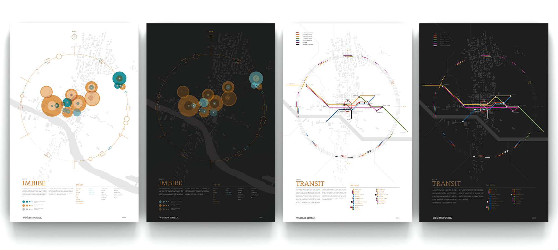
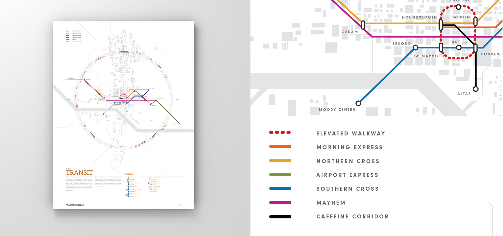
Let’s starts with the transit map. The map is exactly what it looks like, a transit map for the city of Austin TX. Why? Because while walking around this beautiful city attending the conference (getting coffee and meeting friends) it become a fascination of mine. What would a transit map built around our very limited use of this town, look like? So I started collecting position data, time stamps and visit types. Turns out, you don’t need much data to start creatively categorizing and deconstructing patterns.
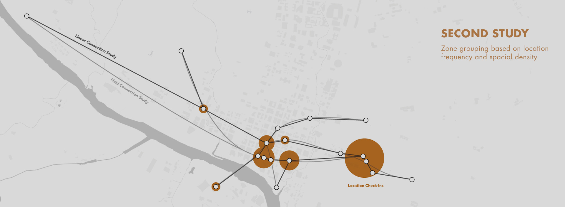
The 3 images below get into this analysis phase. This whole process actually took a good amount of data processing and creative comparison. Starting with the locations, I tallied them for visits, marked the time of day, and then started sketching plots between them. The idea here is very much in line with metropolitan transit studies. With them the question is asked; "Where can we create a transit line that benefits the most people and travels the least distance." The first pattern to emerge was obvious; Our trips from the house we rented on the east side to the downtown core where the convention was taking place along with meet-ups and bars. Looking at the studies below, keep in mind this idea of studying form using the base location points as transit stops.

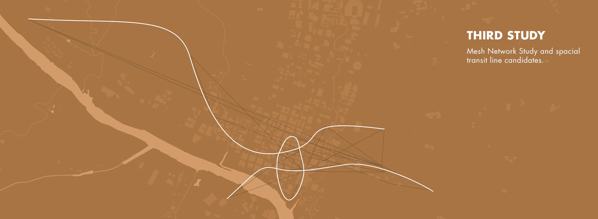
After doing a number of these transit studies, a common pattern kept popping up. A couple East-West lines were needed as well as a central loop line. I started plotting lines around those two base lines that would then connect the rest of the stops. At around this point a healthy 7-line system was built and like any good civic project a good “Value Engineering” brought that total count down to 5.
A raised walkway connecting all of the major hotels and convention center downtown creates a central arterial. A dedicated airport line connects to the house and a highly specialized “Mayhem Line” narrates an infamous all-night crawl. The outer rings visualize when various lines were actually used and how long the trips took. All said and done, the SXSW Transit map is a narrative visualization of one infamous year to the city in the middle of Texas. If you study it close enough, that story starts to emerge.
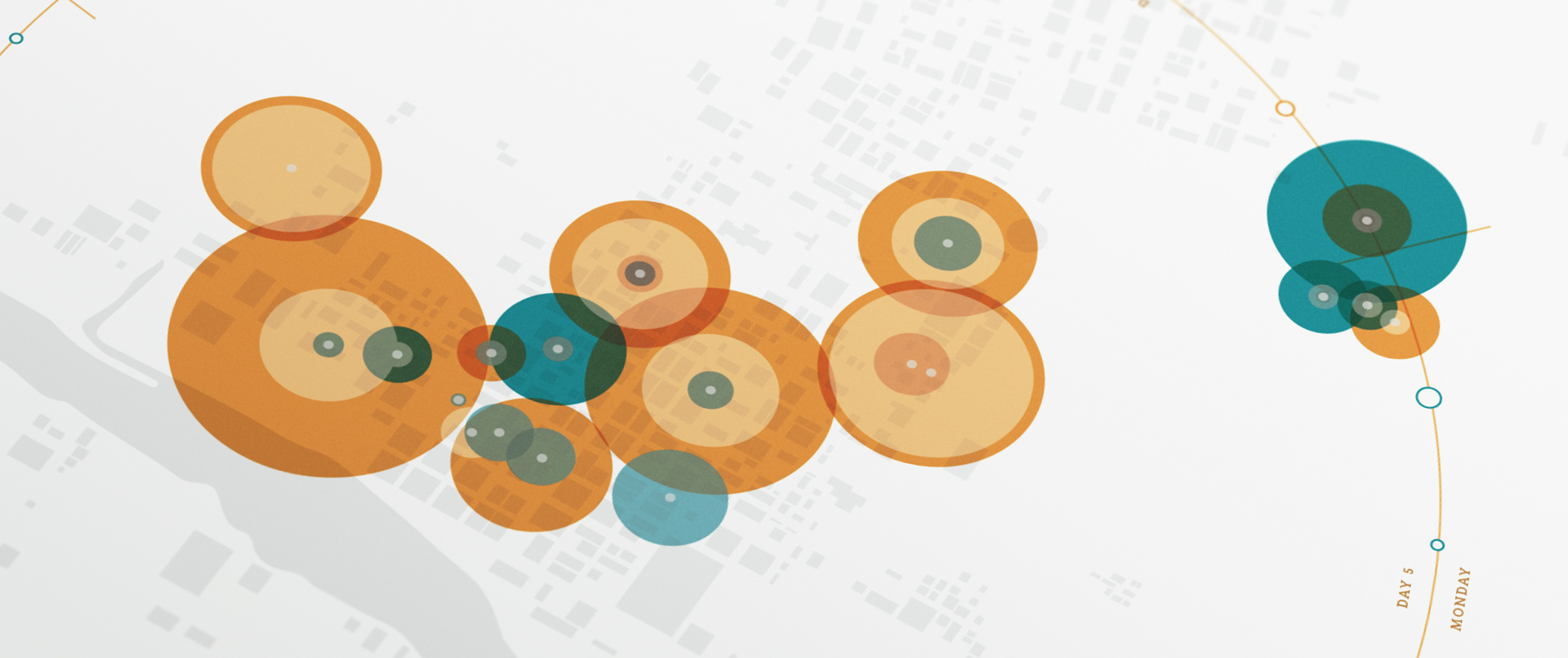
For the second map, we did a fun comparison of our two favorite pass-times at the festival; Drinking and mingling. The Imbibe map captures a fun and creative approach to typical data mapping. Yeah, we drank a lot, but not just boozy drinks. We captured every type of drink in our study and then captured every type of social encounter we had. Why? Because we’re a curious lot.
The circle locations are where we partook in some sort of drinking. The size of the circle is a volumetric representation of how much we had to drink. In conjunction, the darkening overlay circle represents our social encounters. You start to get a pretty silly and obvious pattern here. The outer ring captures when we drank and what types of beverage as we travel around SXSW.

The takeaway from the SXSW Imbibe poster is a data visualization of a unique group of people enjoying a rather booz-heavy trip to the interactive conference. As you start to look closer at the print a few interesting stories begin to emerge. In the upper-right, more water was consumed than alcohol. Another hot-spot of non-alcoholic action explodes in the center of town where a morning coffee was our elixir of life.
Data visualization is a fascinating study where design helps tell stories driven by data. Where I love to dabble is in the data art that creates narratives. What kind of stories can we uncover with unique perspectives on this rather simple data-set?
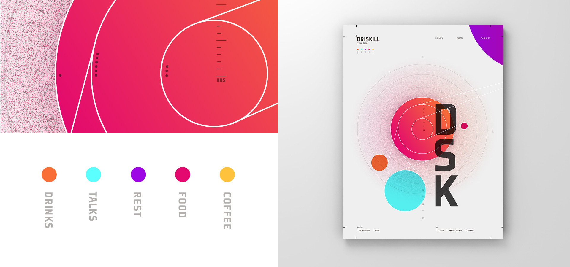
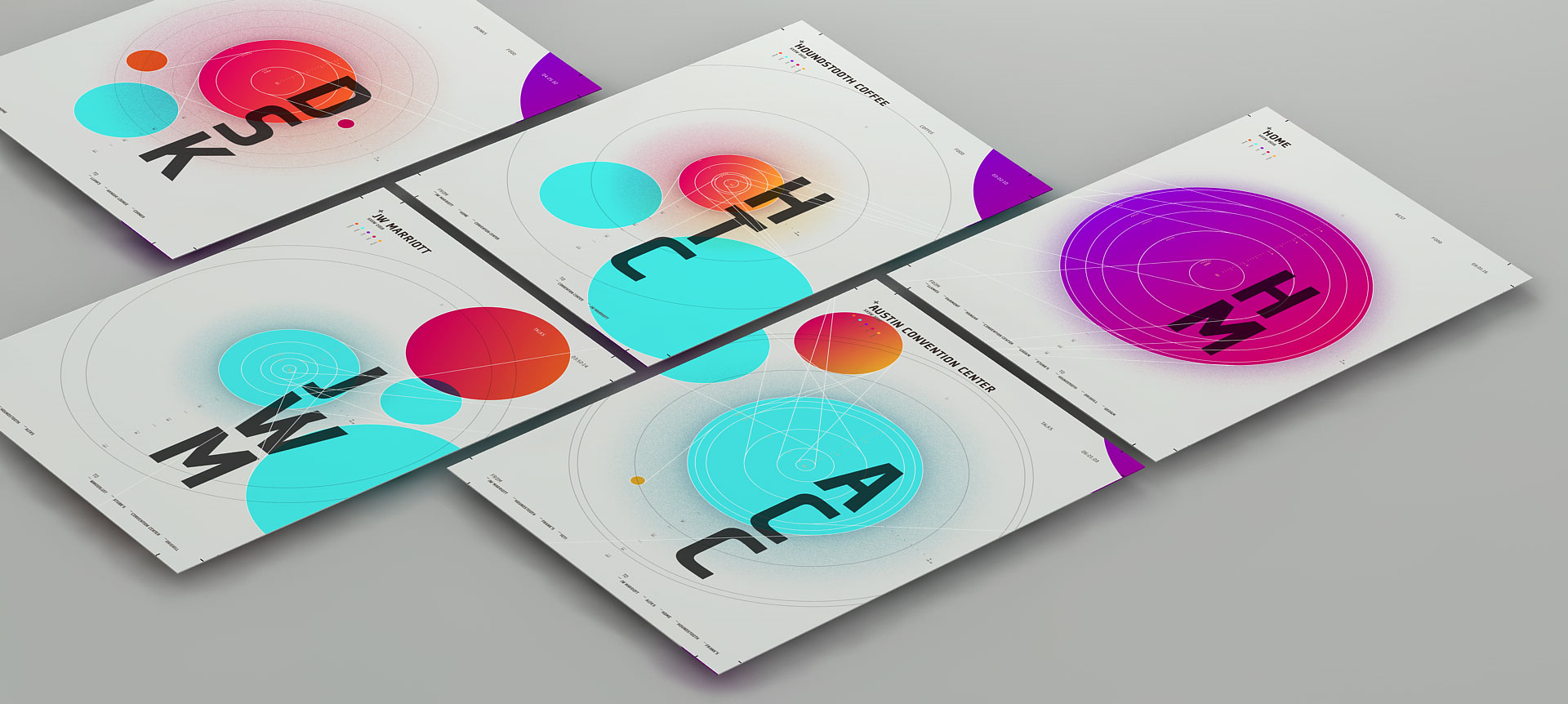
In a recent addition to this collection, I envisioned “top locations” as planets in their own solar system complete with orbits, moons, and space dust. The SXSW Planets visualize locations that had been visited more than once in our most recent trip. Many spots around Austin were single visit spots but these 5 rose above the rest as we would return to them over and over again. The house, coffee shop, convention, and key client meet-ups reveal a part of SXSW that is more closely representative of our actual trip.
The size of these planets represent the total time spent there. Like a record, the white line demarcates visits. The tiny dots on the left side of the circle represent total team members for that specific visit. The tiny dots on the right side, outside of the planet, represent the average sound decibel recorded at that location. The distance to the orbiting planets and their location in relation to the center planet represent spatial distance to the next or previous location. The white line that “lassoes” these planets together move off the previous planet in a clockwise fashion and circle around the center planet in a counterclockwise direction along the demarcation line in which we visited. The line then shoots off towards the spot we headed to next.

All of these visualizations represent an approach to data-visualization that is centered more on the impression and less on the conventional form we are familiar with. I believe data-visualizations can tell stories and create impressions upon the viewer but only if they are not immediately ignored as “boring data”. I like to break down the initial barrier by presenting a design that doesn’t look like a visualization but instead, like expressive graphic design.