The 100 Titles
Design / Direction

The talented gang behind the show "The 100" approached us at Royale to present our idea for what an intro title package could look like in their post-apocalyptic future world. Of course, I love anything sci-fi so this is where I agreed to ALL the terms and conditions. The show itself is very interesting and well done from a talented team passionate about making something truly unique on the CW network. After some key back-and-forths with the show created Jason Rothemberg and his talented show writers, we took off on an idea that would build upon the show's already dense world and give viewers a unique angle on the events that happen every week.
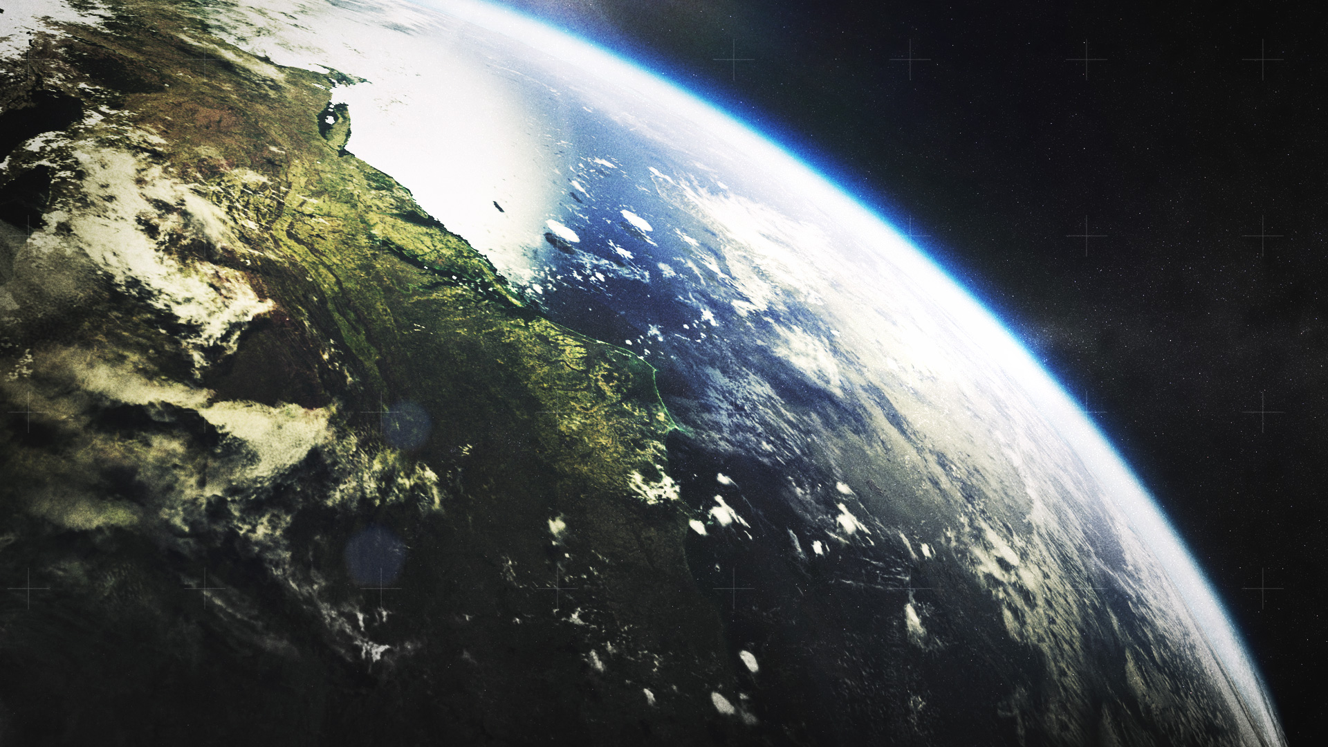
I really enjoyed the amount of narrative depth Jason was bringing to his world and wanted to expand upon that as much as possible without revealing too much ahead of time. The idea was to give viewers a birds-eye view of all major events from the show and highlight locations that were otherwise never seen from such a high vantage point. Our first task was to explore this idea and the overall tone for which we would be styling the entire intro.


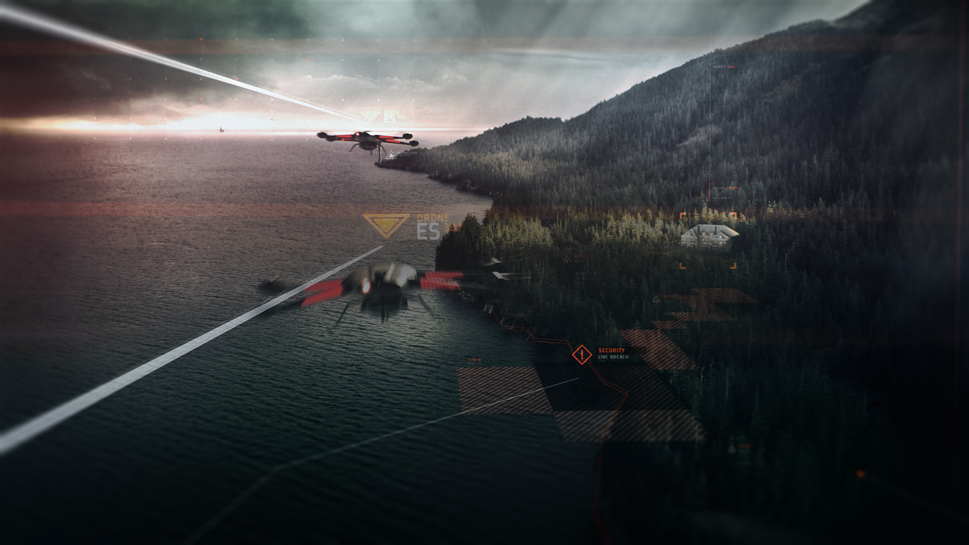
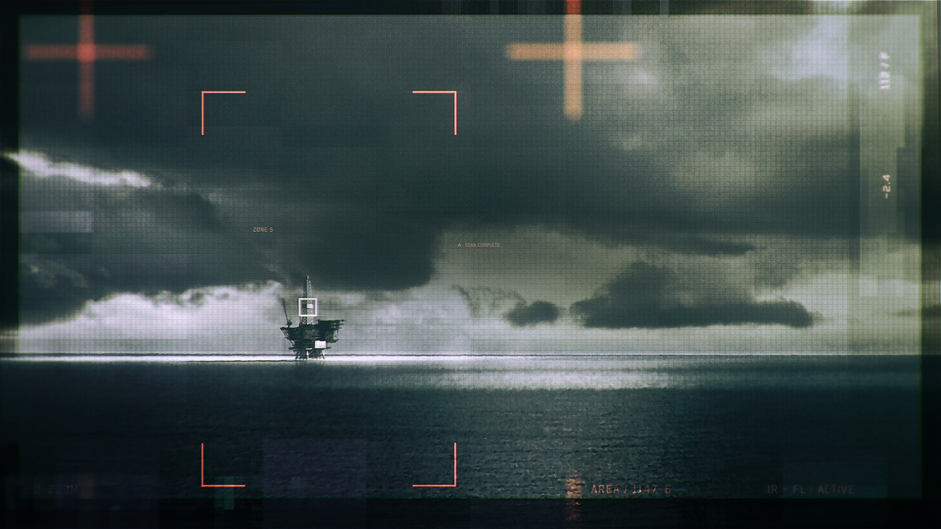
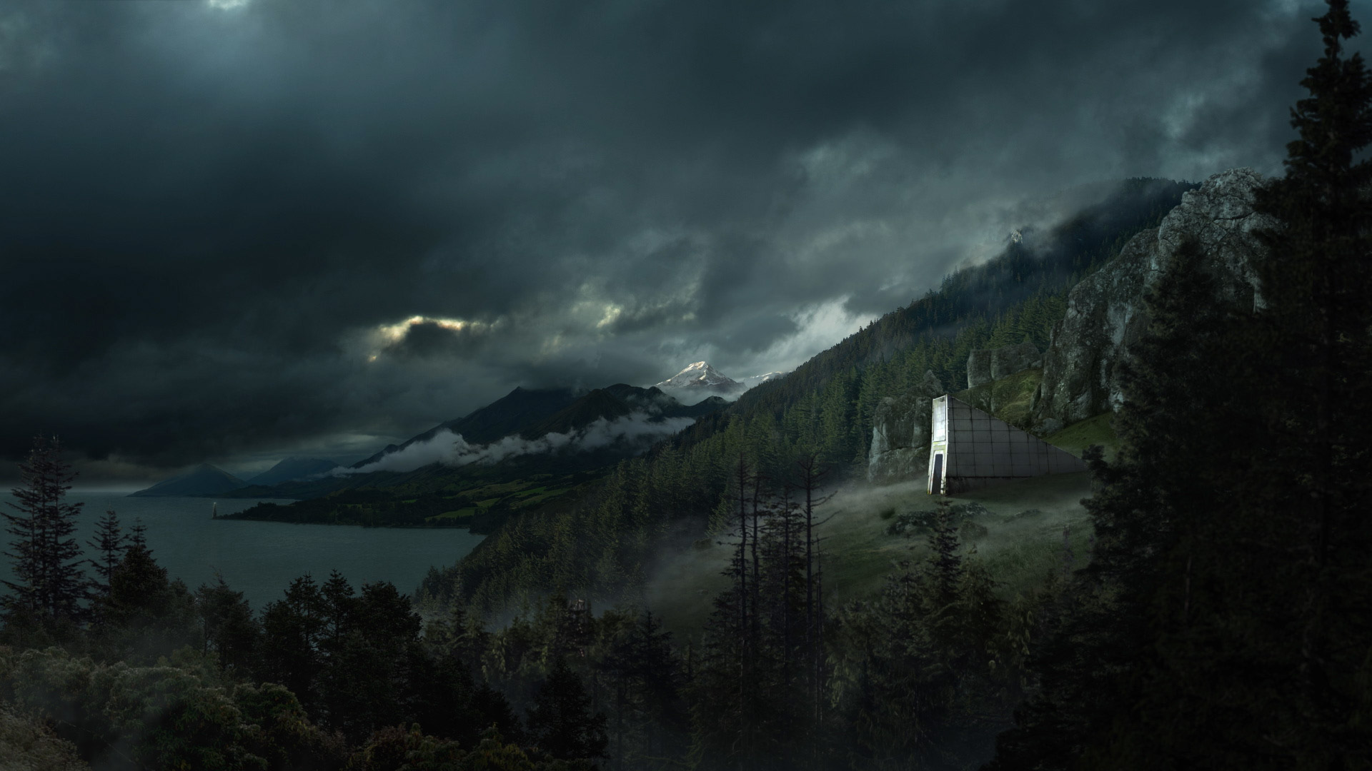
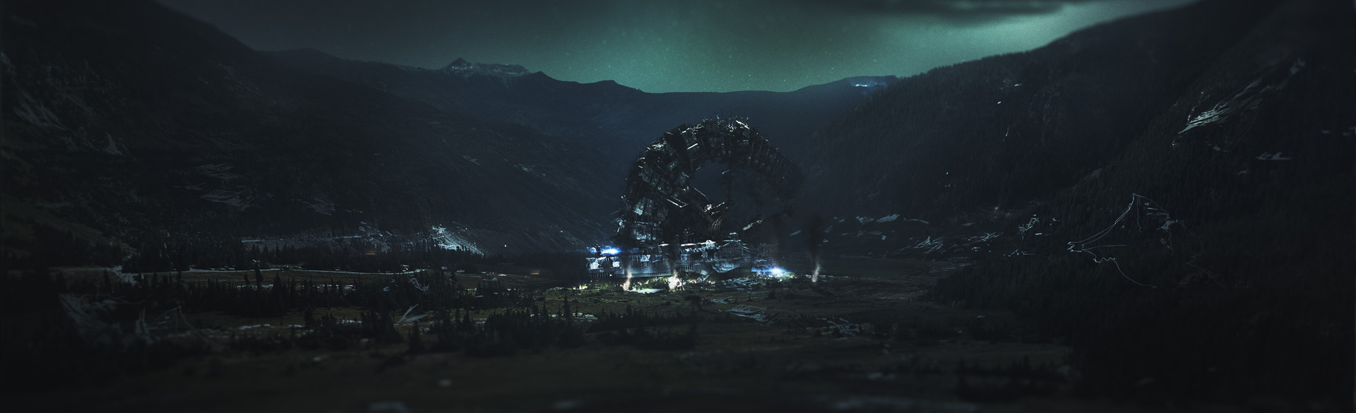
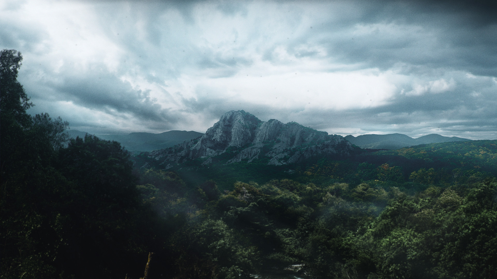
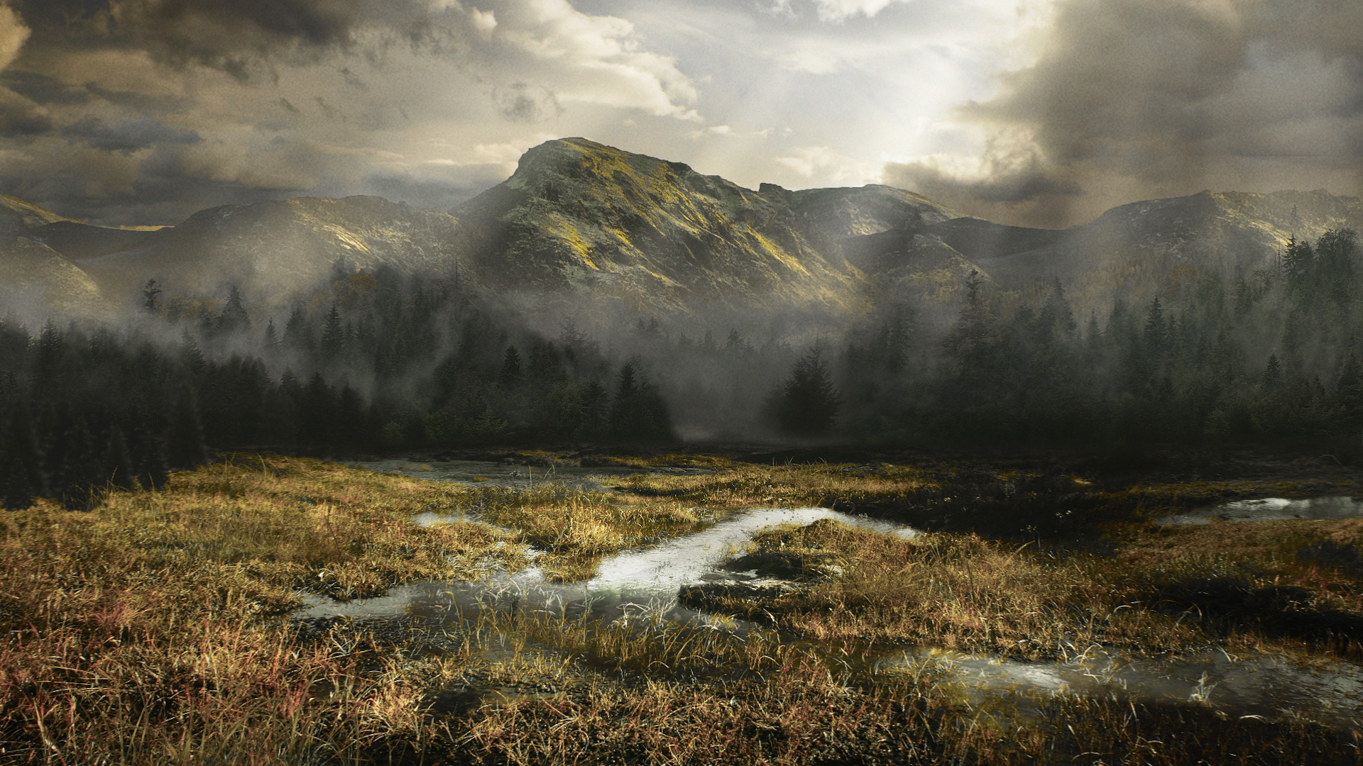
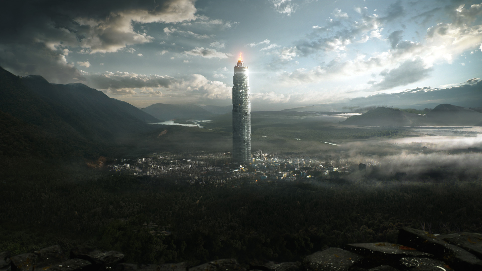
Locations and elements seen in every shot were a mix of matte paintings and footage. Some shots we chose to go with a lower angle and used footage as our plate to work from. Adding elements on top of this, we created locations from the world and graphic design assets to call-out what was going on below. These elements were minimal and served to add accent to the scene without taking away from the dramatic views we wanted out of the shots.
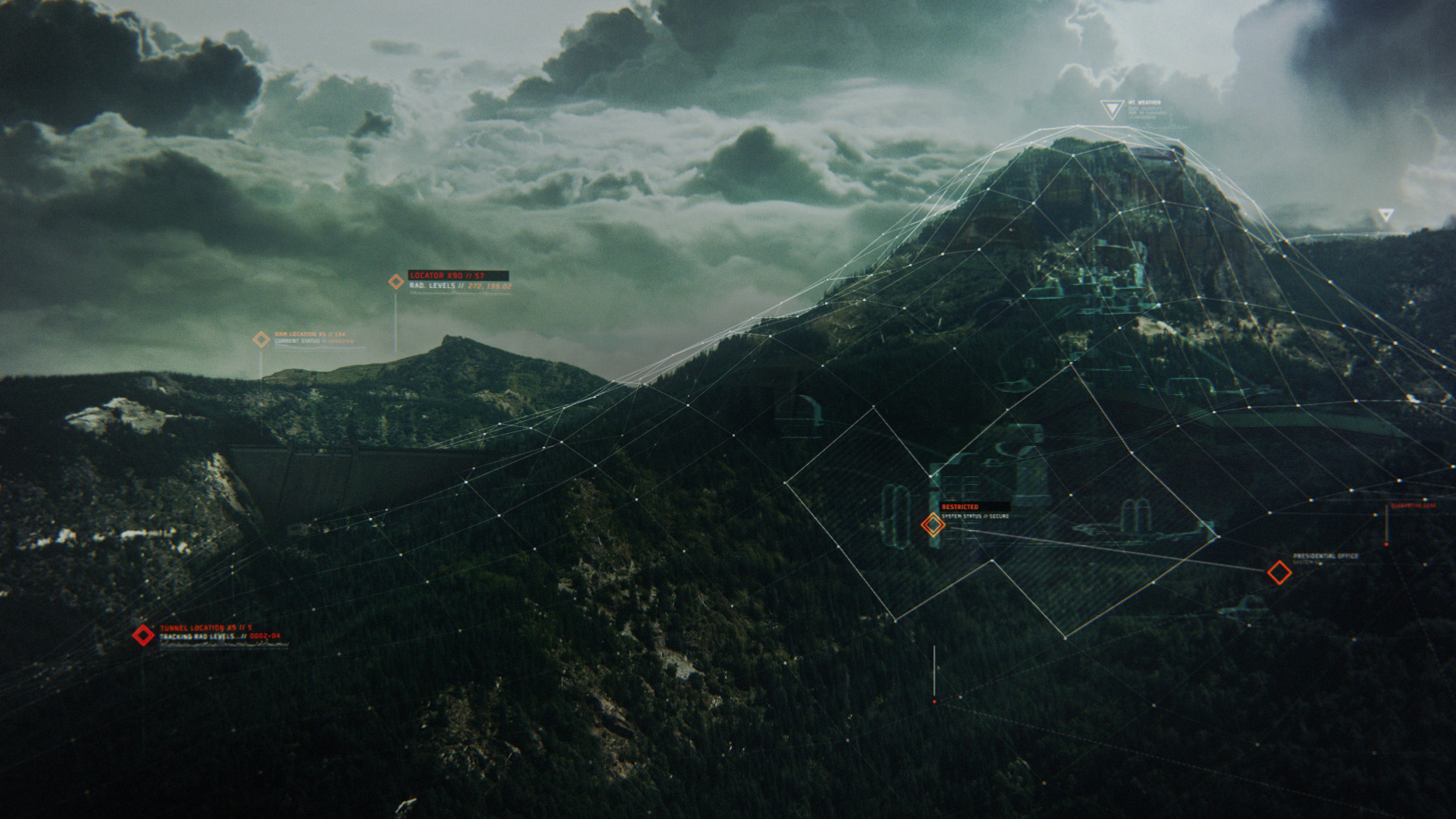
First and foremost we wanted that epic look. Adding design elements to the shots was a matter of defining character locations and their routes through the scenes. A semiotic toolkit was developed to help establish the design language for the UI elements. In addition to this, we used the same language to develop our typographic animation style. Again, without going overboard, we really wanted to keep the language compelling yet minimal.

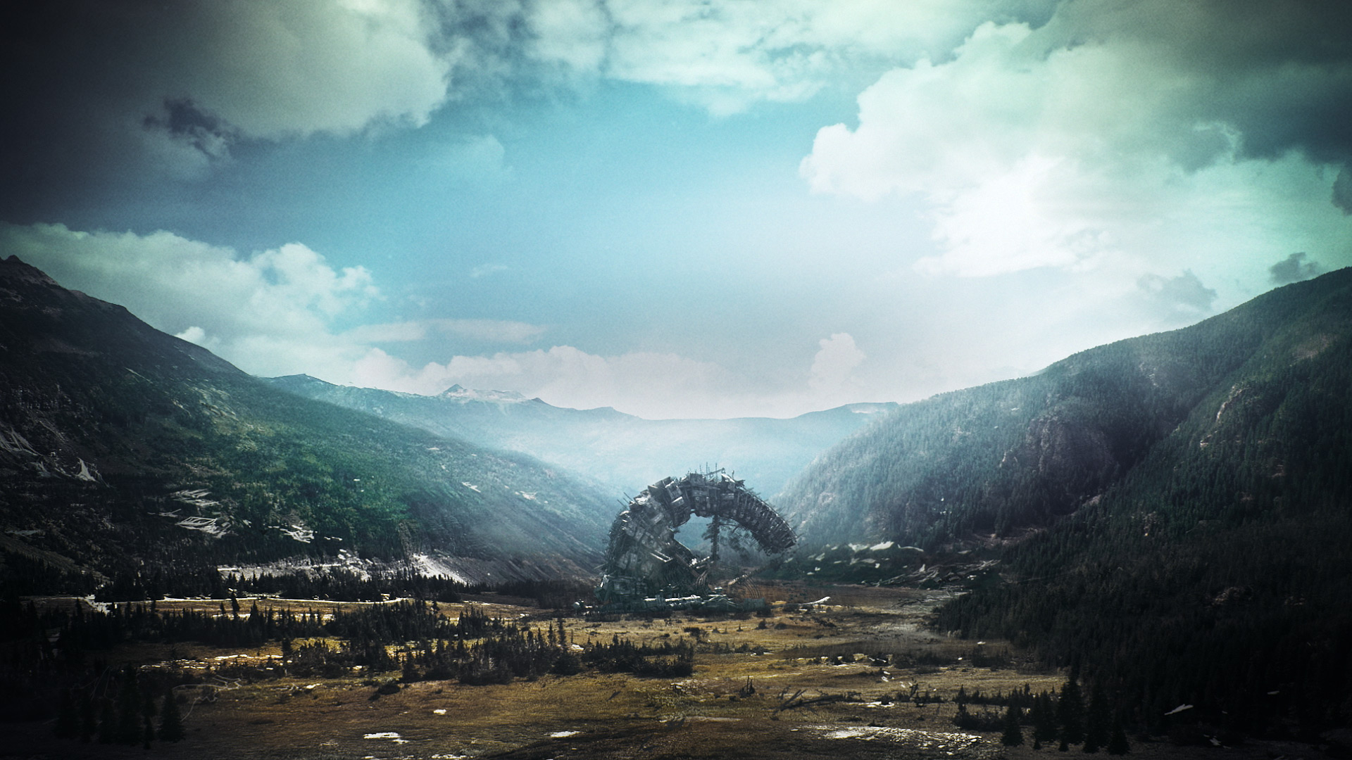
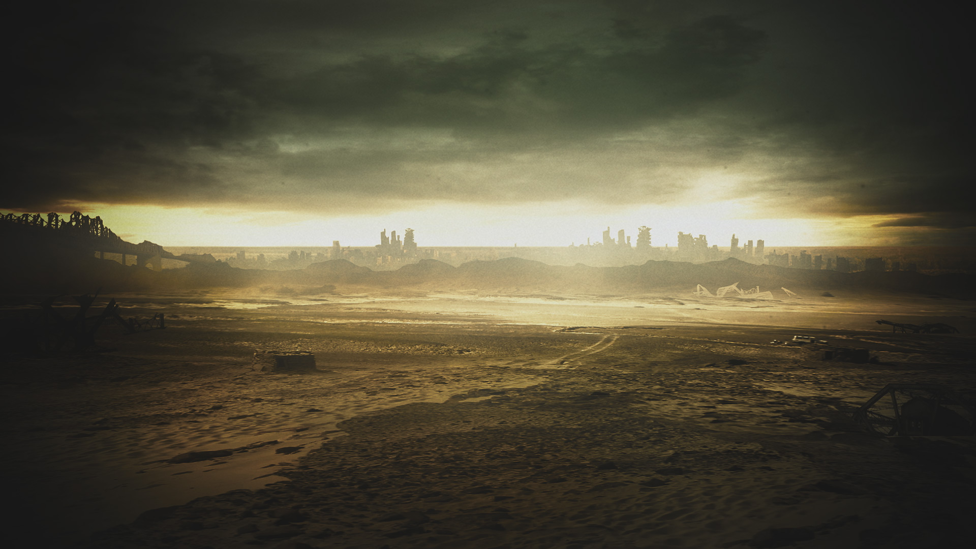
The design toolkit helped us build out the shots we would later see in the actual intro animation. We developed each and every shot first from the creative narration we wanted to see. In the show, the characters travel through some pretty wild locations so we wanted to show those great spots from our unique vantage. Mt Weather, the iridescent forest, and even some sweet teaser scenery in a desert for some locations still yet to come.
The design process had us developing over double the amount of shots seen in the final credits for good reason. I really wanted to build an intro that the creative team at the 100 could alter each week depending on locations they were visiting. Some of these shots would be used for this use while others simply had no place in the final sequence.

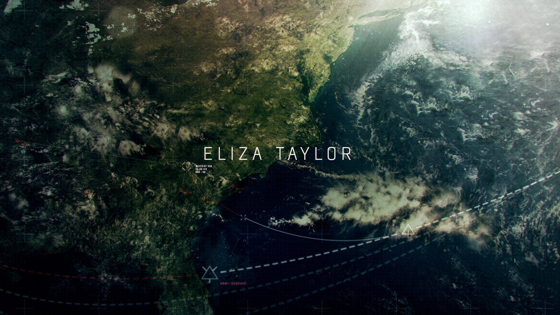
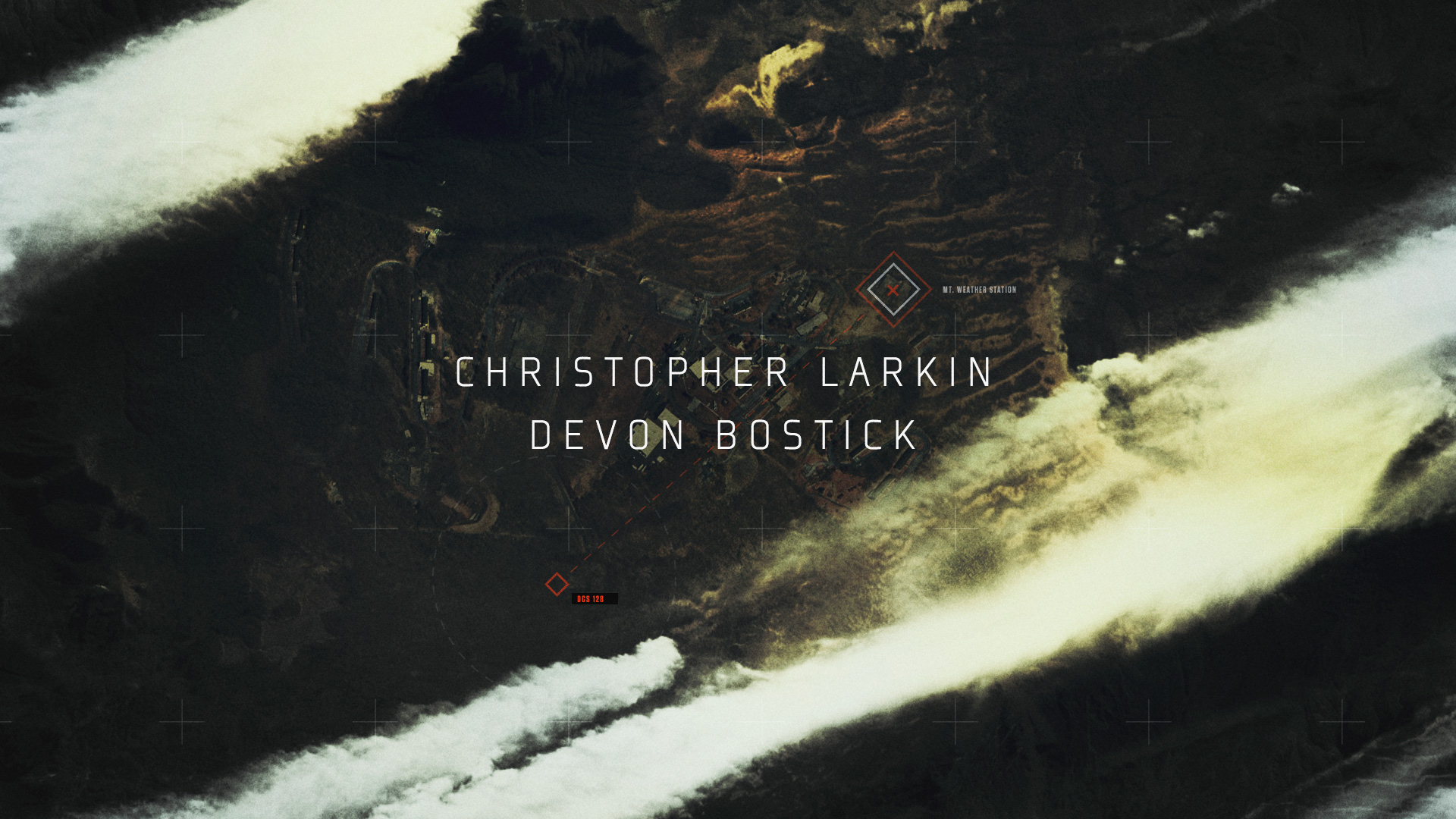


Early Motion tests explored the look of our omnipresent drone POV style with designed telemetry scattered around. We used a combination of footage and projection mapping techniques throughout. The animation below is our early developmental tests for this process.
Bookending the intro are title cards for the show and the show's creator, Jason Rothemberg. These bookend elements were matte paintings created to give the editorial team a bridge into the first shot in that week's episode. We developed 6 bookend shots for the show giving a wide array of locations to be used.