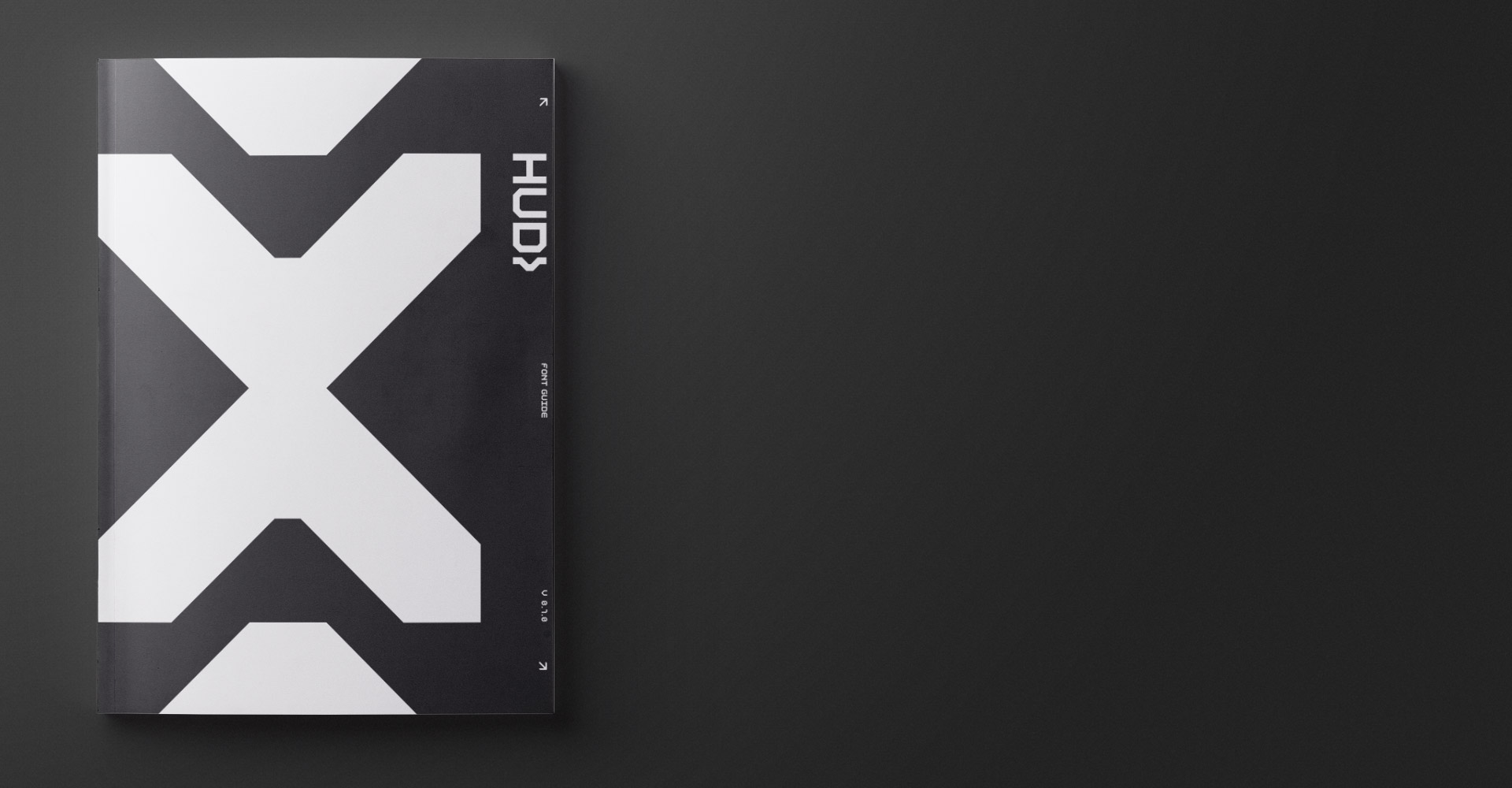
HUD
Custom Font Design
Design is in everything involving a multitude of creative aspects on every project.
Setting out to work on a project involves all sorts of creative channels and needs that often fall into the minutiae of a project. The demographic study that remained a PDF on a dusty server somewhere or the color study breaking down the use of specific hues of green over the decades. These are fascinating elements of much larger projects that get lost once we wrap. This happens all the time, and trying to explore the minutiae can oftentimes become a project into itself. Every detail is important and when a project needs lots of detailed typography, a custom font is often the only solution.
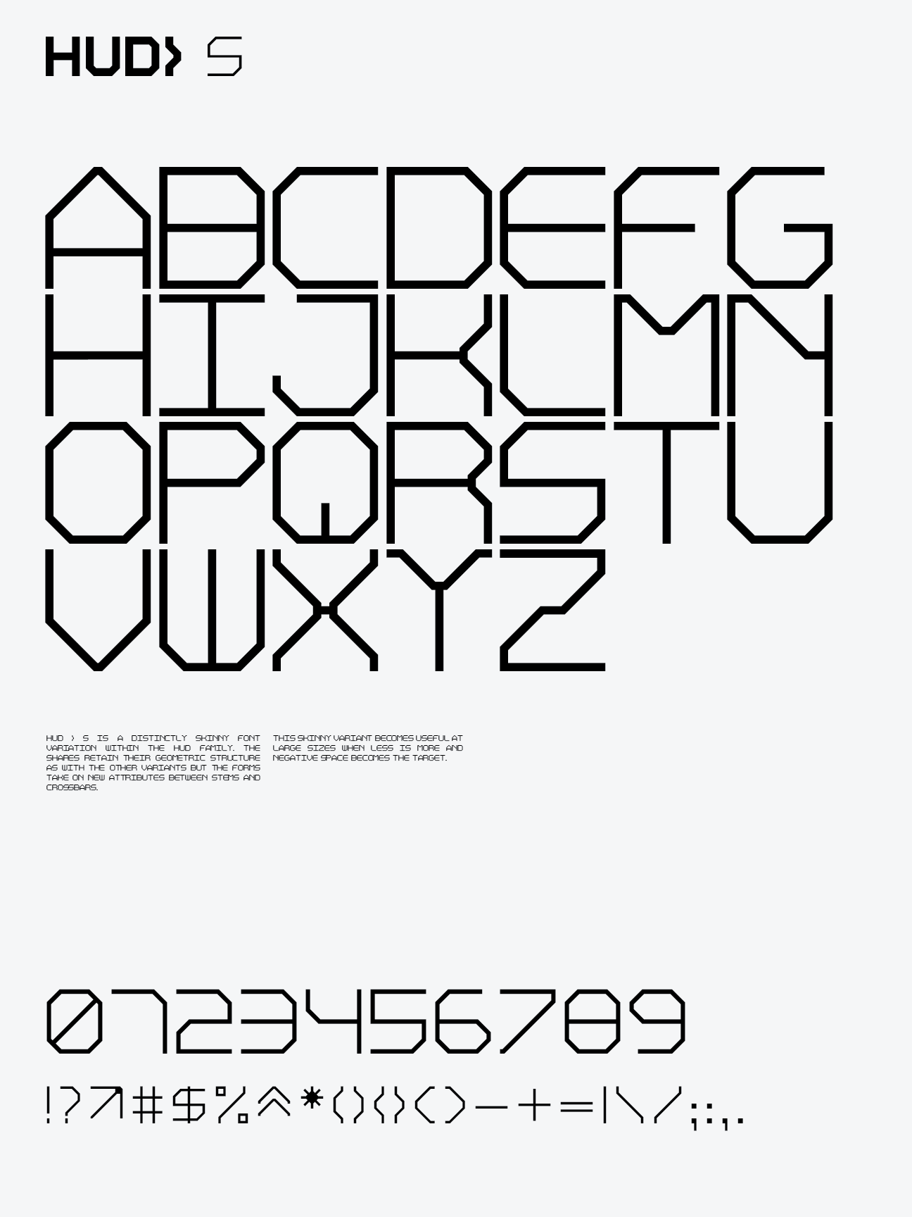
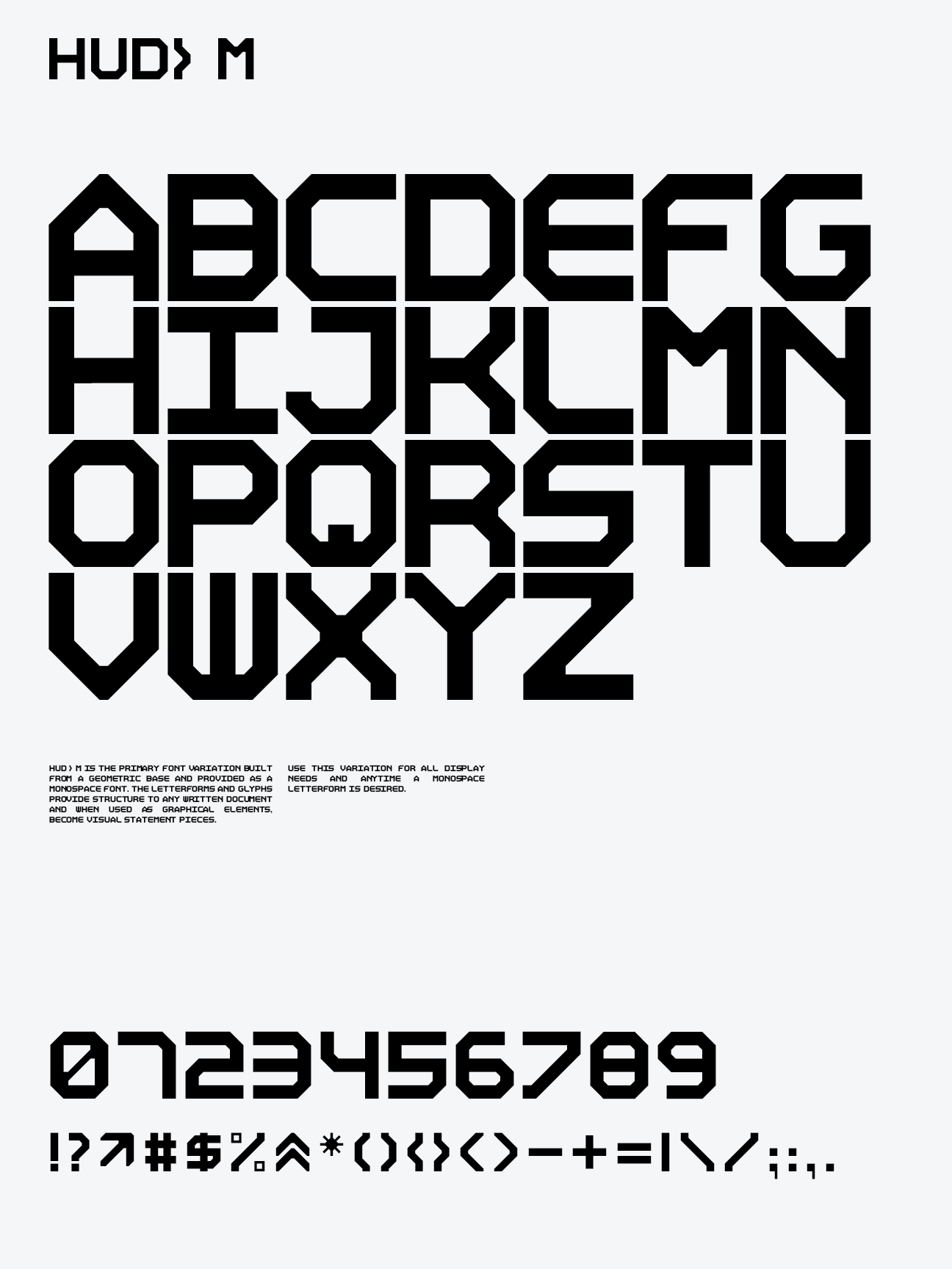
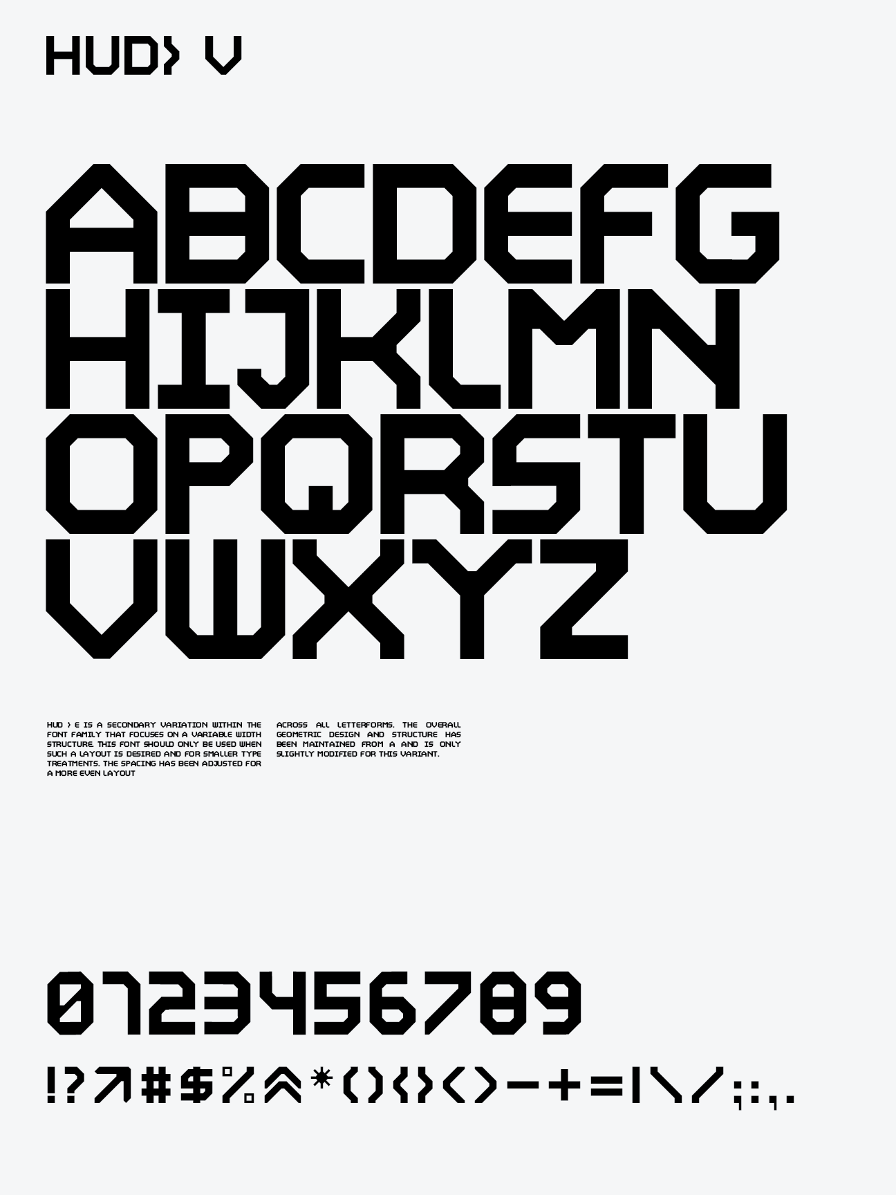
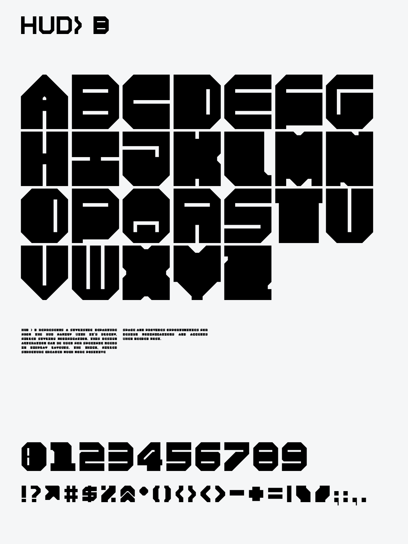
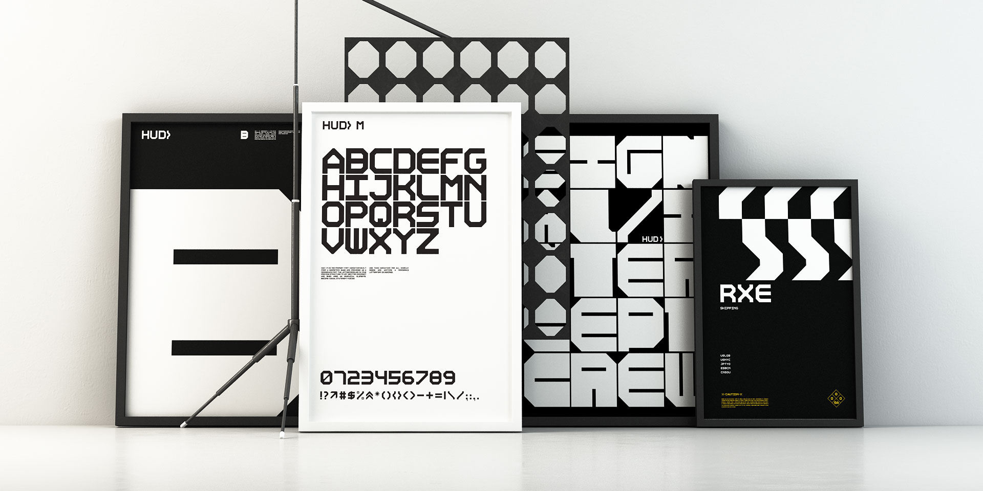
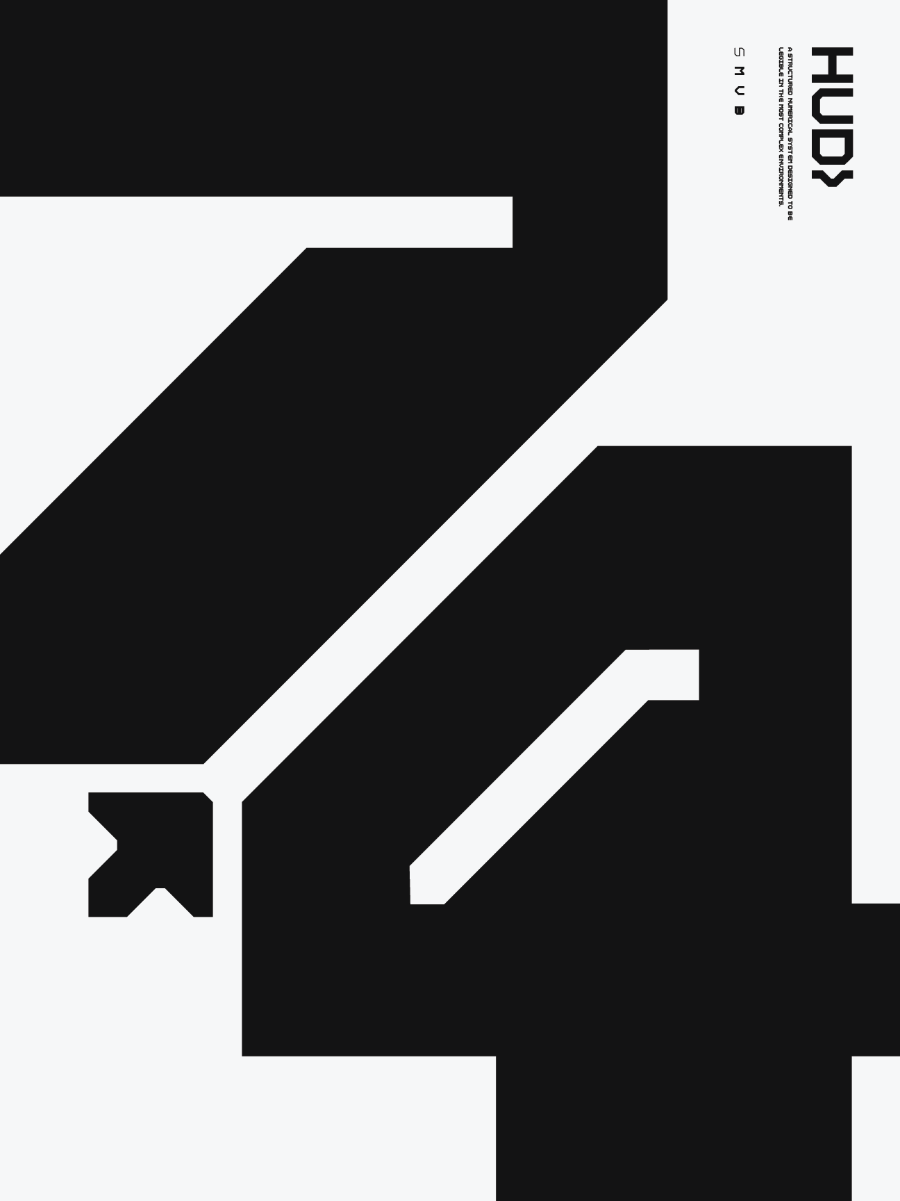
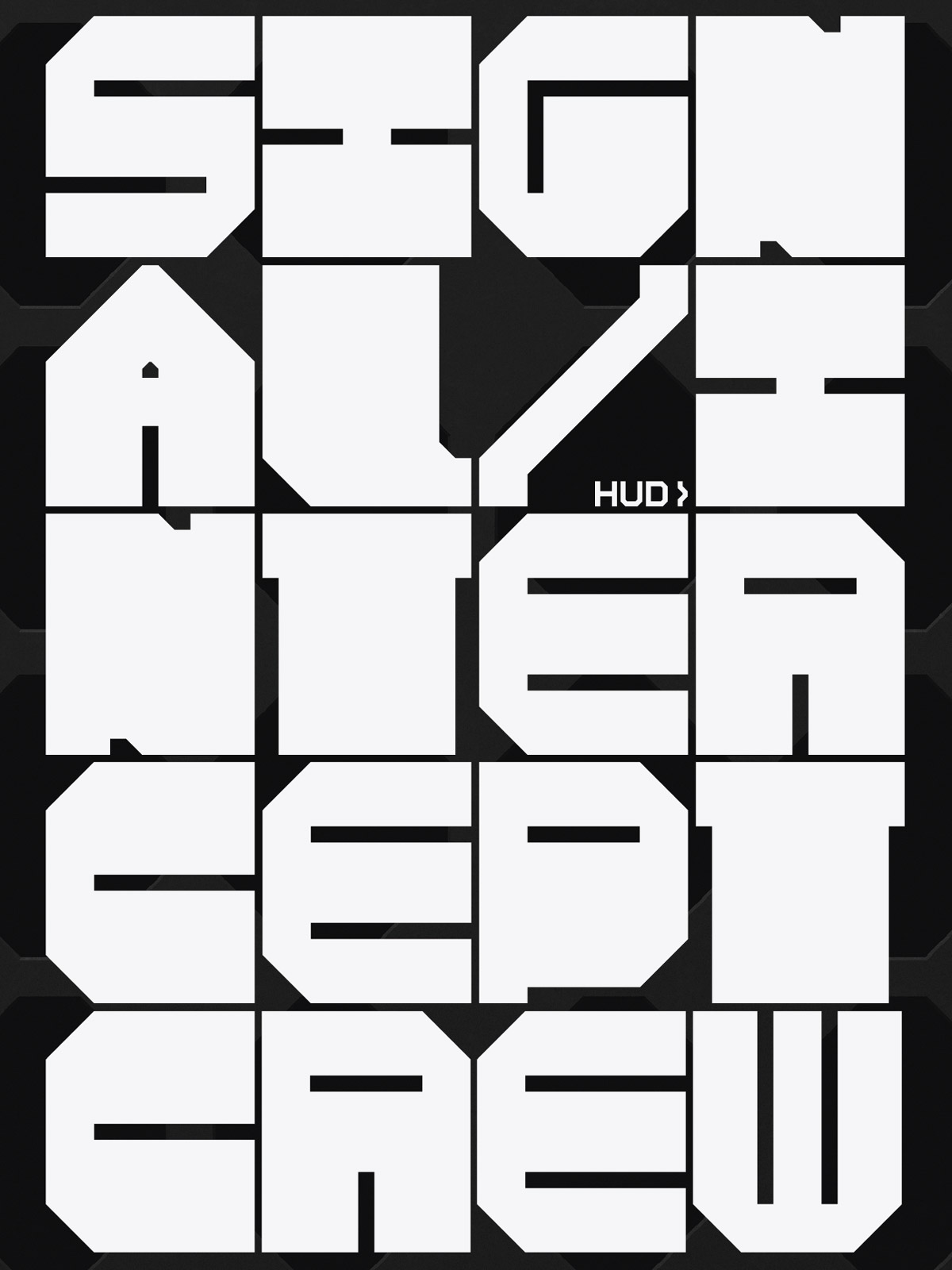
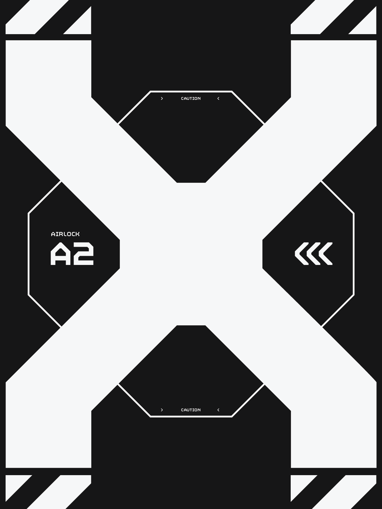
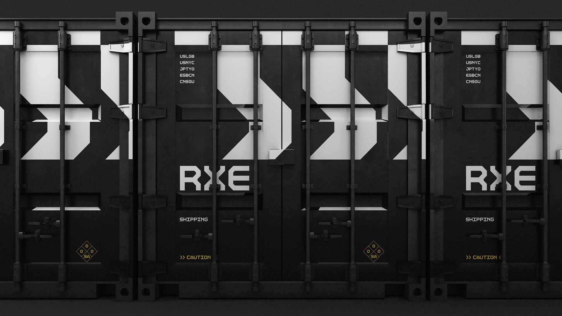
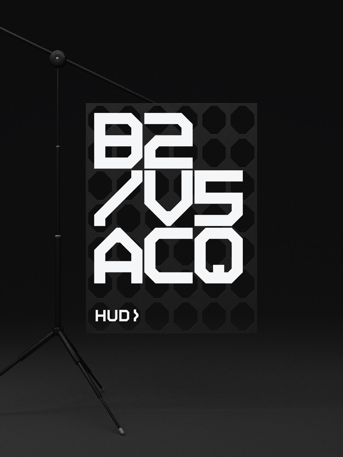
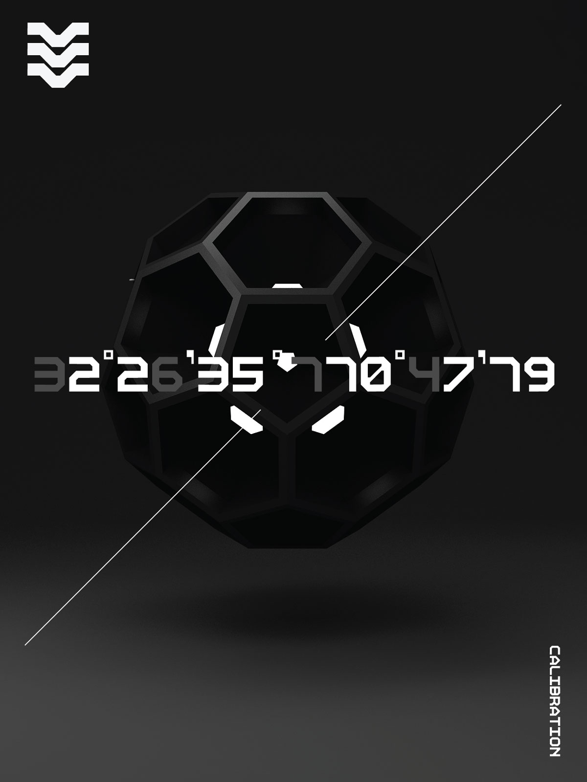
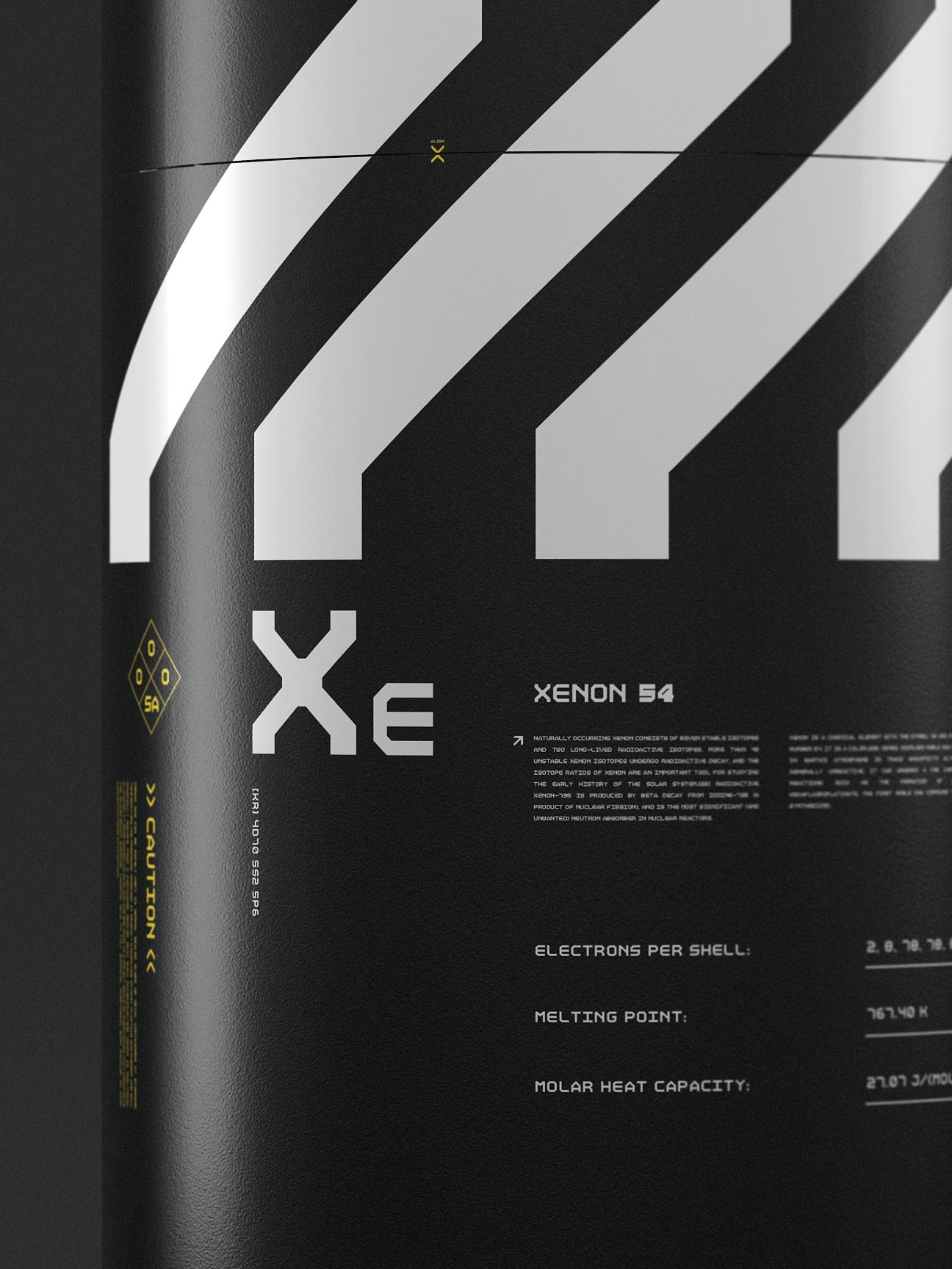
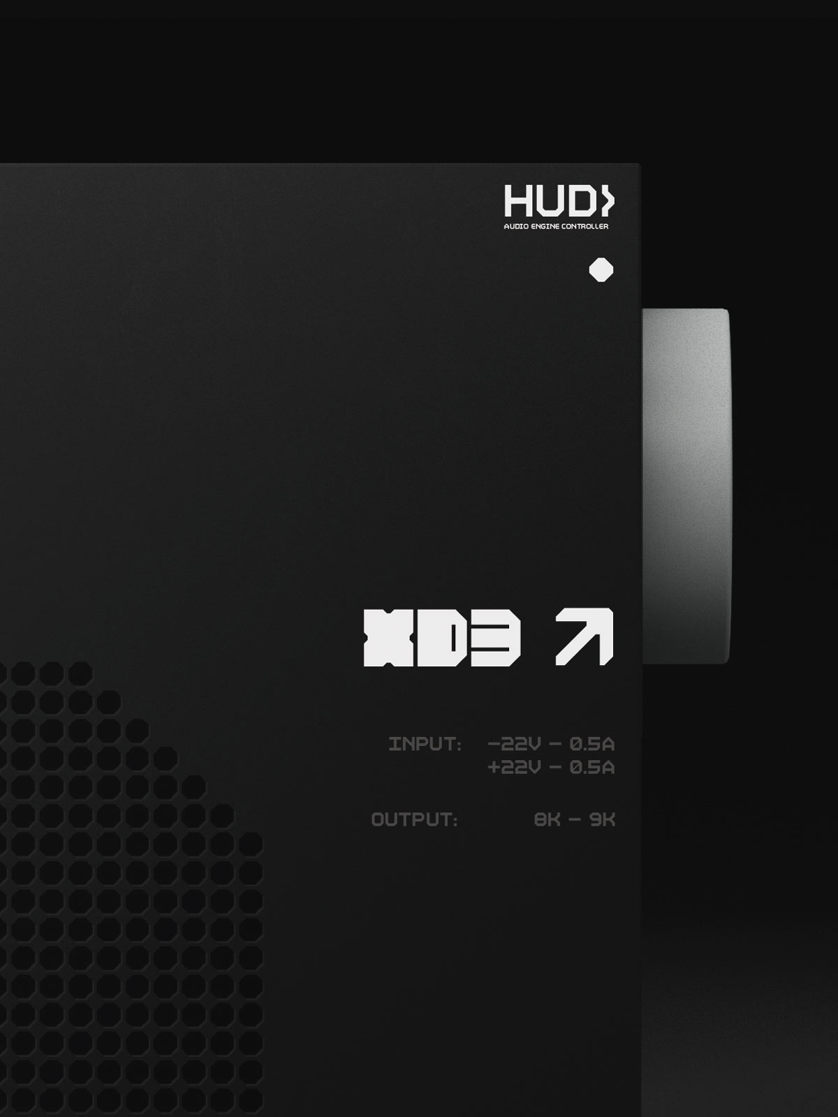
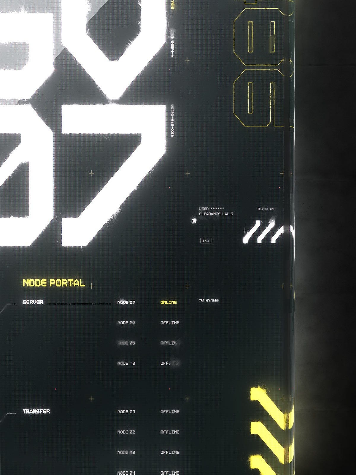
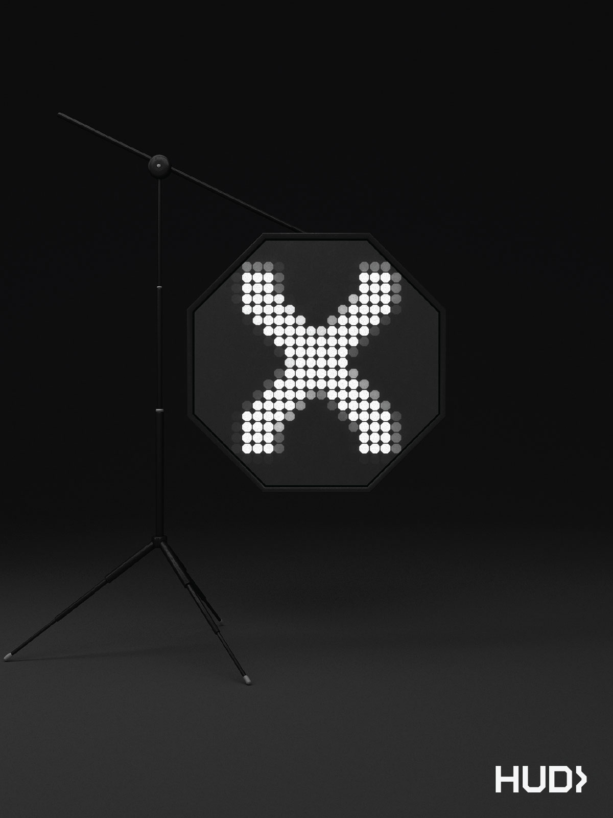
This project is an exploration into the minutiae of one such detail; a custom font family called HUD. Designed to be a geometric font that provides graphical structure in a composition, HUD is simple yet practical. The font offers variants that explore skinny, monospace, variable, and BOLD. HUD is fun with variety coming from a creative use of the variants and used whenever I need a tech-y geometric look.
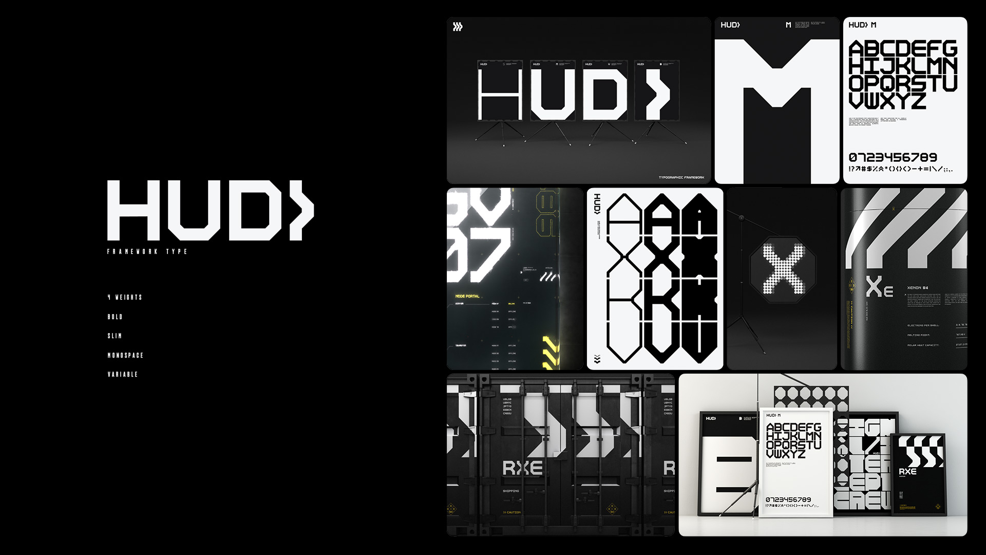
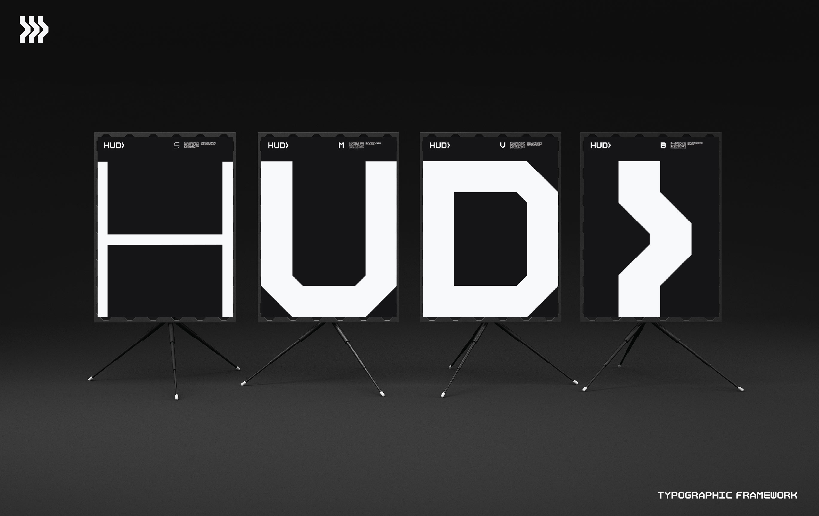
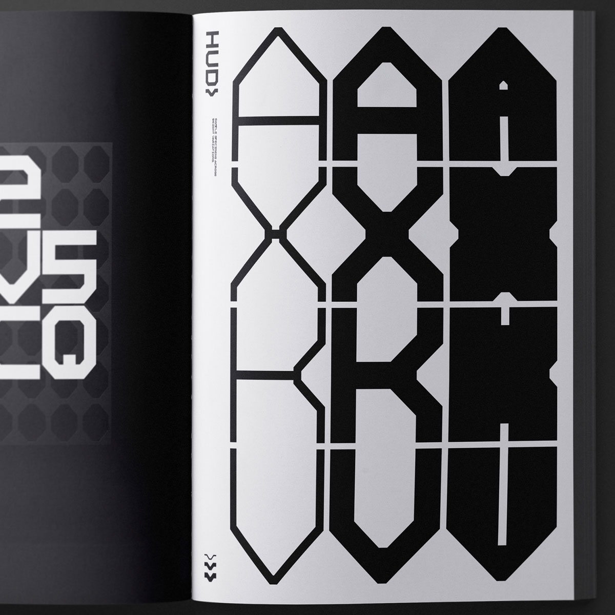
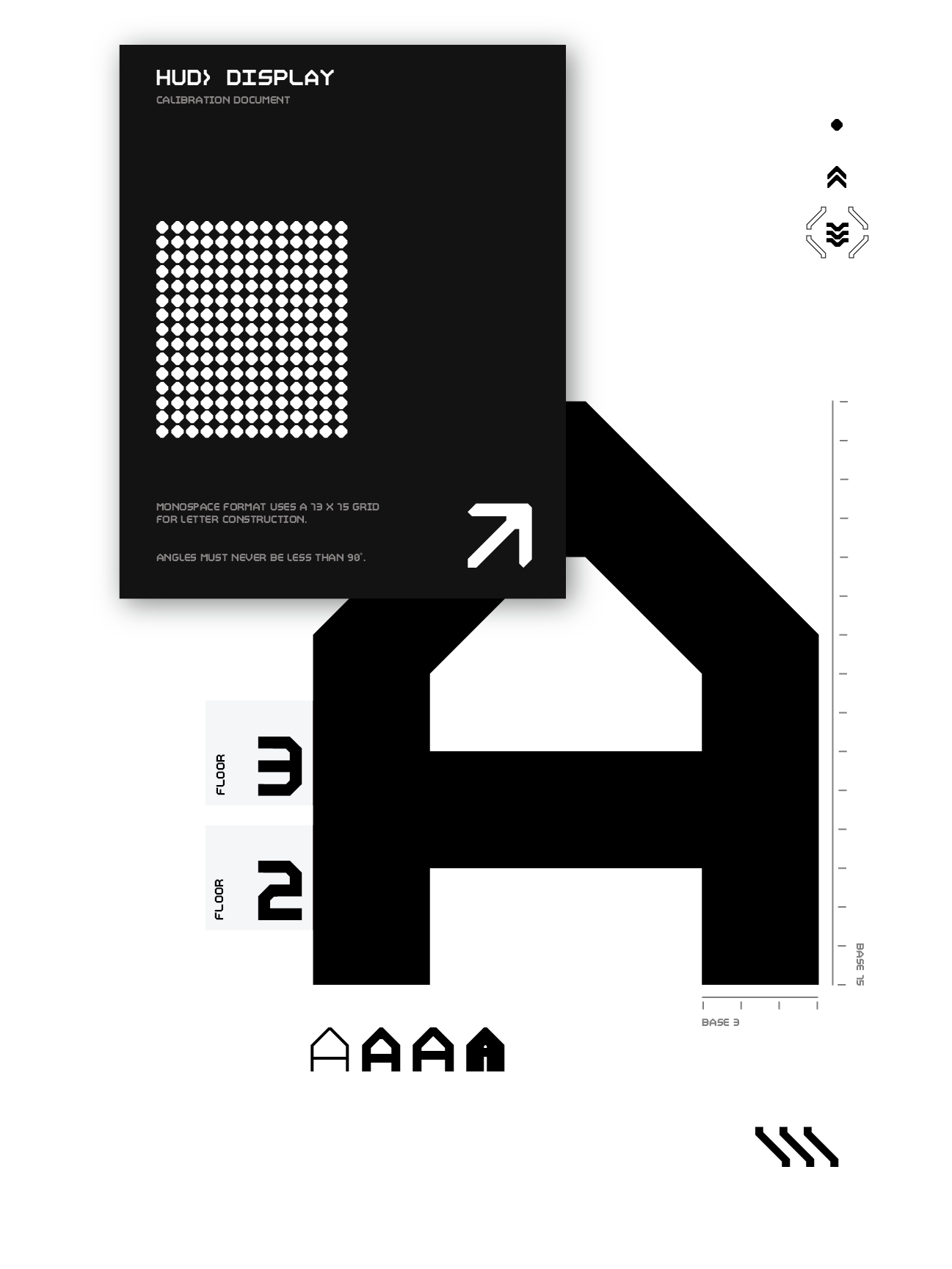
The rules are simple. Each character is created in a base grid of 13/15. Angles can not be less than 90 degrees to avoid sharp edges and all stems and crossbars need to match thickness. Variant "M" is the standard monospace version of the font and the cornerstone of all over variants in the family. The “B” variant becomes a deviant of “M” with its generous use of positive space. Variant “V” is a variable width version of “M” for those times when optical balancing becomes most important. Variant "S" is the skinny version for when you need those lines to be just... skinnier.