Forza Motorsport In-Game Graphics
Creative Direction
Designing Race Culture
Back in 2022, Turn 10 approached Royale enquiring about our abilities and interest in collaborating with them for in-game graphic development and animation for the next installment of their iconic racing series; “Forza Motorsport”. Turn 10 has been cranking these games out since the dawn of the original Xbox and with each installment, the realism is pushed beyond its limit setting the bar extremely high for all those other racing sim games.
The needs were all inclusive and touched just about every aspect of the game. From menu graphics to on-track fictional advertisement animations, we hit it all. All said and done we delivered well over 800 total deliverable design and animated assets. When you fire up that game, you won’t be able to miss the mark we left on this storied franchise installment.
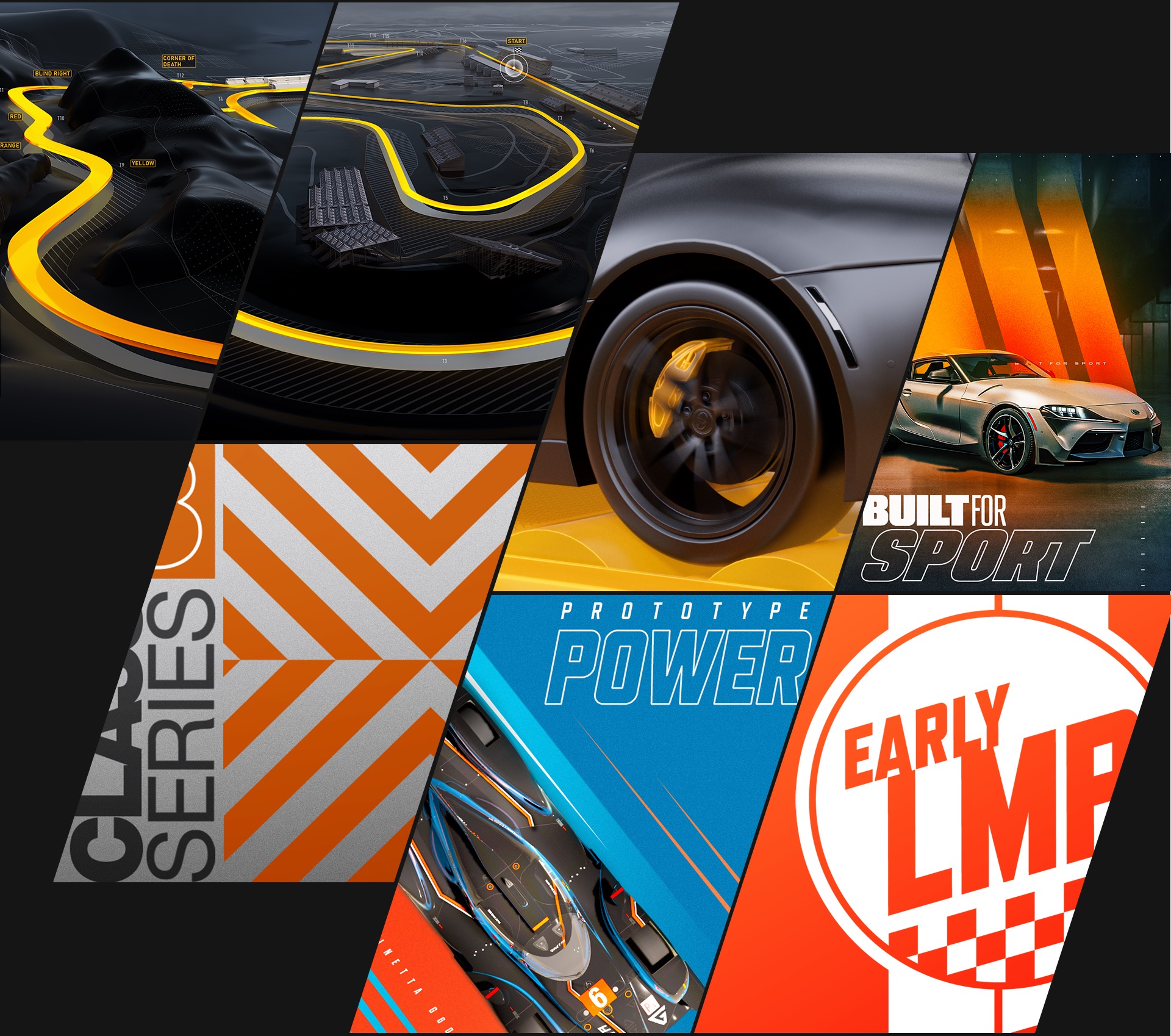

Race Posters
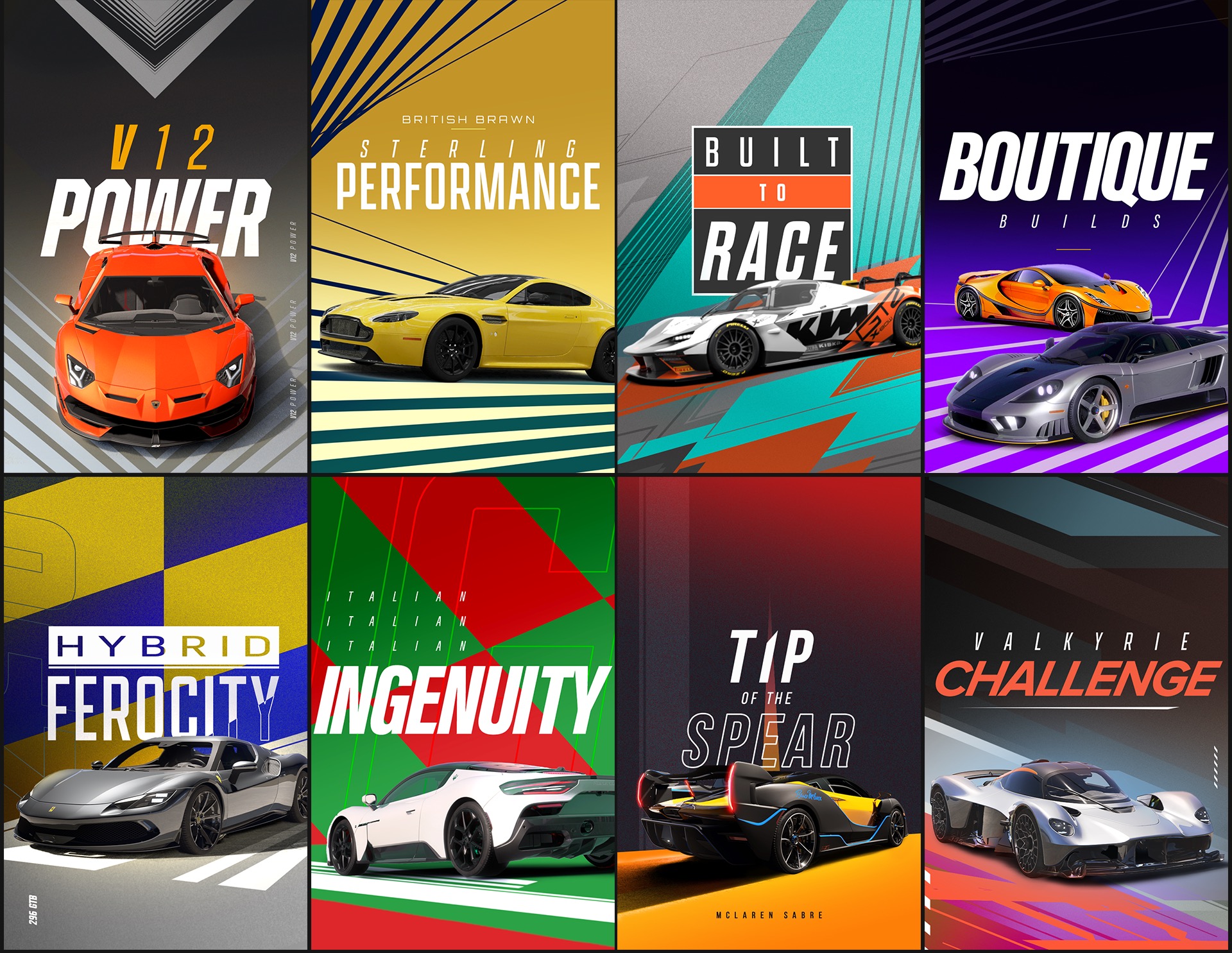
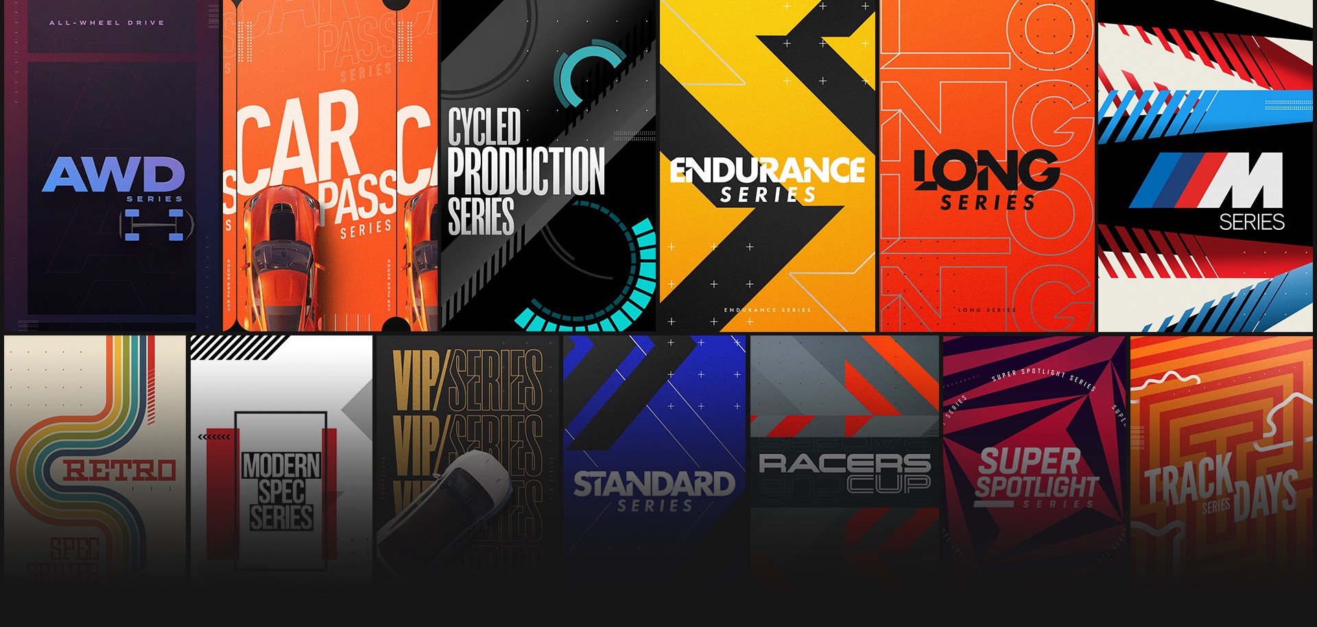
We first set out to come up with a graphic language that would allow for a wide variety of design styling but hold true to the Forza sensibilities and aesthetics. This approach was used to inform how our collection of graphic posters would adapt and flex for each individual event, group, tour, and race.
The posters were created in a variety of aspect ratios for use in different game modes and menus. These posters are designed to capture the sensibility of the tour names and give each a unique design language. There are a ton of these posters in the game reflecting just how many different types of racing events a player can take on.

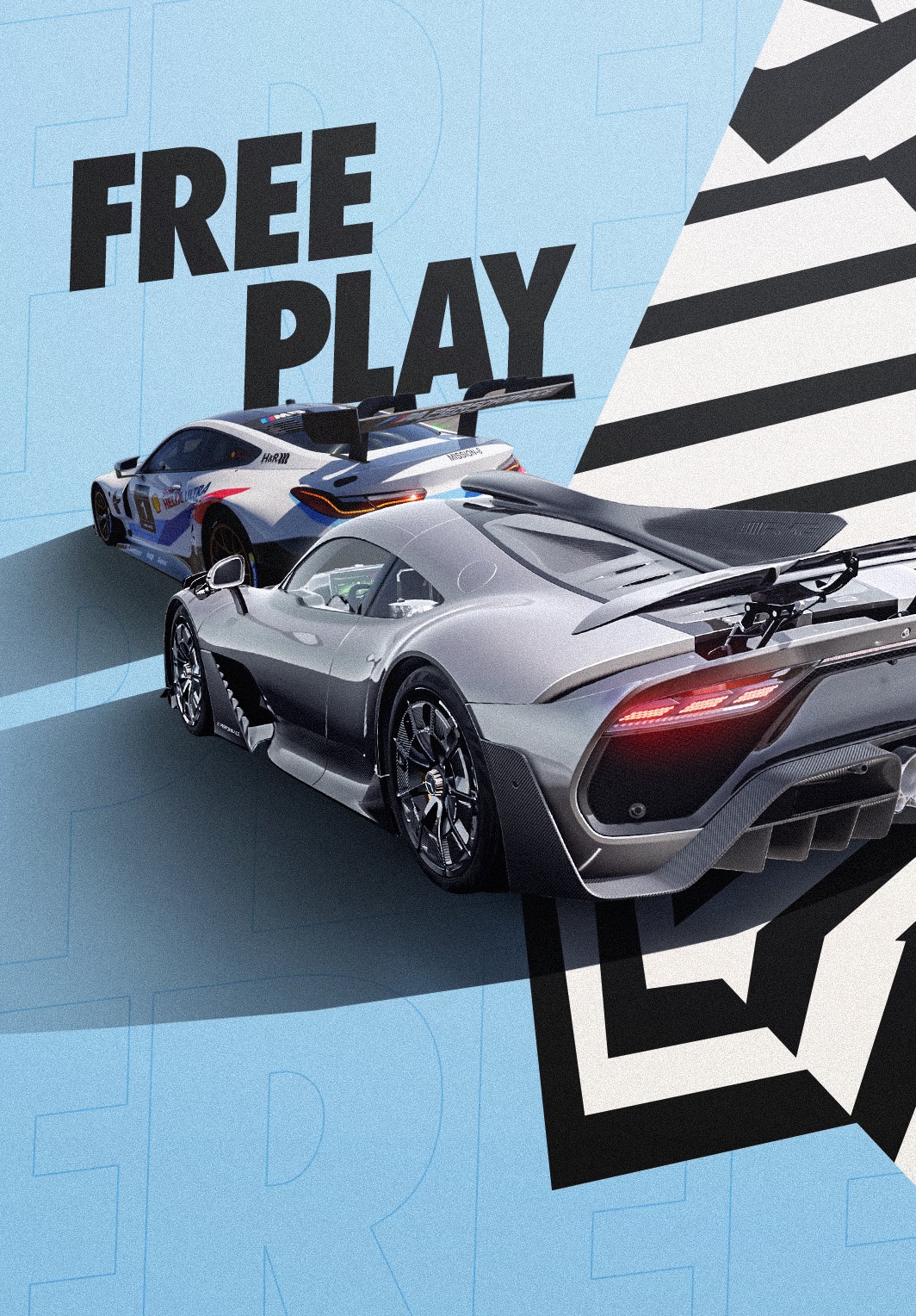

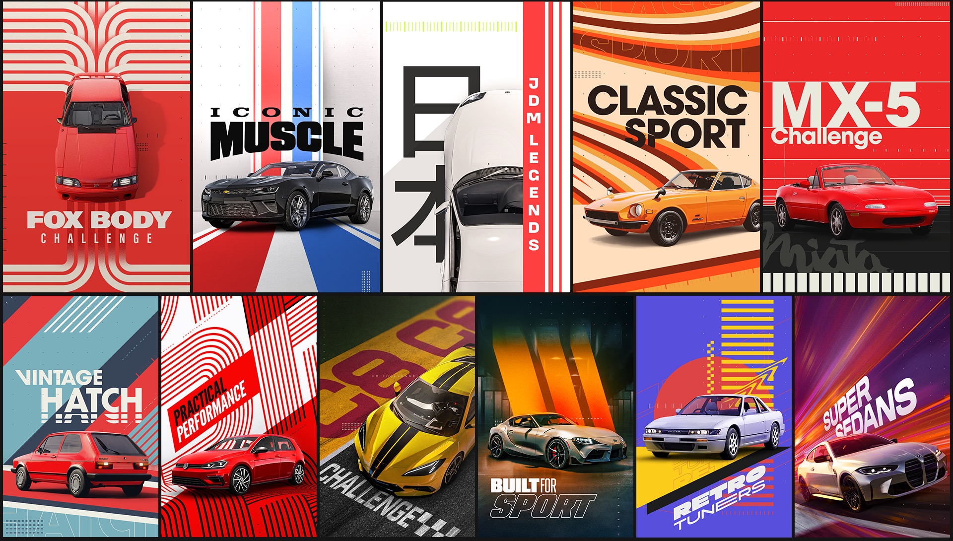
Some of our poster collections lean on the race theme for their inspiration in styling. While design languages for races like “Retro Tuners” is pretty obvious, others needed a little more exploration to land on just the right look. The process of design exploration was embraced by the team at Turn10 every step of the way making everything effortless in process.
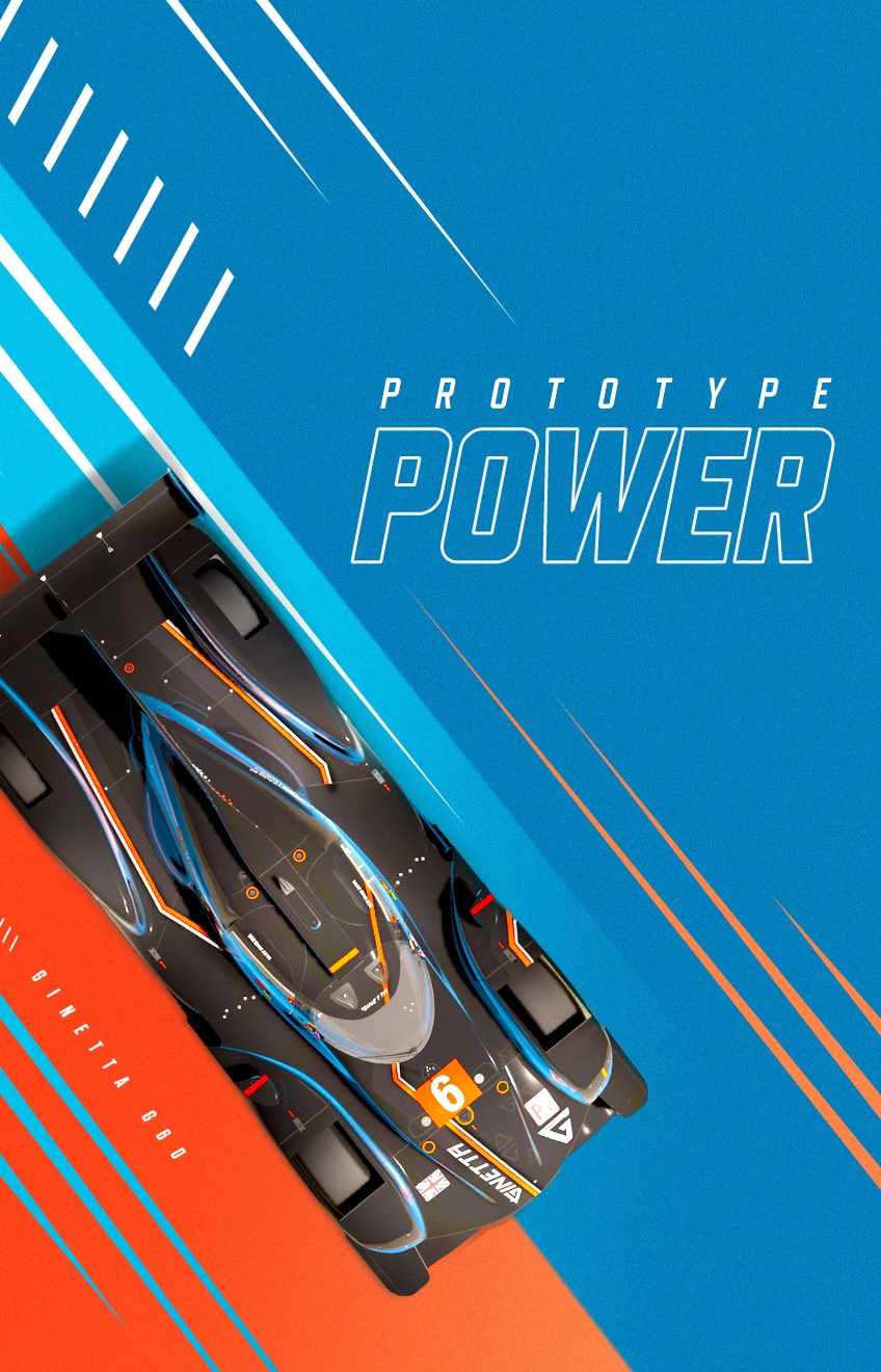



In Engine
One technical aspect of these posters is that each and every car featured on the poster is a captured render from the game. Our process to create the hundreds of unique designs was to mock up an angle and car type then head into the developer build of the game and match the camera angle, lens, lighting, and car for the final render to be placed in the artwork. We hosted a Forza development box in our offices where our design staff was able to hop on and grab new renders when new designs came down the pipeline.
High Gloss
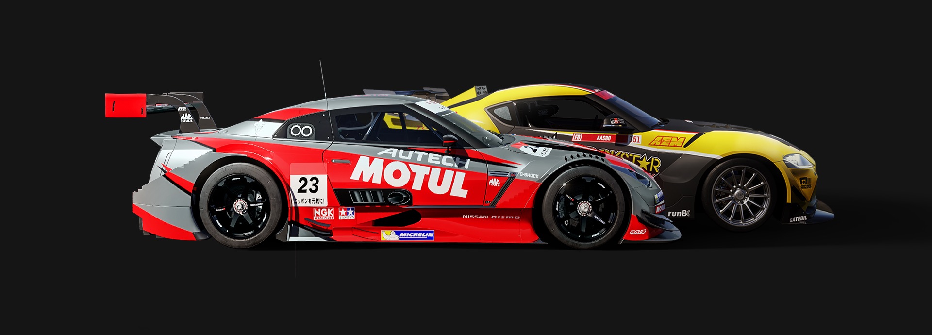
Not content with just static posters, we were also tasked to bring a bunch to life in looping animations that would be used in-game. For these specific requests, our animation team interpreted the designs into unique motion pieces that would look great reflected on the car bodies. These moments in game would be focused on the car, up close, as the animation is reflected over them like those glassy car commercials we’ve all seen.
To achieve this, we created each animation specifically tailored to get the best high-contrast reflections possible. We had our own setup to test and find moments where this would play better than others. Making these custom animations work for both the shinny car bodies and on their own gave our design and motion teams plenty to figure out.

Track Maps
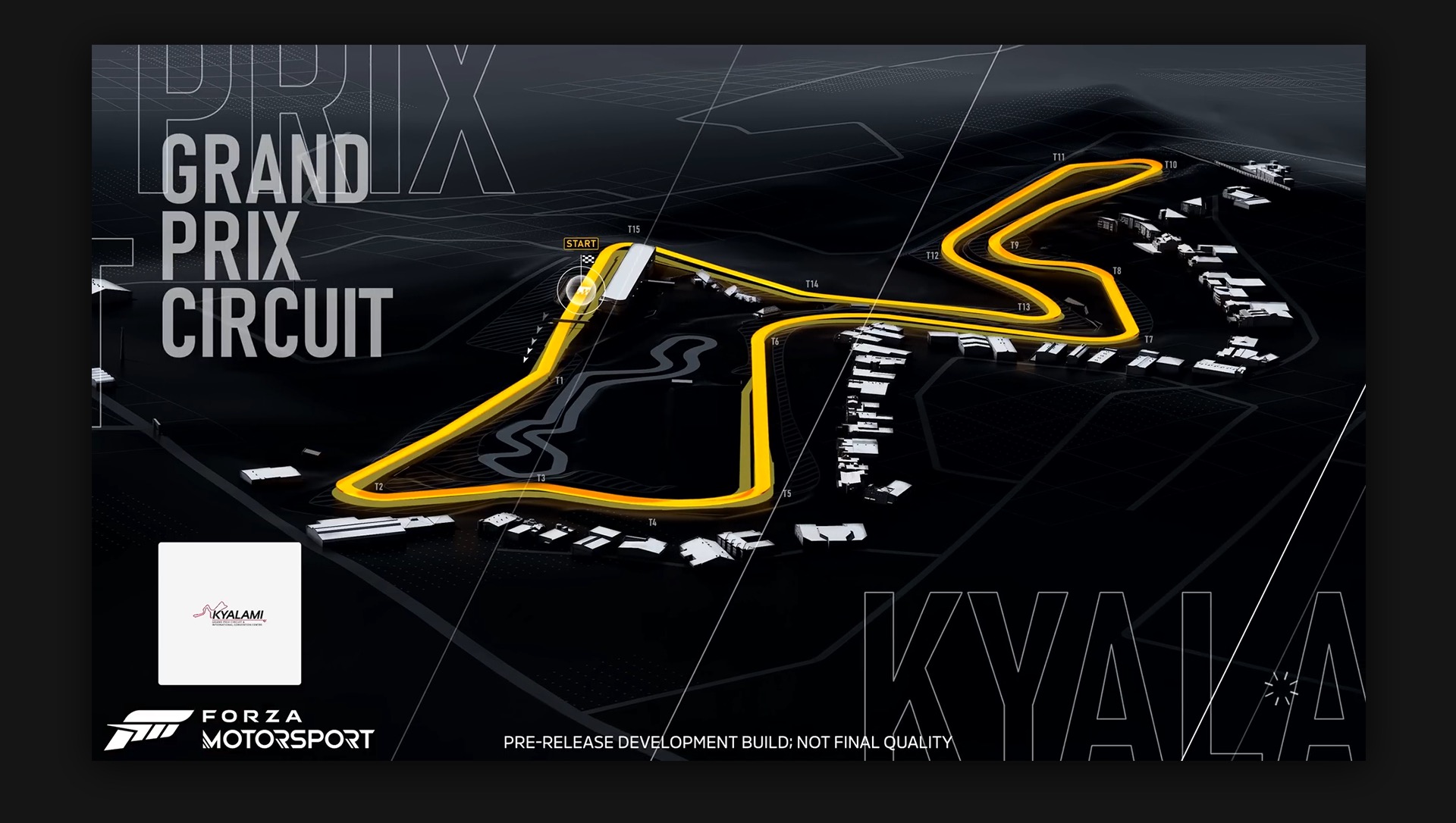
When a player is ready to hit the pavement, the chosen race will load up with a graphic track map. Various angles are displayed while the game loads giving players a look at their upcoming race and any details they should be aware of. These maps were created to highlight the chosen ribbon and give the player some contextual information with a unique graphic style.
Complimenting the rest of the game’s design language, these graphic maps let the ribbon come forward with a vibrant gold tone matching the menu styling. Each track was taken from the game and rendered into a graphic style bringing all of the focus to the gold ribbon with the backdrop of the graphic buildings and terrain setting the overall stage.

Tune It Up
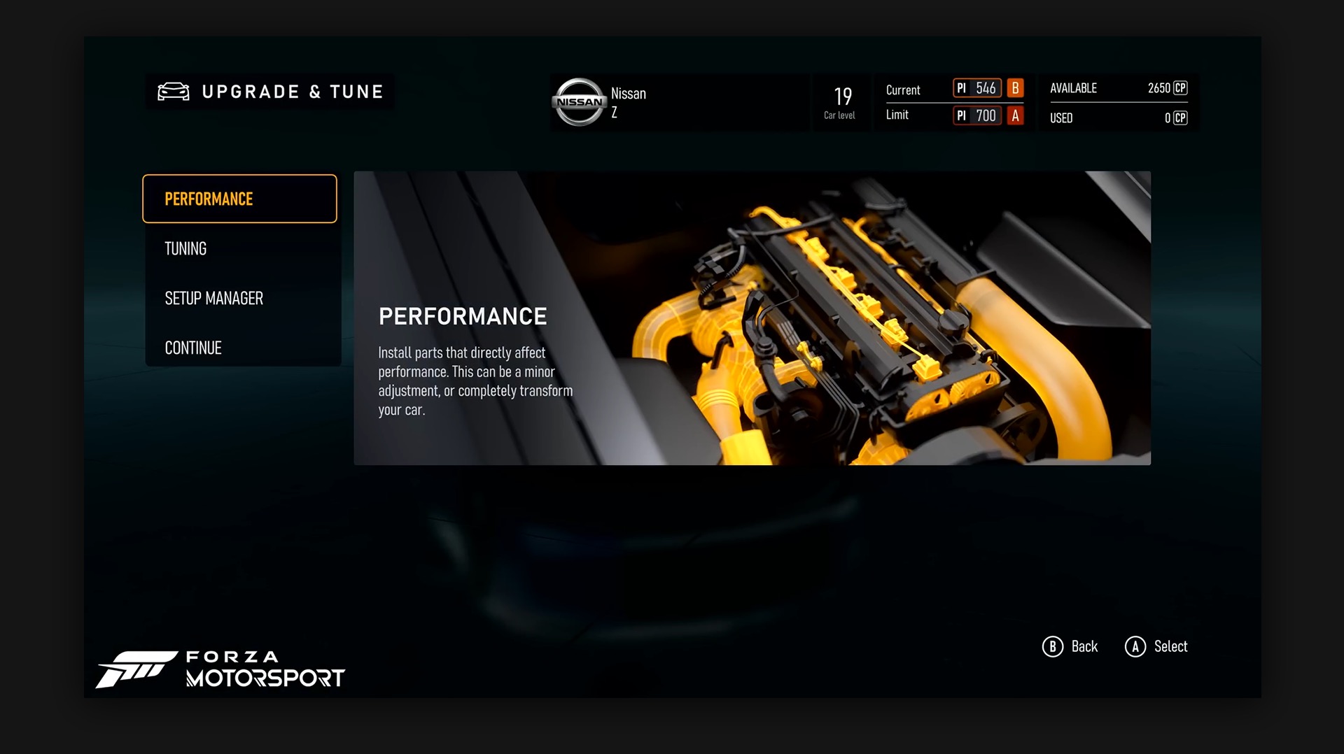
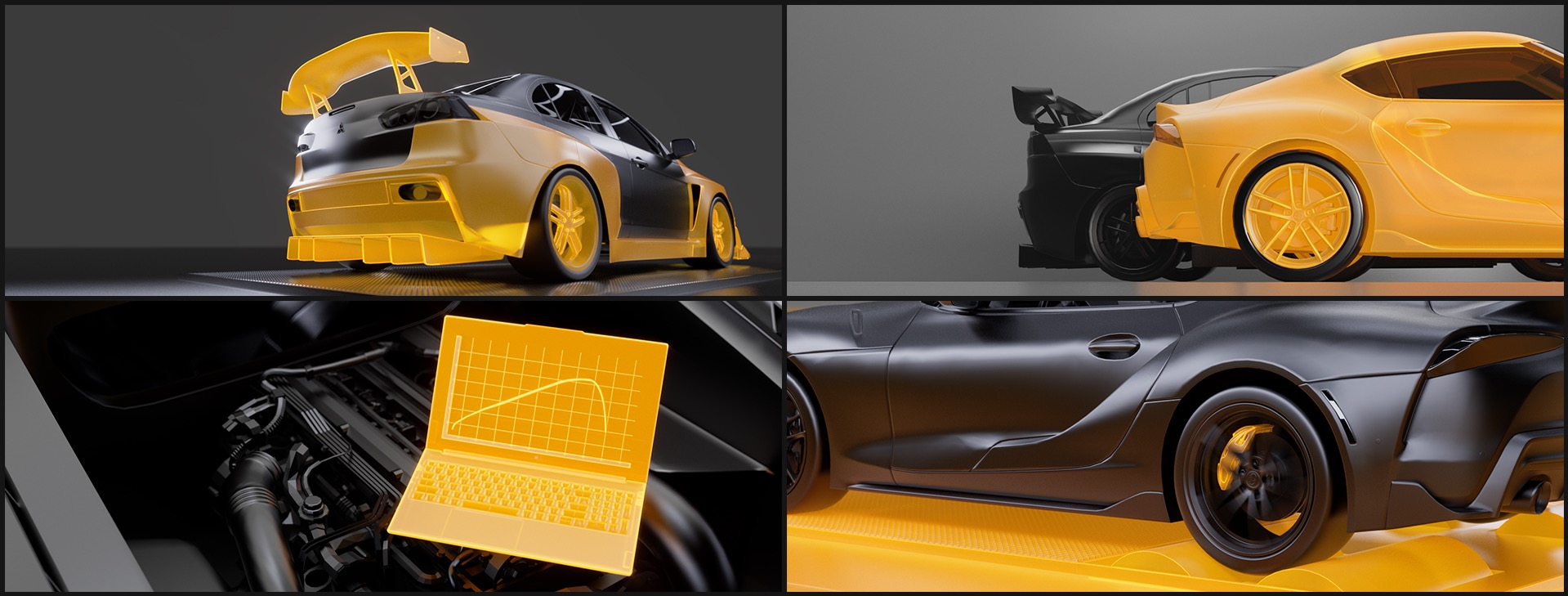
Diving deep into race culture, tuning becomes a science where decimal points will define a win from a loss. A player has an incredible amount of options to tune their performance beast for the best track time possible. Each section is highlighted in a graphic rendered style echoing the games overall style.
These vignettes are focused on each section a player can explore. The cars, engines, and parts are straight from the game and modified into the black and gold style. This global design language becomes a high-level staple of the game’s visual look and feel out the menu experience.

Part Swapping
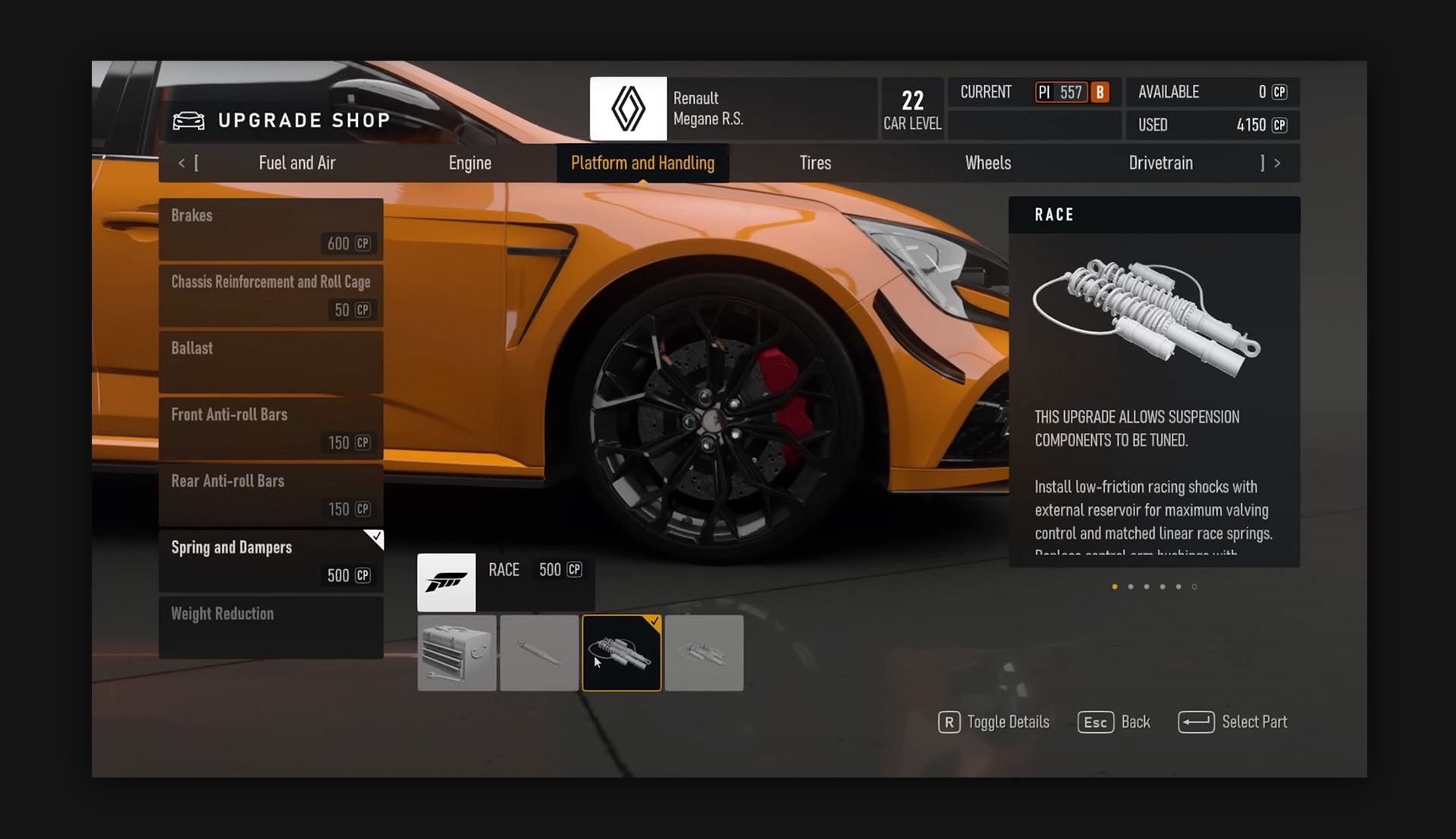
Anyone invested in race culture and who takes advantage of every single feature of Forza will want to geek out on every part in their car to swap them out and tune it up. We’ve got them covered with a whole library of car parts in various stages of upgrades. In Forza, players are able to get in and swap out parts like their drivetrain, intake, and aero.
We set up a complex system for rendering out these elements. Since each had upgrade stages, we knew consistency was going to be key. Over 300 individual parts were rendered for the kit ranging from nuts and bolts all the way up to full engines. Each part is critical for the player and we wanted to make sure they were treated as such.
Top It Off
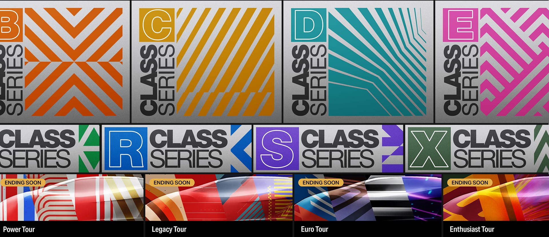
And just when you thought we had covered it all, we’ve got more… So much more. The visual vernacular of Forza Motorsport is incredibly rich with layers of design styling each with their own unique voice. Class series graphics, tour buttons, and many, many logo’s.
The game needed a complete kit of graphical elements that let it flex and give the player plenty of room for growth. As they get through all of the circuits, we wanted to make sure the visuals became a reward of their own.

Finish Line
All said and done, well over 800 graphics and animations were delivered for this incredibly rich racing sim. Working along-side the team at Turn 10 to help bring our graphical pov to their beautiful game was an amazing experience and we hope it adds a unique layer of design to an already loaded game.
