Call of Duty League
Creative Direction
The ultimate league grows with the legendary game.
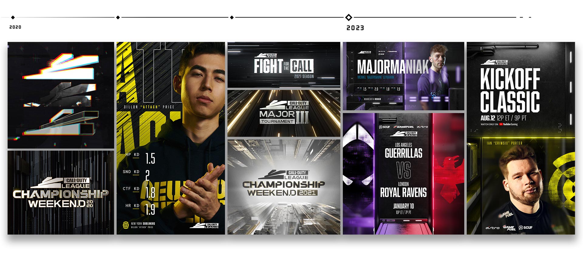
Three years ago, we took on the monumental challenge of rebranding and reimagining the Call of Duty Esport league, or CDL, for short. As we head into the 4th year of this refreshed competitive franchise, we’ve been honored to reprise our role working closely with the team at Activision Blizzard to help usher the league into a new era that boasts a new broadcast kit with a release date in sync with the launch of the latest title in the franchise: Call of Duty II.
Growing the visual identity of a brand is an exercise in consistency and expansion. We look for the narrative journey in design and aesthetics that push a brand beyond expectations and take it to the next level. As we bring this same thinking to broadcast kits, we dive deep into the very core of what broadcast sports is and can become.
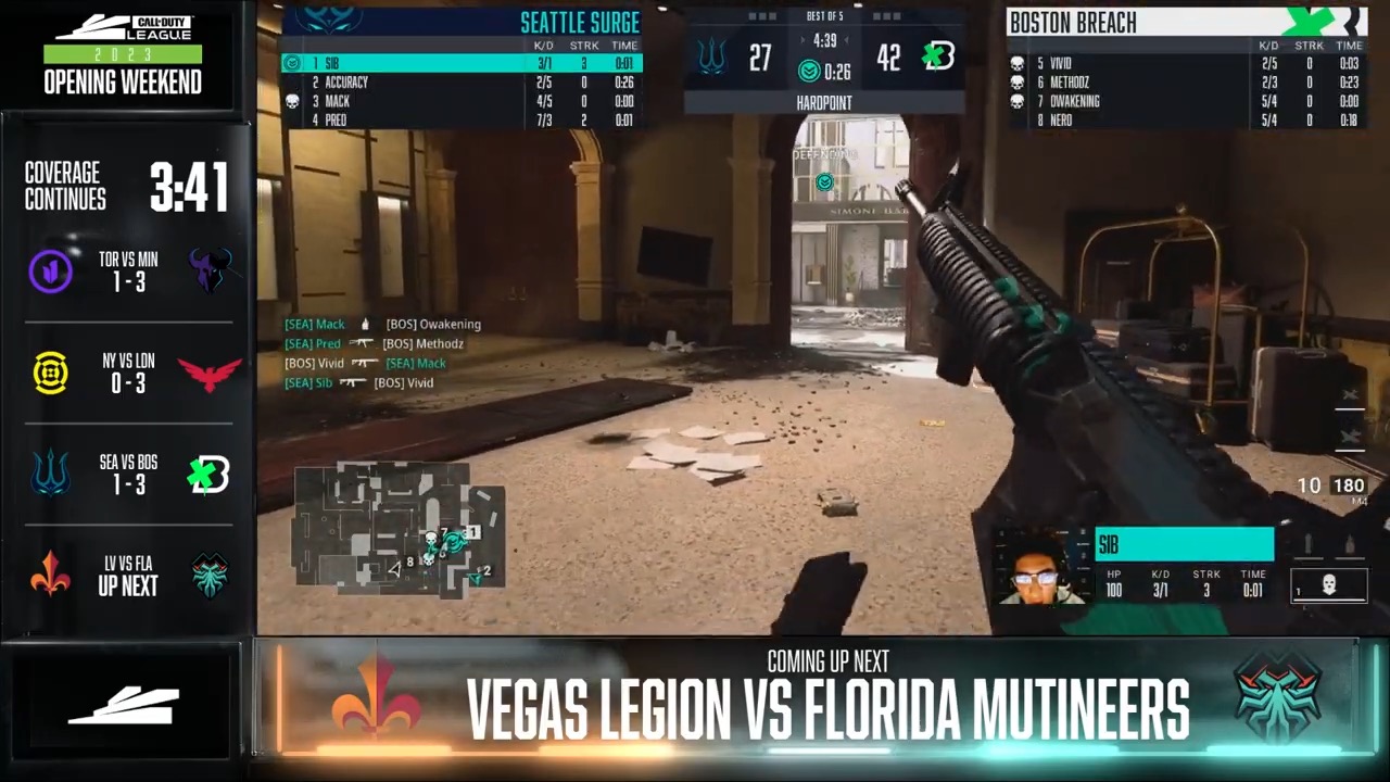
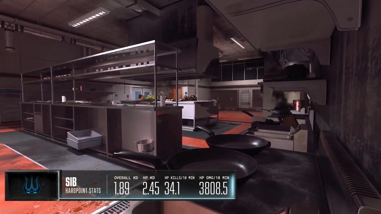
For the 2023 CDL season, we were tasked to come up with a new broadcast look that would both embody the CDL spirit and push it closer into alignment with the latest installment in the MWII franchise. Visually, we wanted the kit to be more tangible, more aggressive. We want to smell the oil and feel the weight. This tone carried us into a new language that can be paired against the game while also providing plenty of flexibility and ownership within the CDL world.
Creatively, we also wanted to explore a toolkit that would expand with the league and offer up some unique opportunities as the year progresses. Much of this still can’t be discussed but rest assured, the opportunity for growth and engagement within the toolkit has been primed. We’re talking about completely unique opportunities to engage fans and thread the needle between sport and franchise. You’ll just have to watch to find out where they go next.
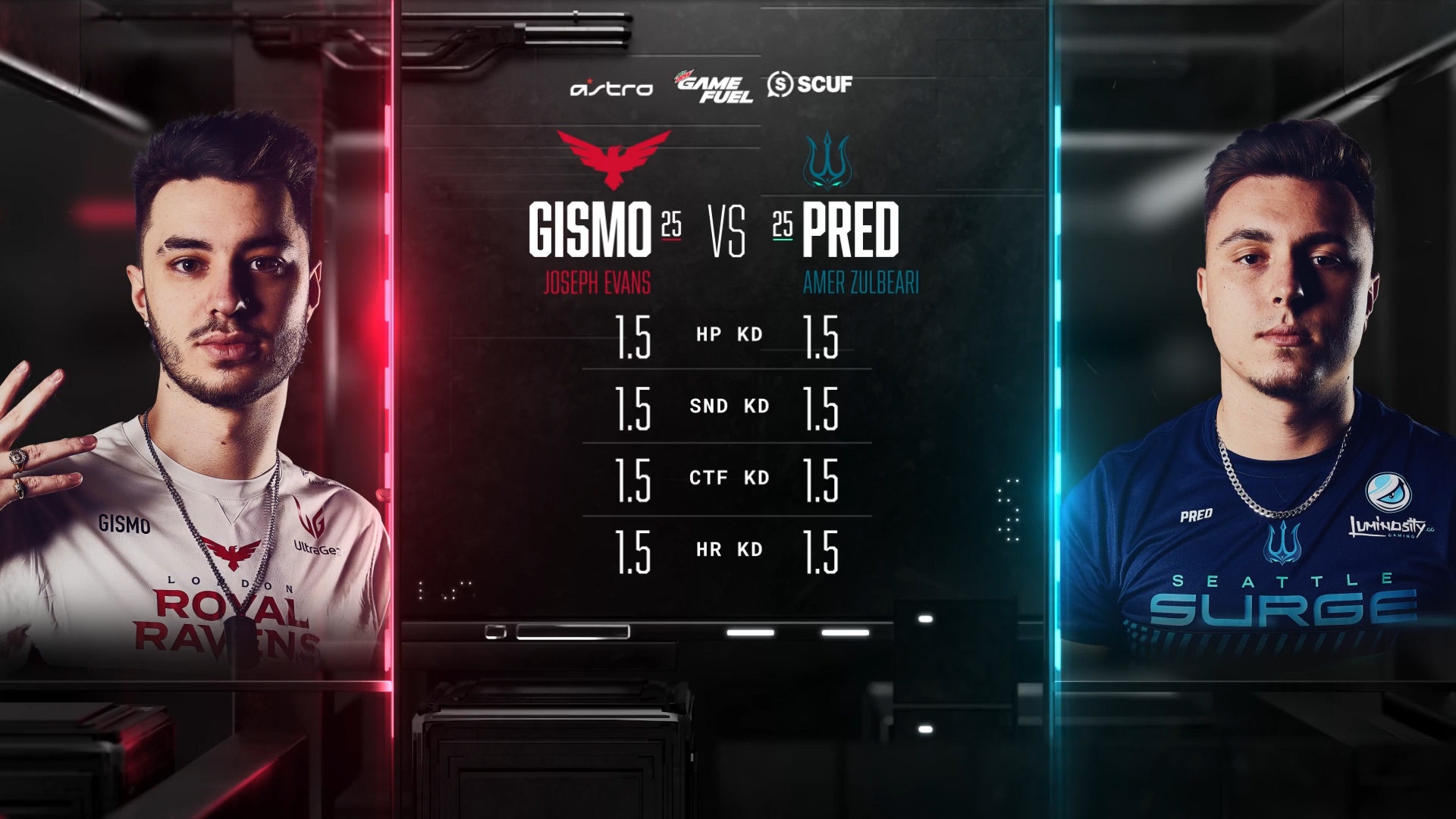
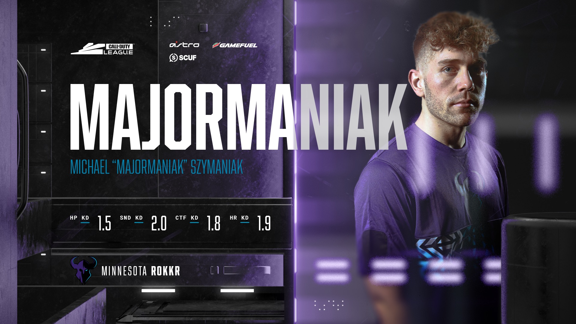

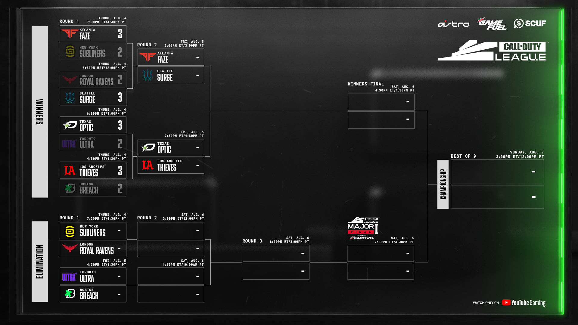
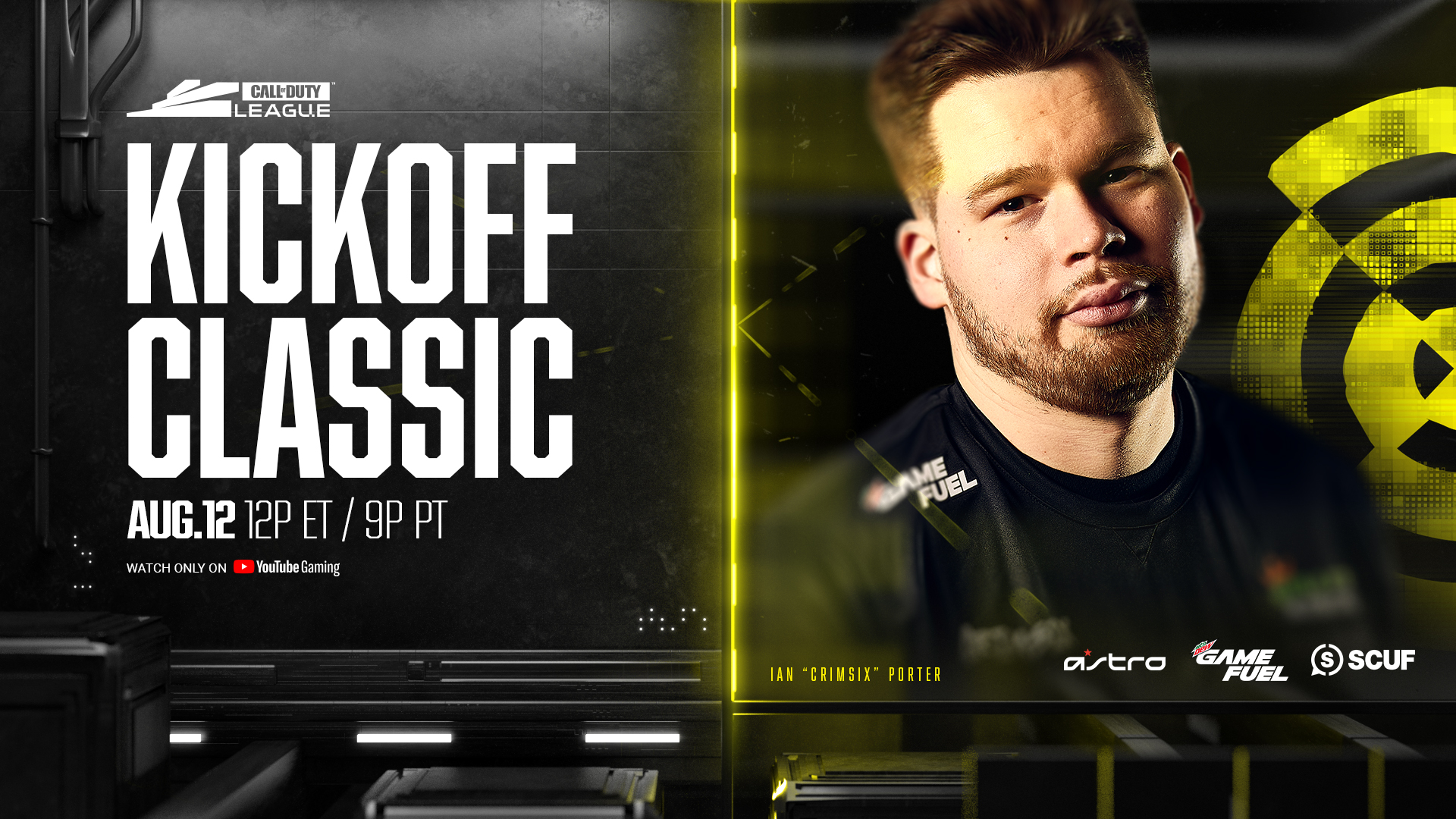
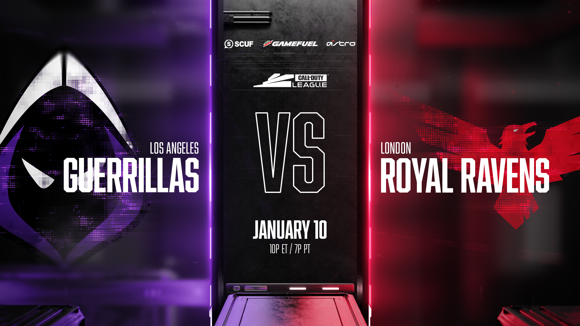
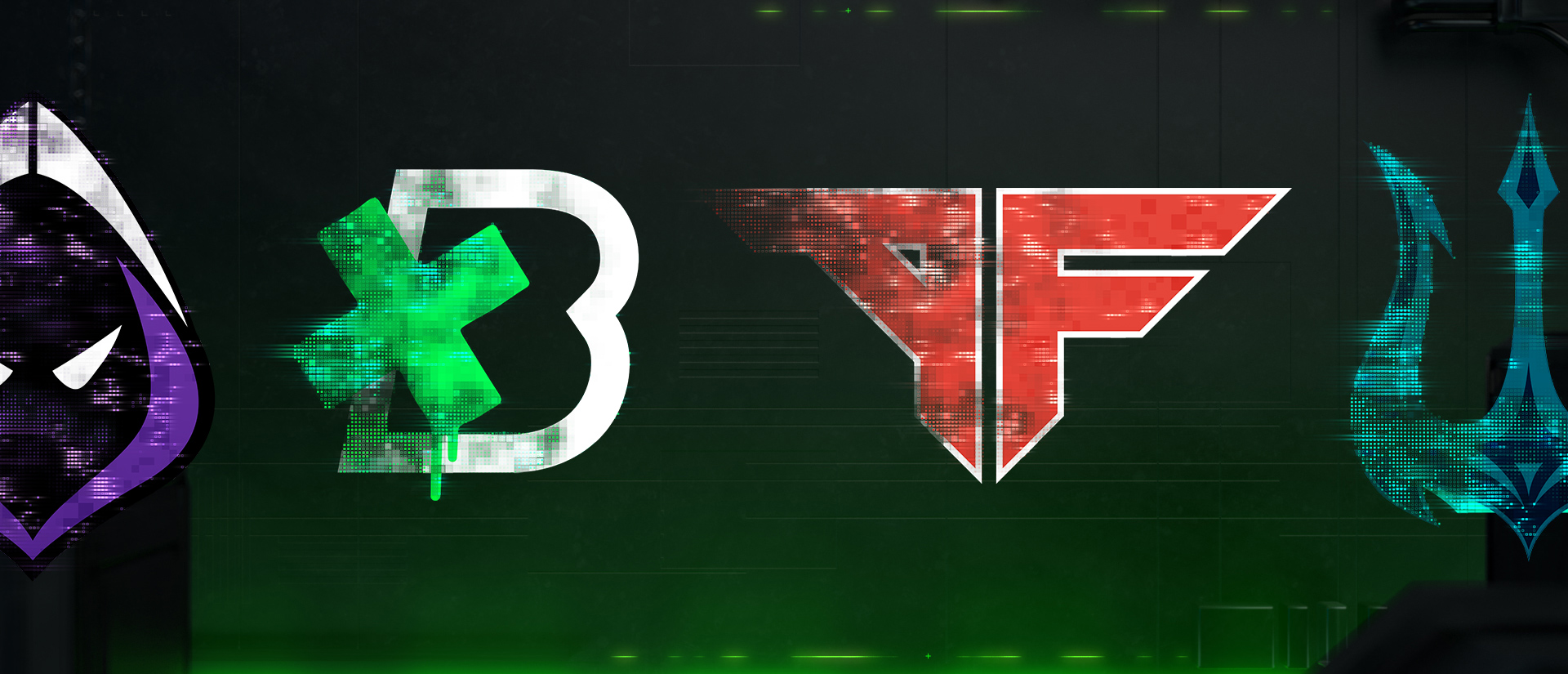
We’ve been building on the legacy of CDL each and every year with a kit that grows along with the league and game. The visual vernacular evolves and builds upon itself to reveal a narrative arc as the season progresses towards Champs. As teams within the league evolve we wanted to reflect this transitional state with a graphic motif for each team logo. We used a digital decimation process to degrade each logo in their own unique way.
