ATK
Custom Font Design
A design system created as an evolving type kit.
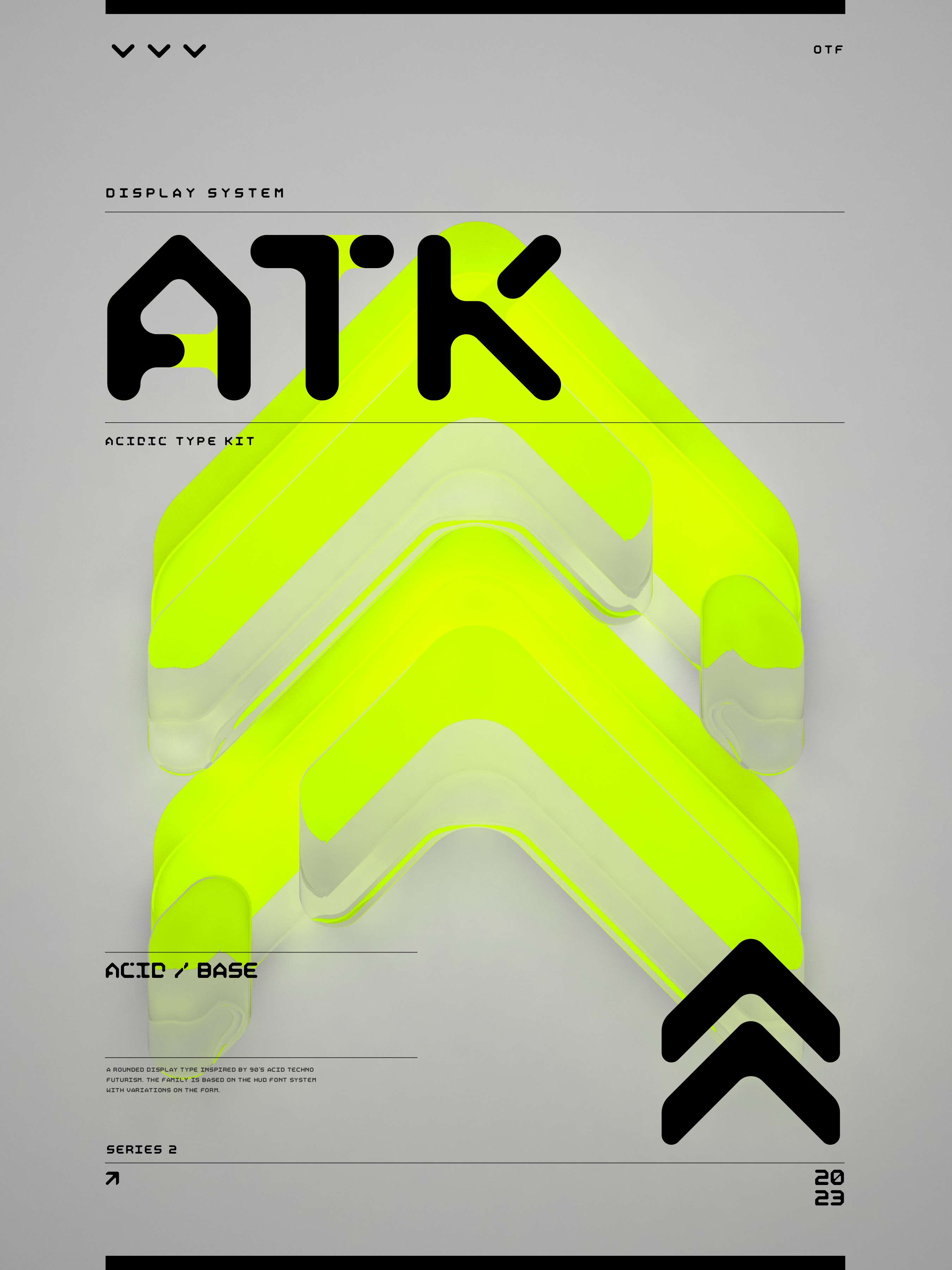
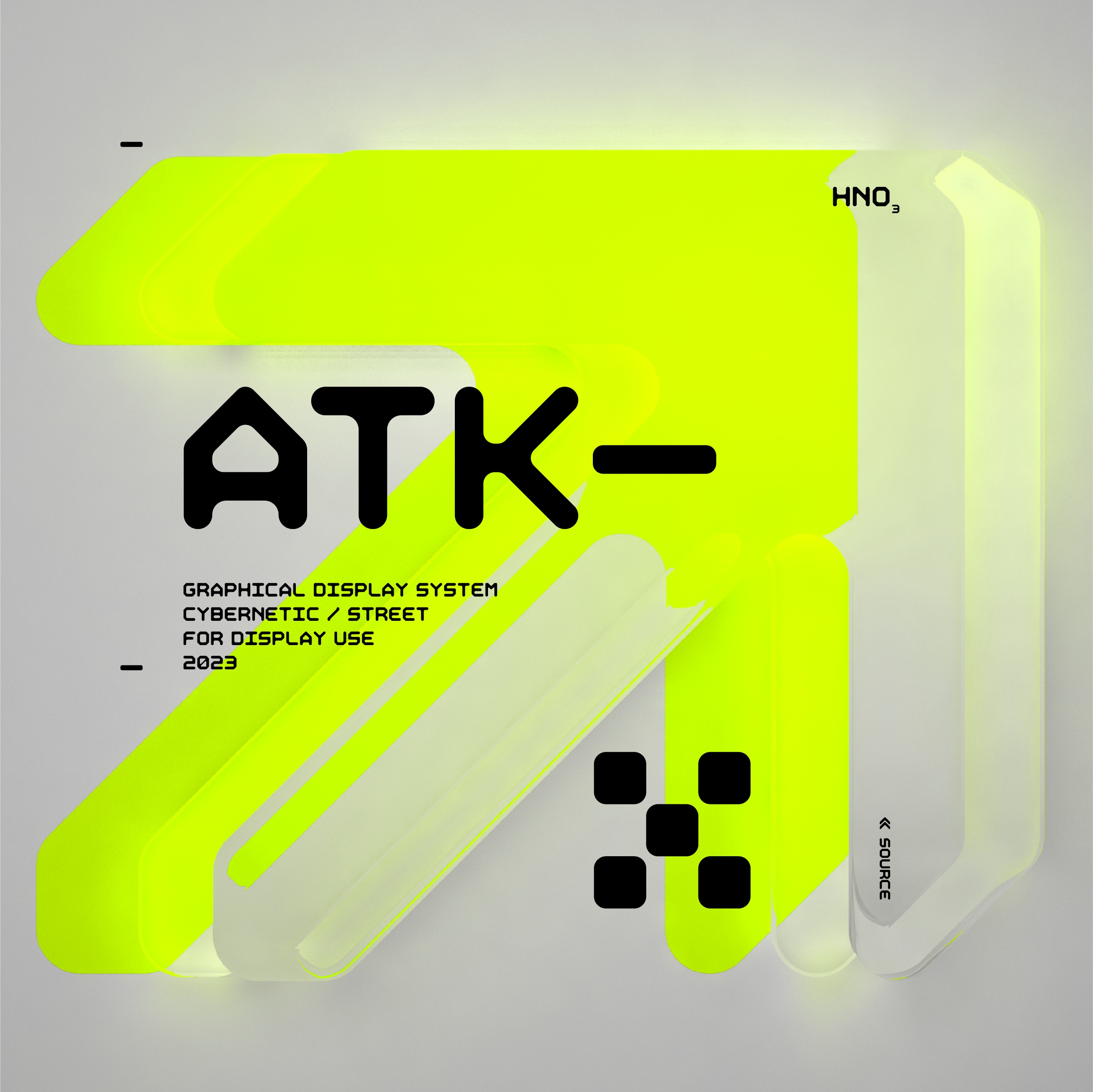
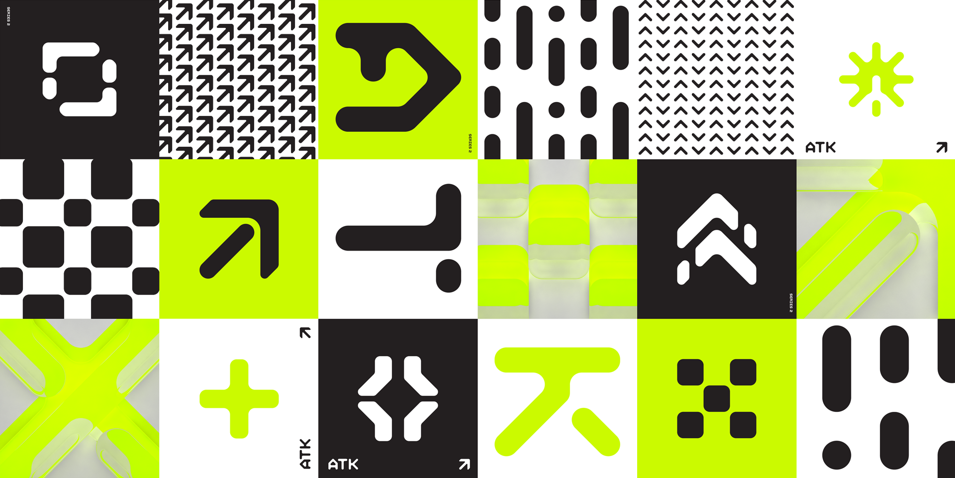
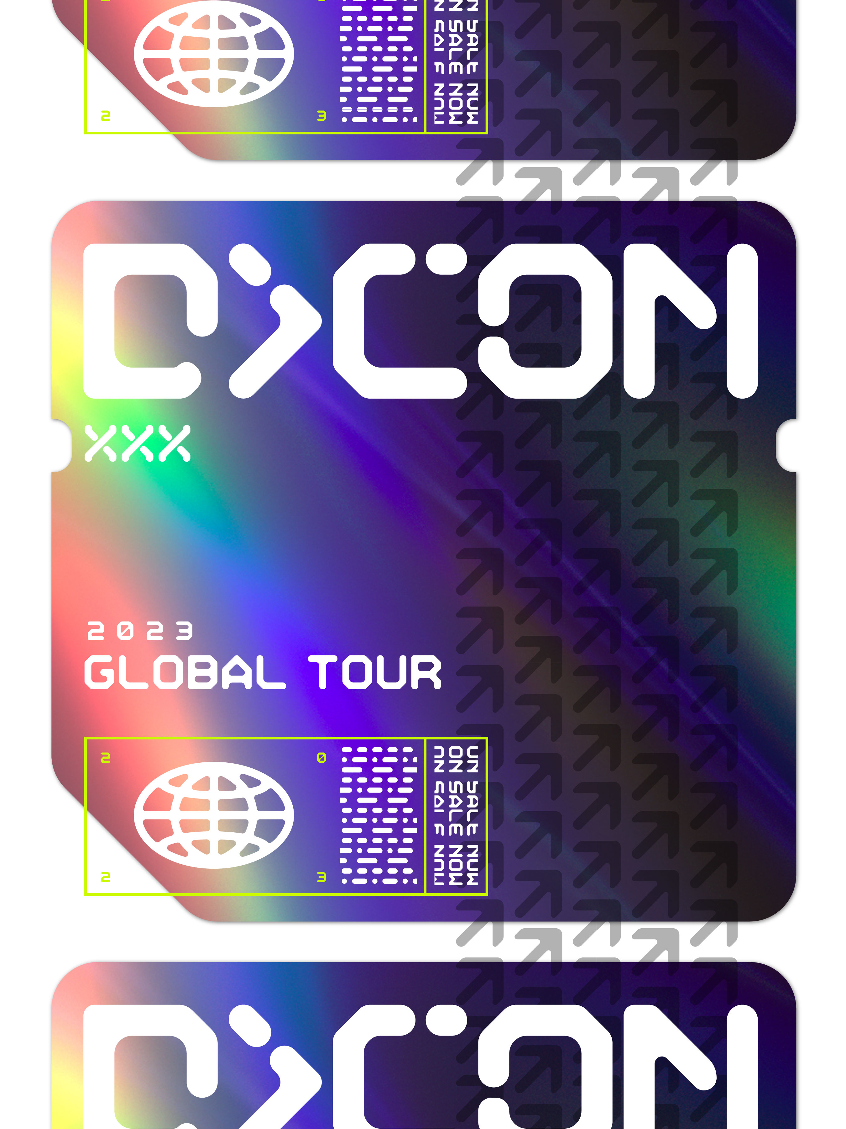
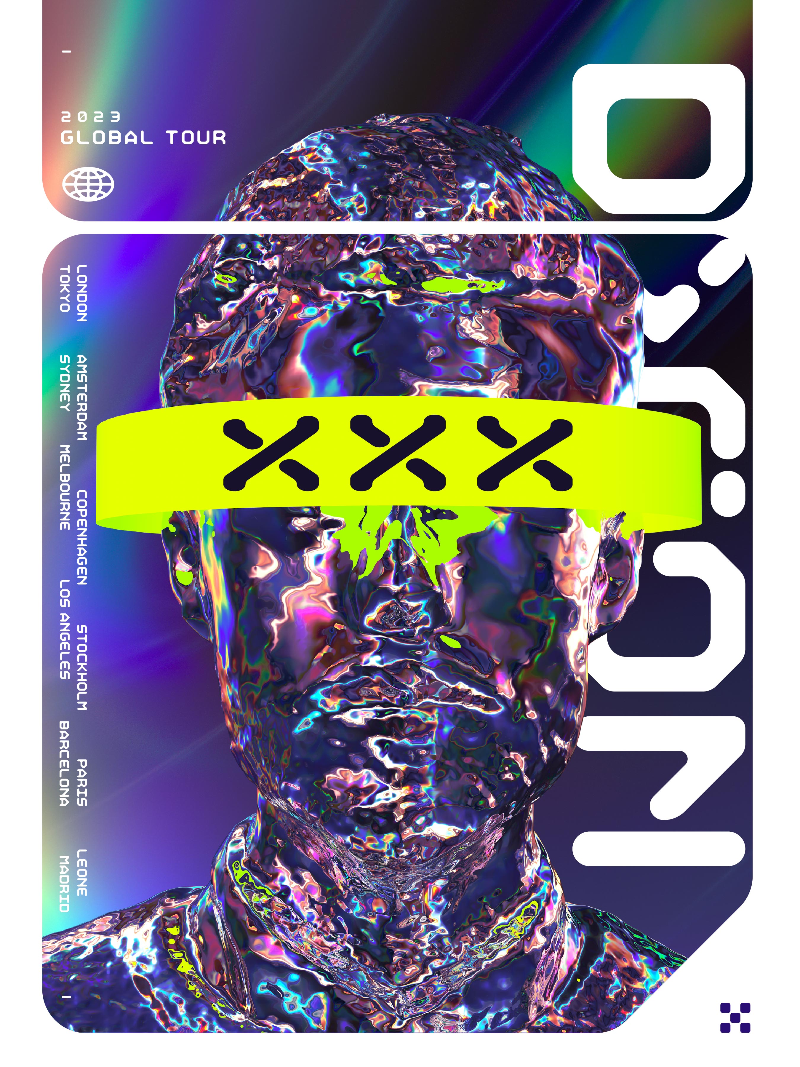
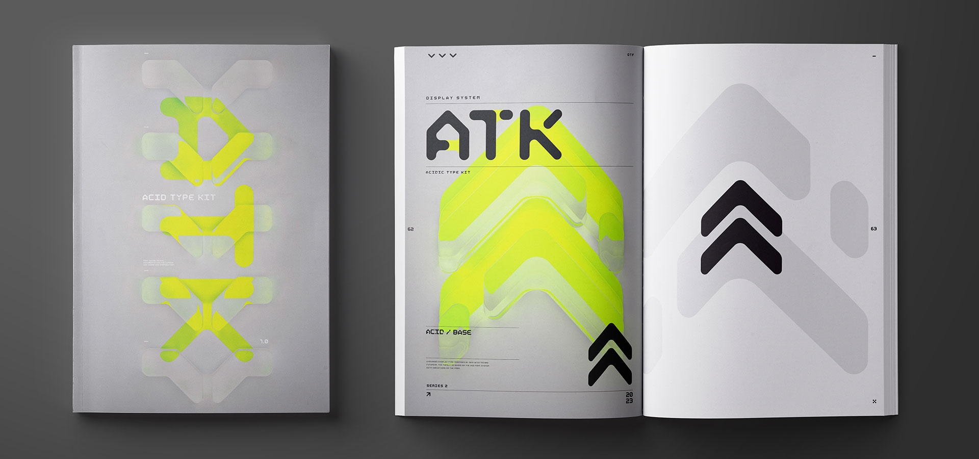
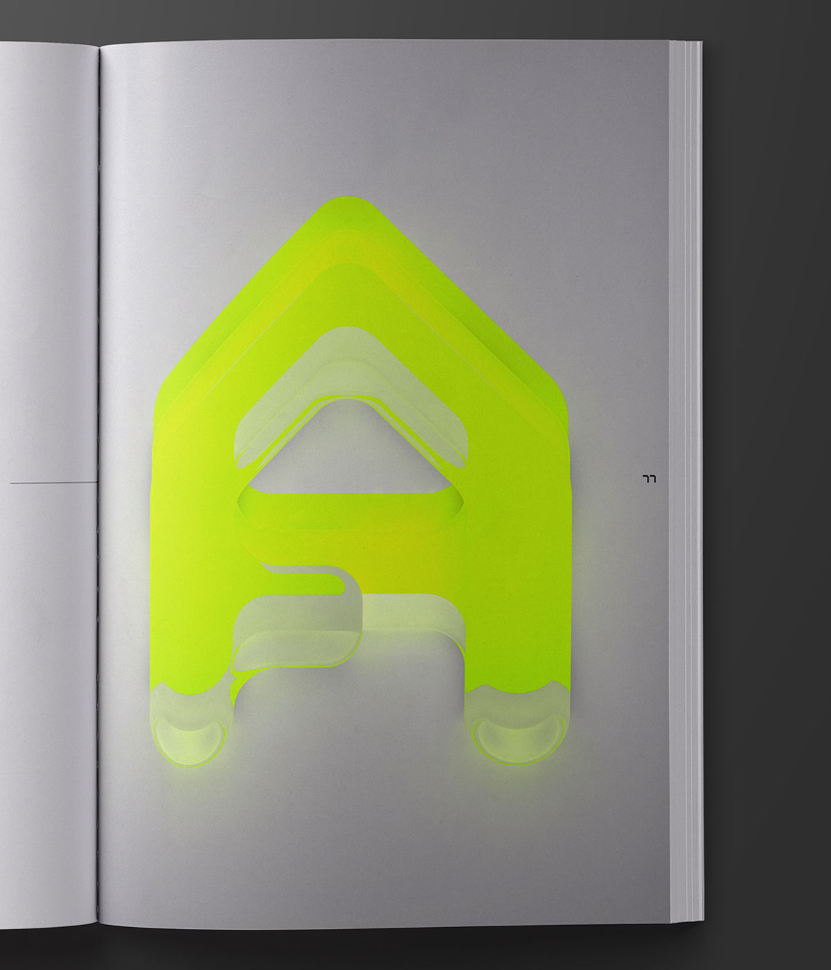
ATK stands for Acid Type Kit to which the entire font is thematically based. As an evolution of the HUD font, ATK grew out of a truly utilitarian mindset and became much more of a designer’s font with two key weights that can be used in conjunction to create endless variability and visual interest. As a kit, it’s rather simple, but in practice the font inspires a whole new use for typography in everyday design.
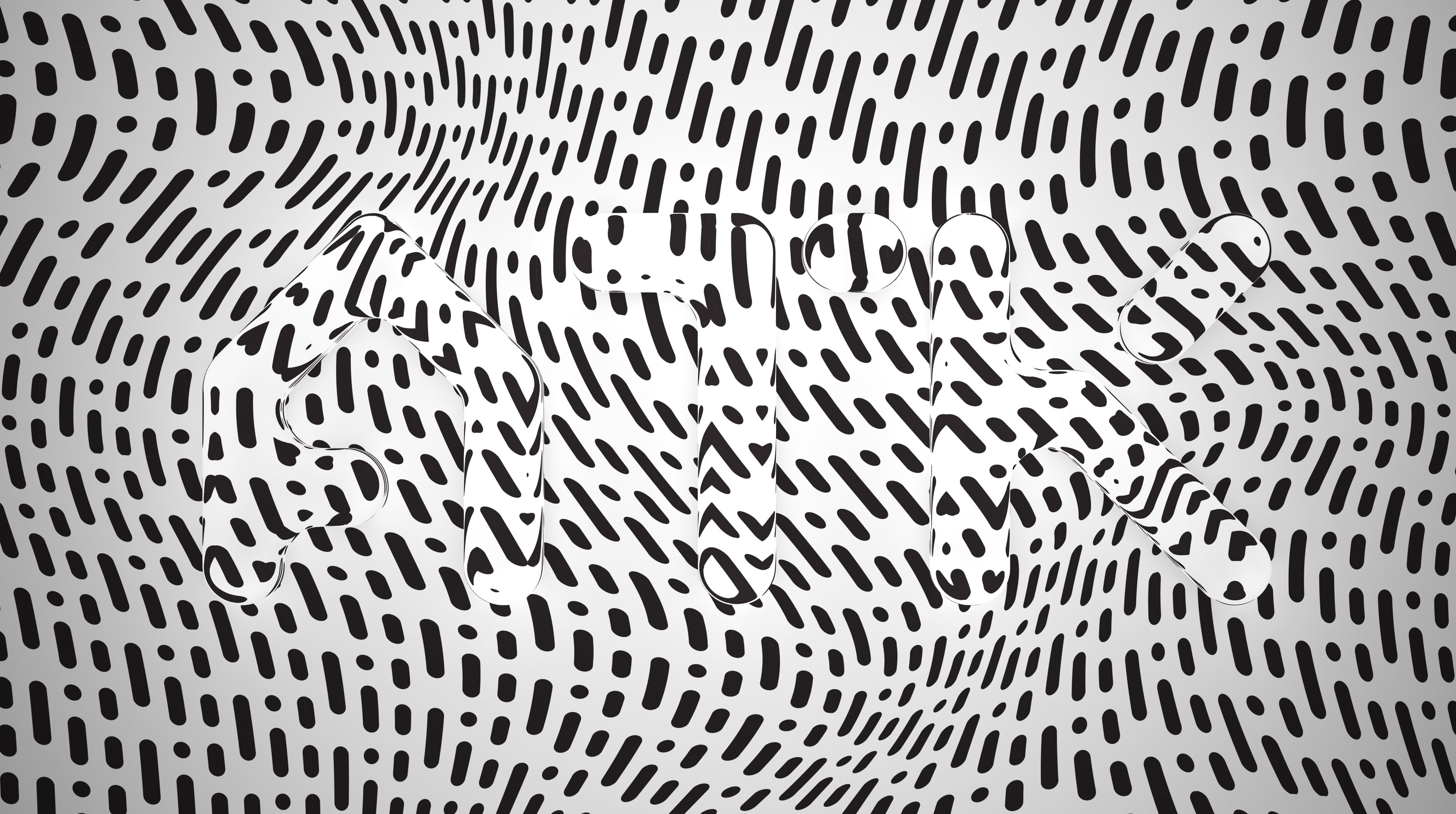
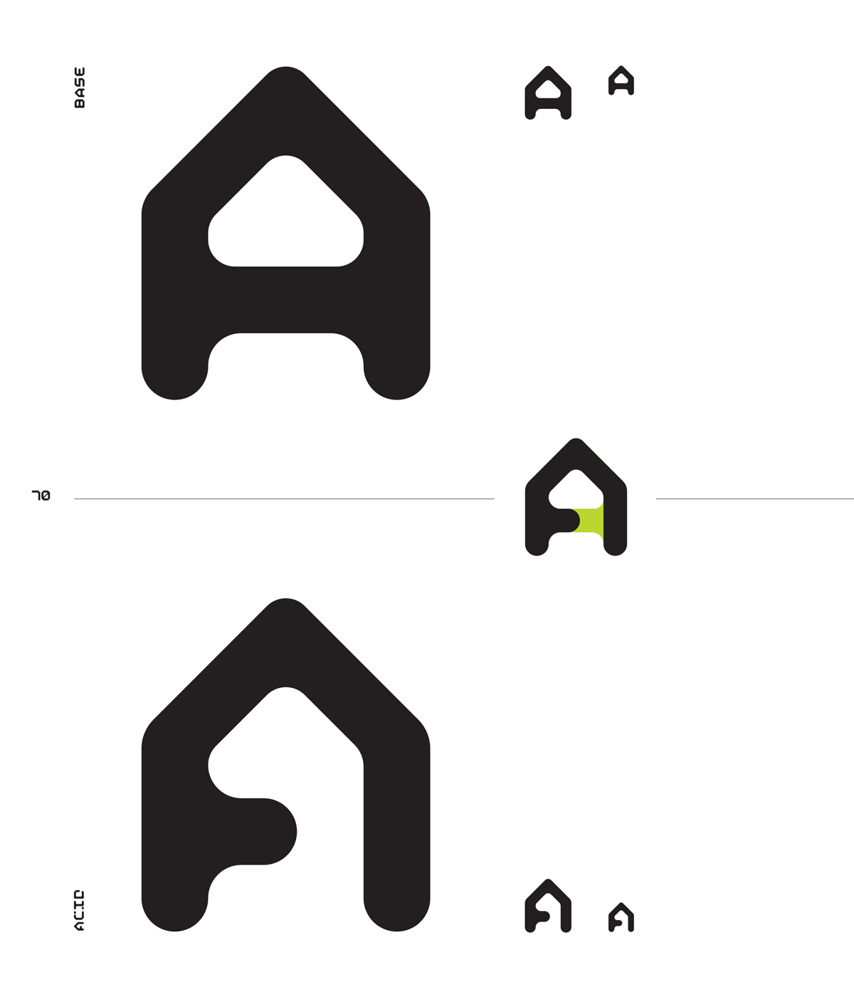
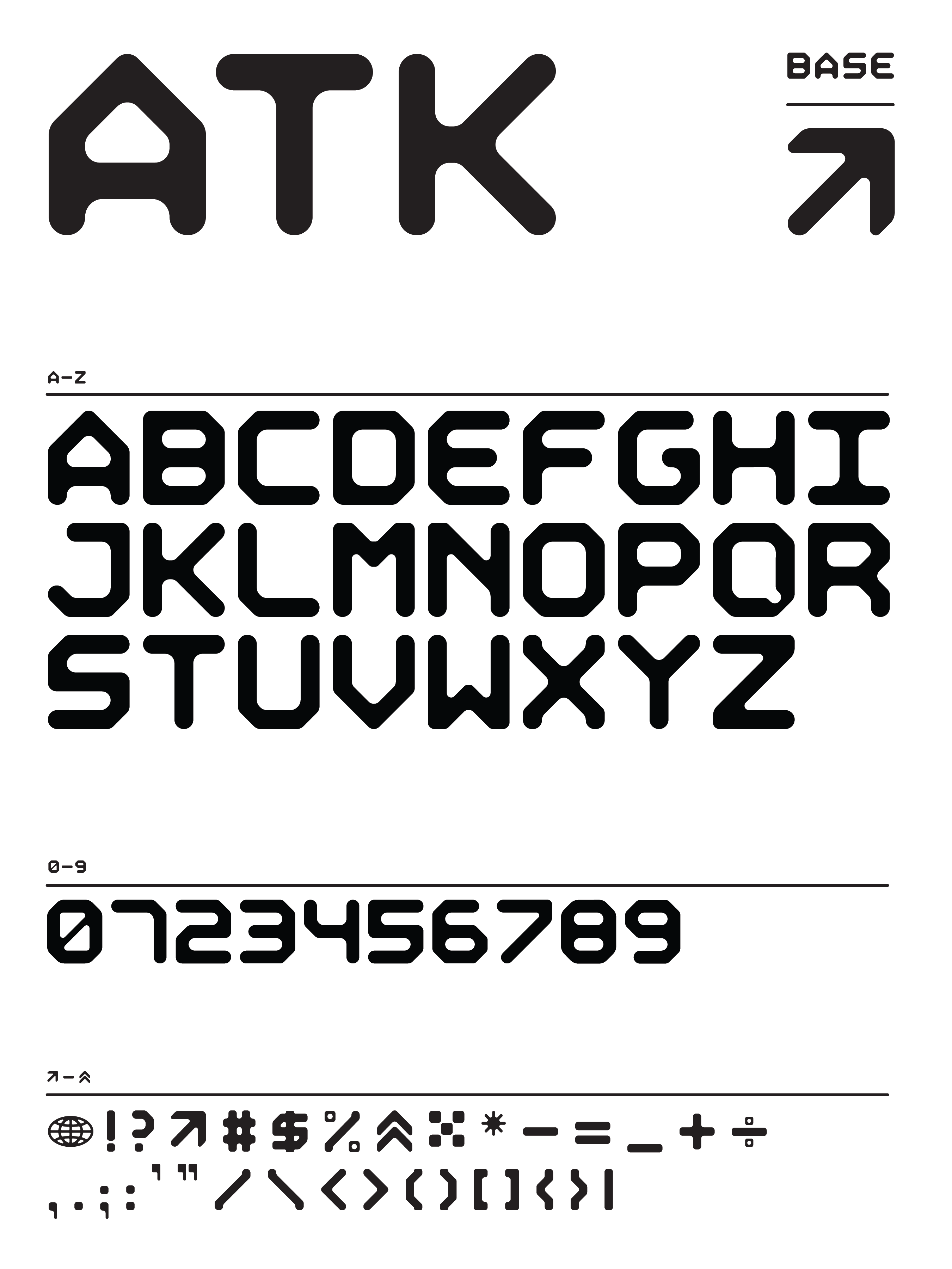
The base font structure is rounded and based around the idea of liquid softening corners and corrosion eating away at the stems. The monospace aspect lets the characters stand on their own in a structured grid but in Acid variation, some letterforms adopt their own blocking to break this rule. Much of the Acid variation is all about rule breaking and corrosion of the forms themselves. The illusion being an acidic compound eating away at the base structure of the font itself.
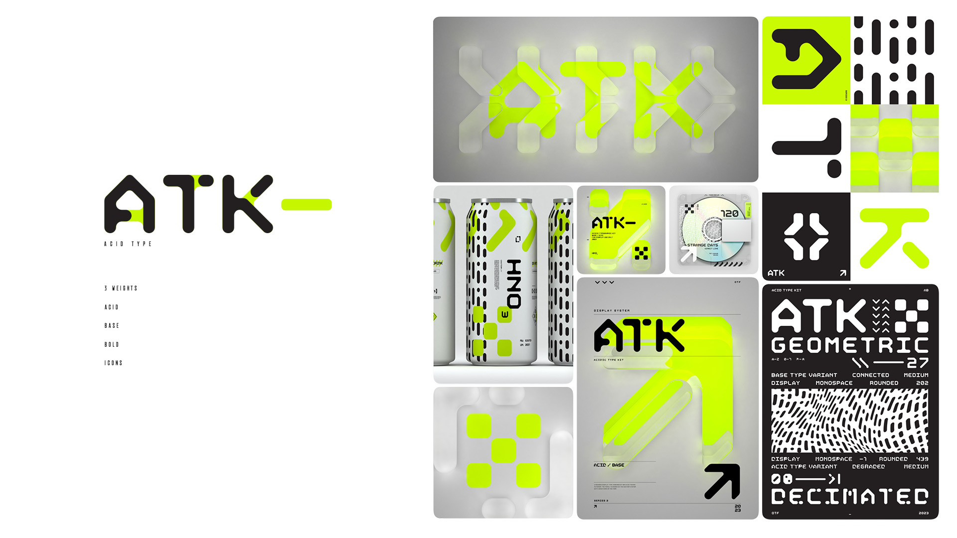

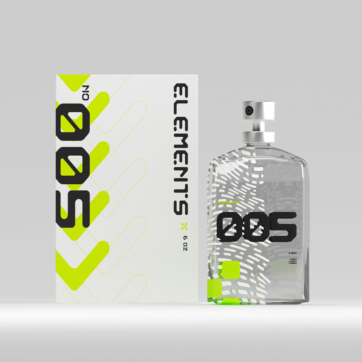
With both weights coexisting in the same grid, mixing and matching letterforms can bring variation to headlines and typographic details. Additionally, using the same character from both weights on top of one another will create a layered effect. Change the color and you’ve got a third style born of the first two.
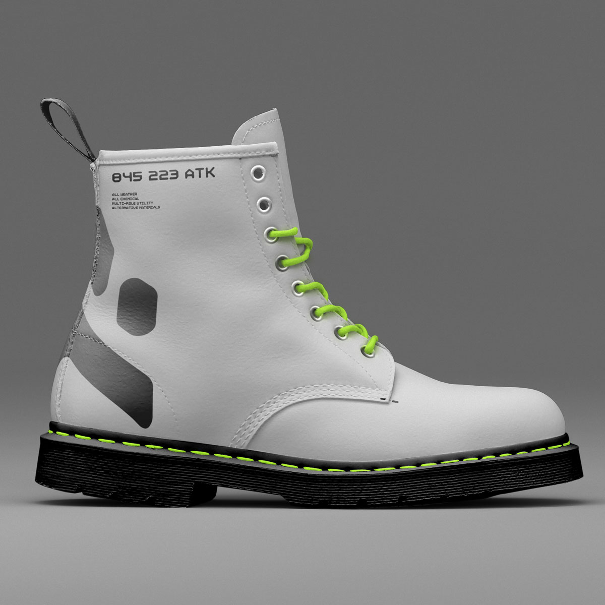
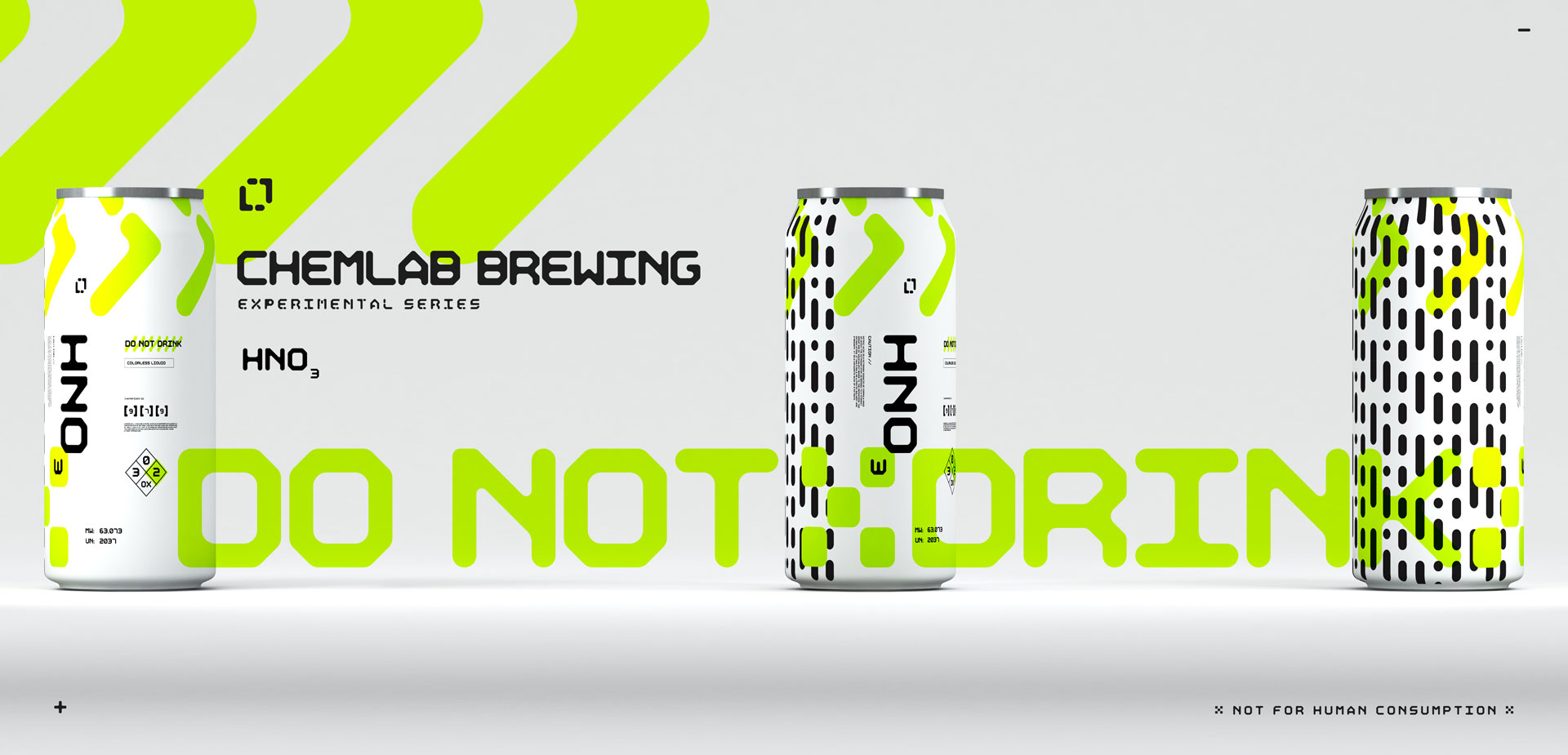
ATK strives to be flexible for both the written word and typographic design with a font that works well at body scale and even better when used as graphical motifs at large scale.
