ARK
Brand Design
ARK Health Sciences co-op invites the world to achieve a life well lived with genetically designed health and wellness products.
Welcome to the ARK brand case study, the world's first Health Sciences co-op that allows members to provide genetic samples of themselves to help design products perfectly tailored to their unique body and needs. This case study covers the ARK brand which comes complete with a custom font, icons, product design, and more. Brand projects always offer up creative ways to tell stories through unique mediums and in the case of ARK, this becomes even more apparent as you dive deeper into their rebrand.
ARK co-op aims to make the world a healthier place through the use of their unique genetic process. By rebranding themselves as a co-op, they've empowered consumers to take part in the very process of creating new product lines and advancing genetic research. These products are created for the consumer but also enable ARK to find more inexpensive ways in bringing their products to the rest of the world. ARK wants to reflect their global mission with a clean, confident, and empowering visual identity that will span generations to come.




Brand Design
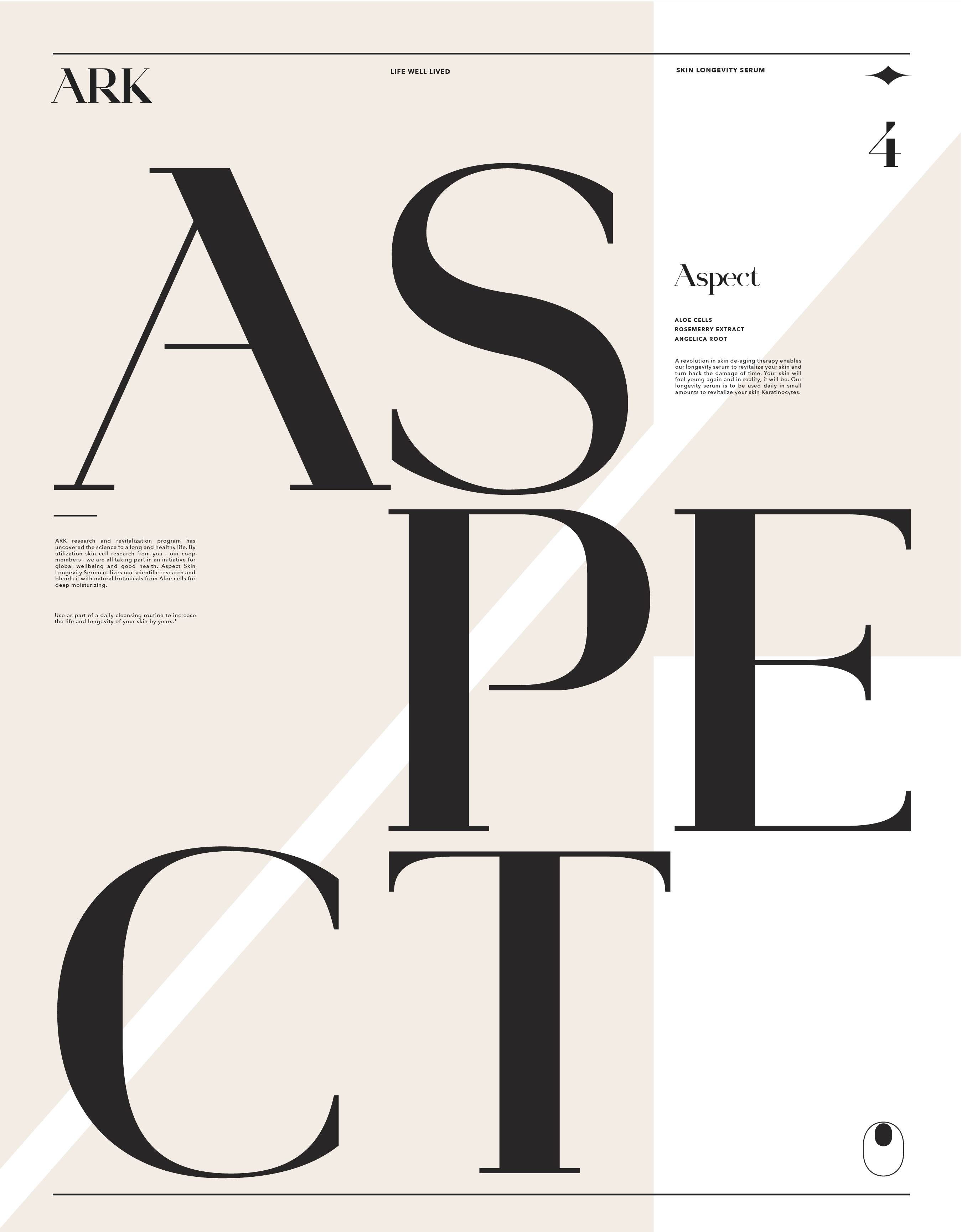
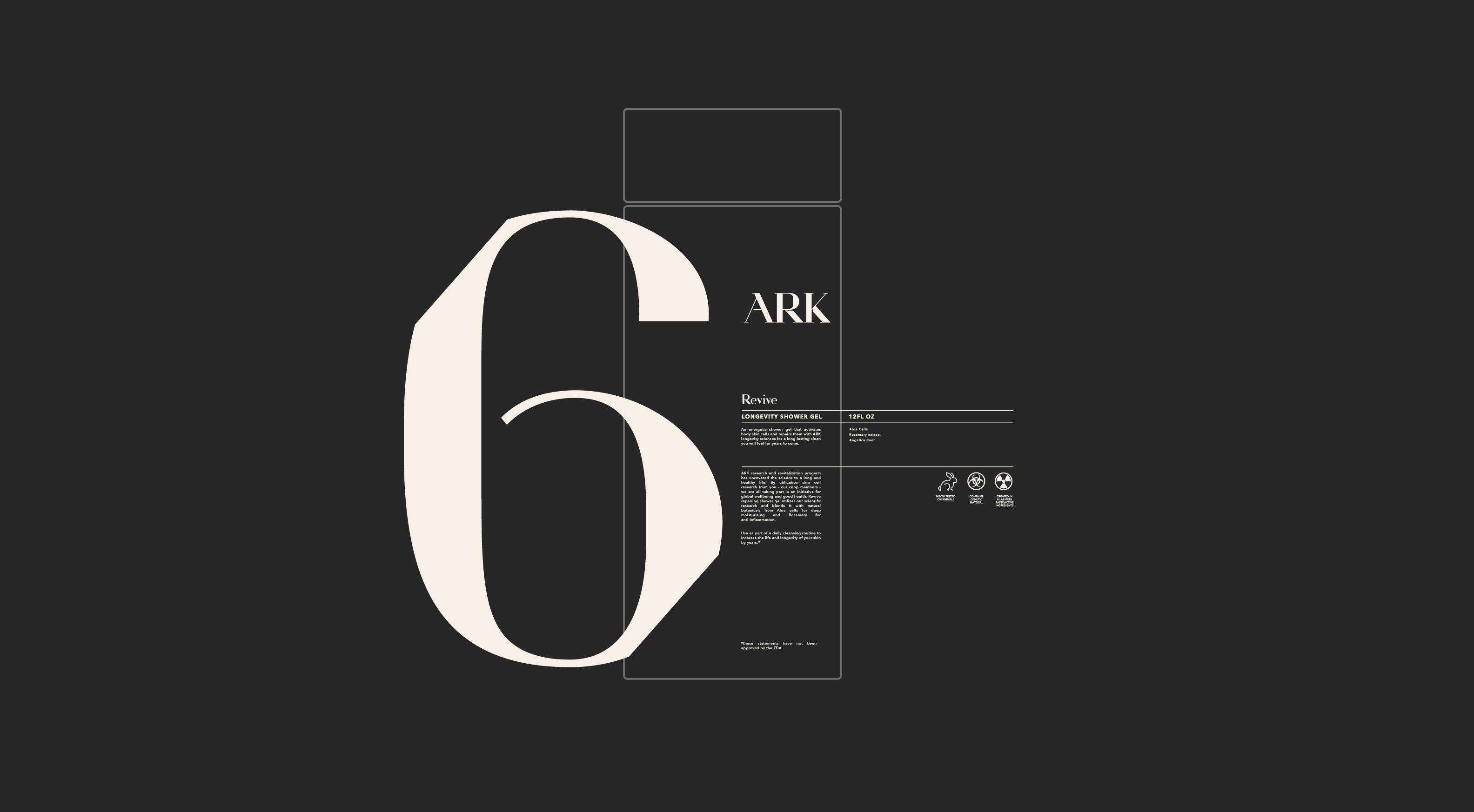
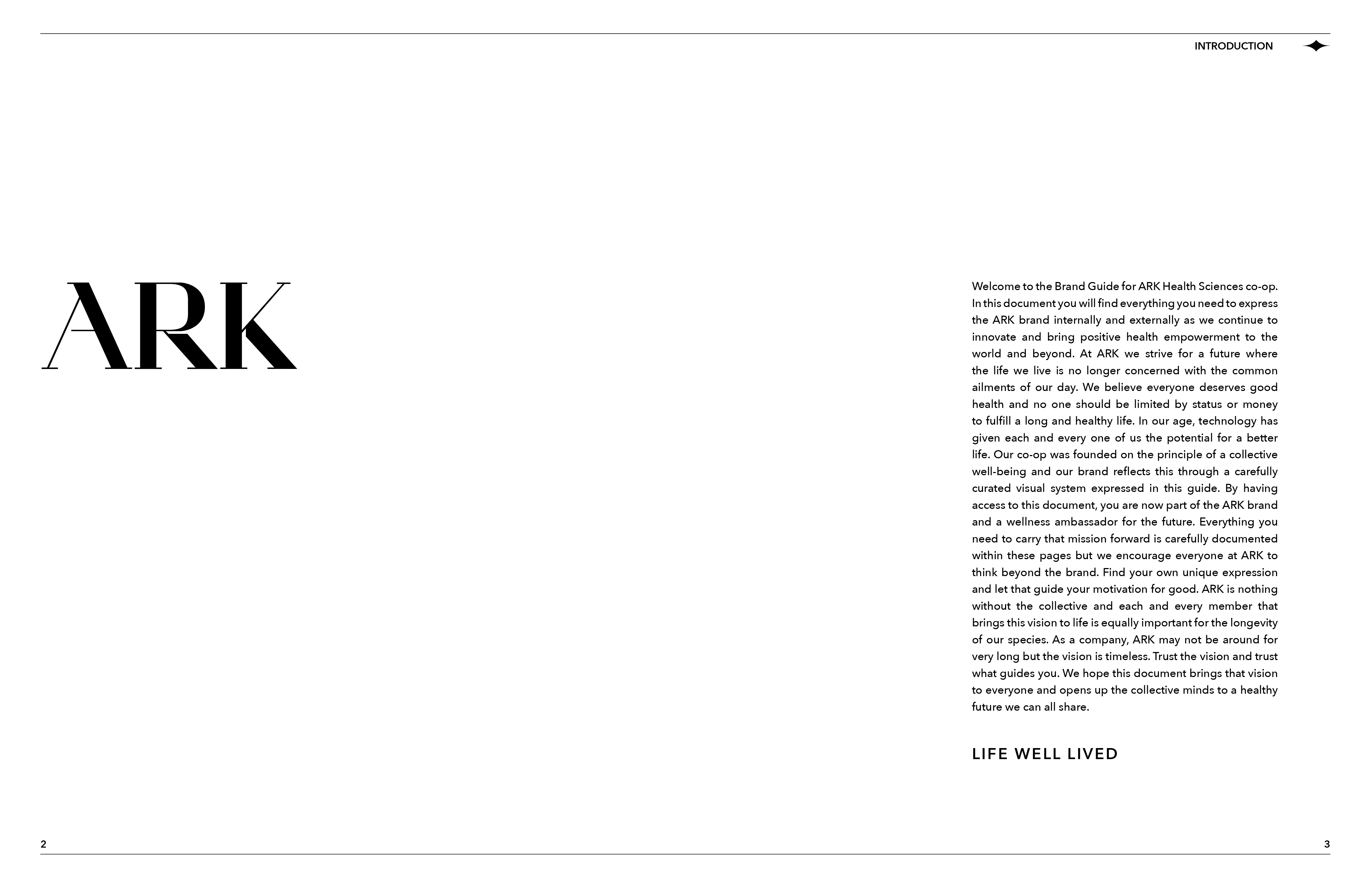
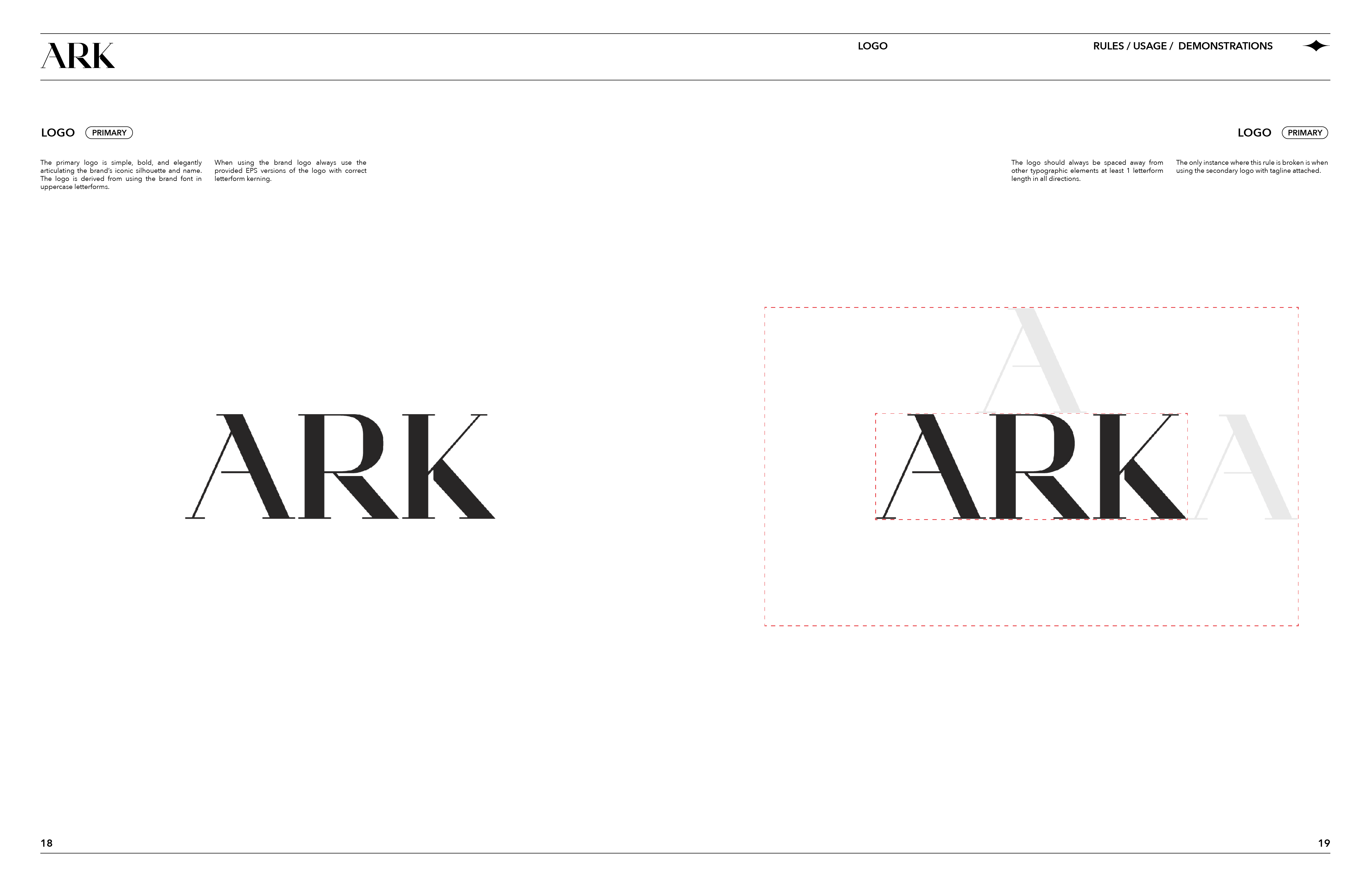
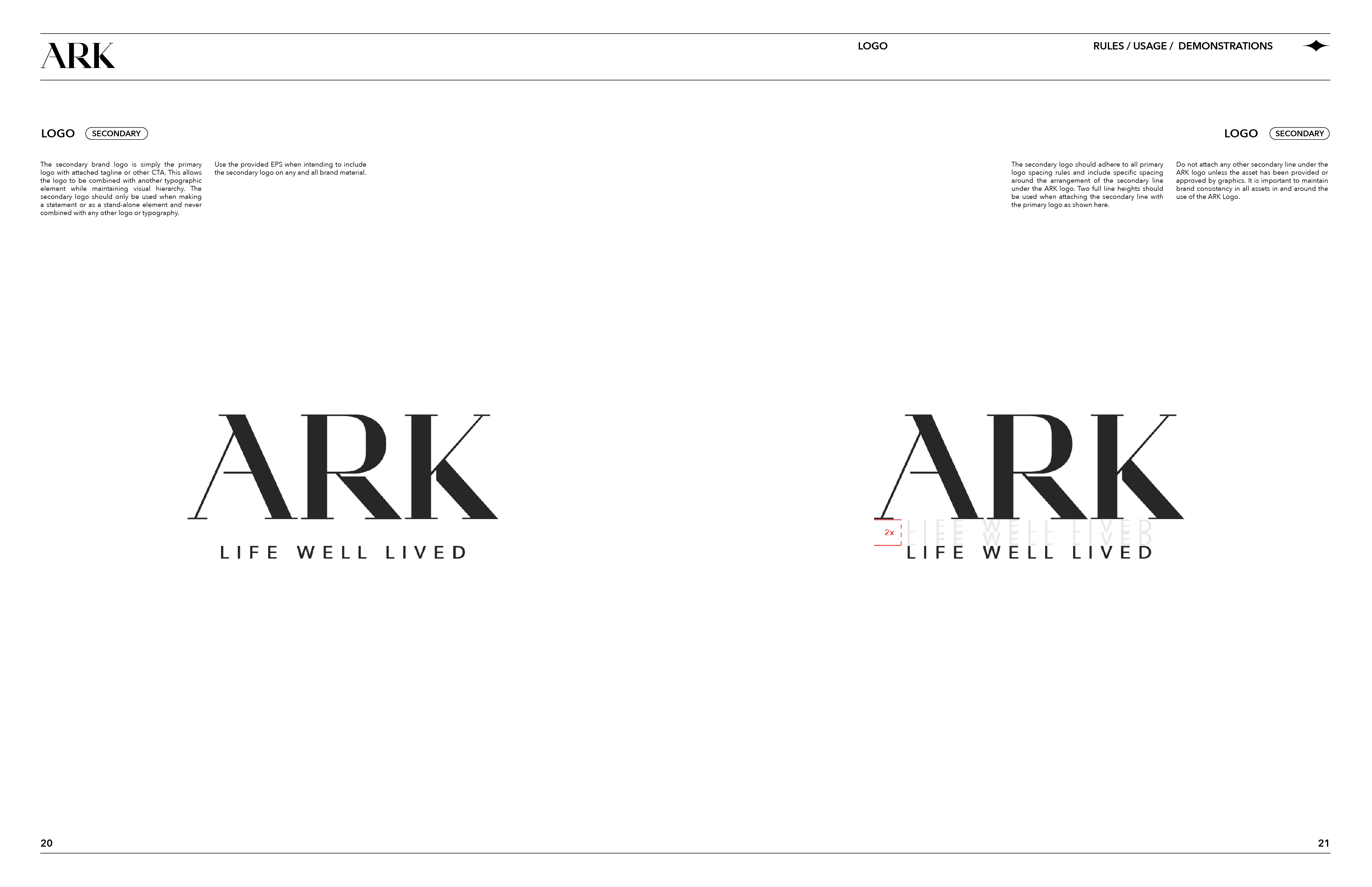
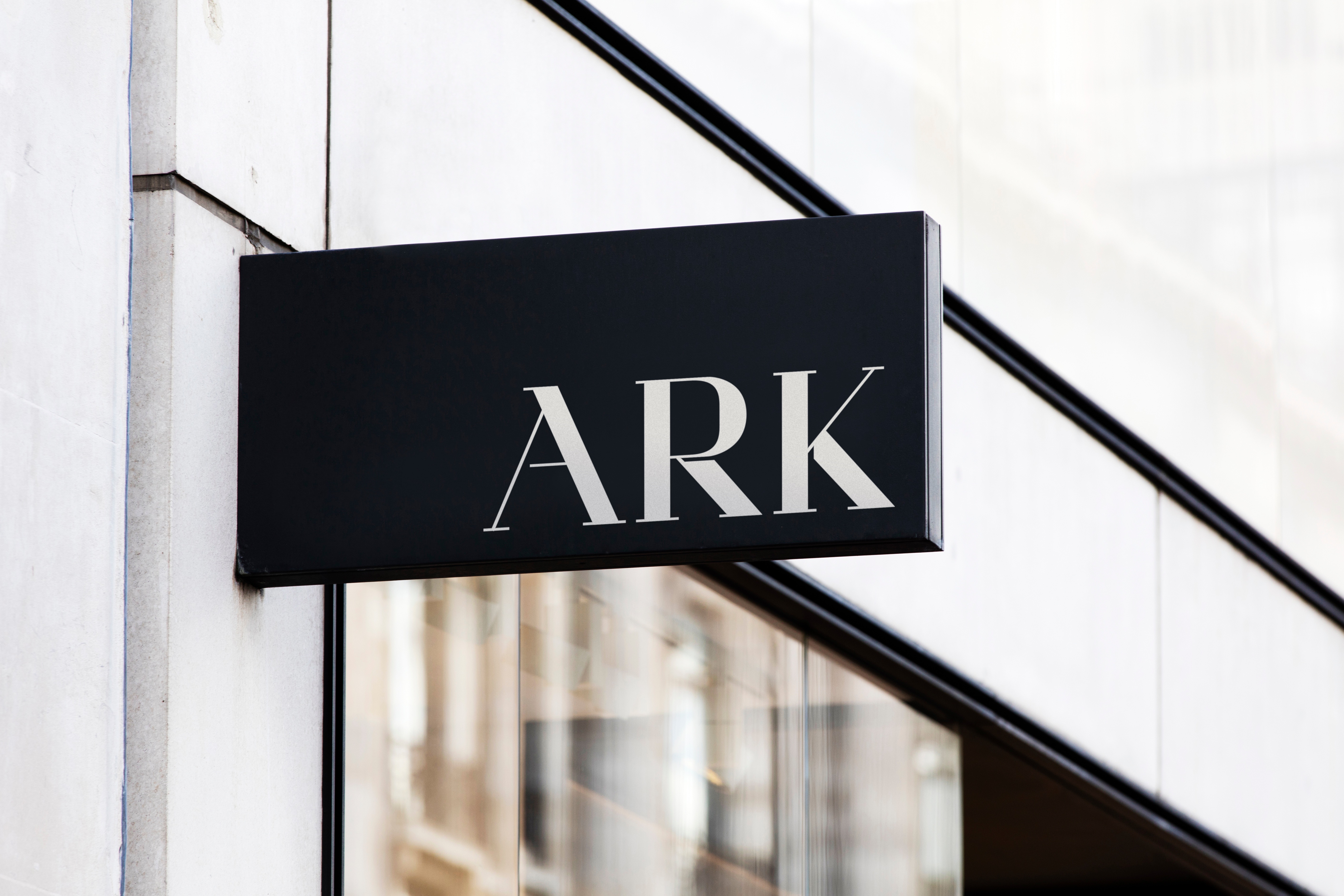
The logo and brand symbology play a large part in communicating the brand’s voice and vision with clean lines and refined design detailing. The ARK logo is a simple wordmark derived from the brand’s custom font family; ARK Regular. The logo is clean and versatile on its own or paired with copy and content. By achieving the ARK Logo with the brand font, the usage becomes clear and simple to execute across many brand verticals.
The ARK font is a custom serif font designed specifically for the brand that embraces modern elegance. The family was created with two weights for regular and semi-bold looks. The font families come with upper and lower case, numerals, and symbols.




Iconography
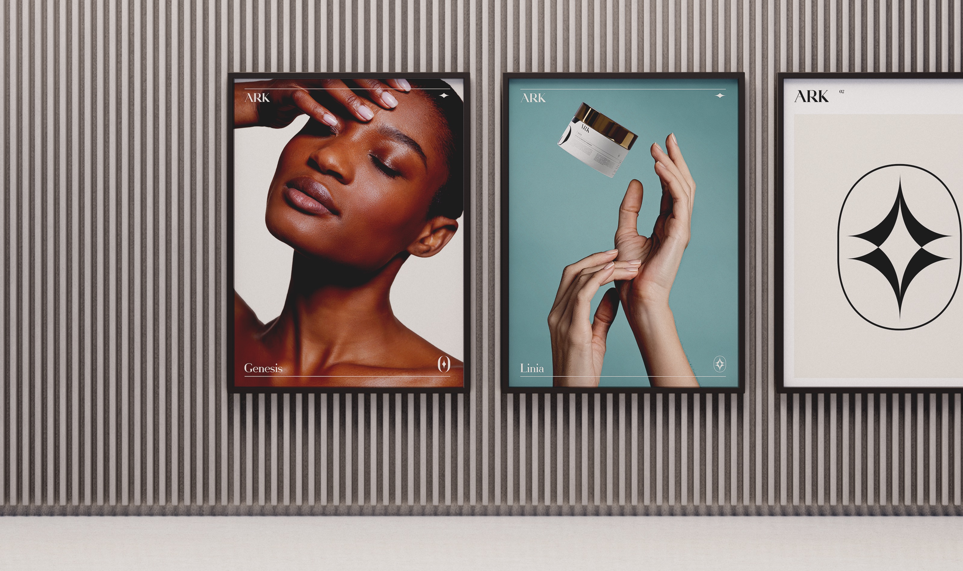
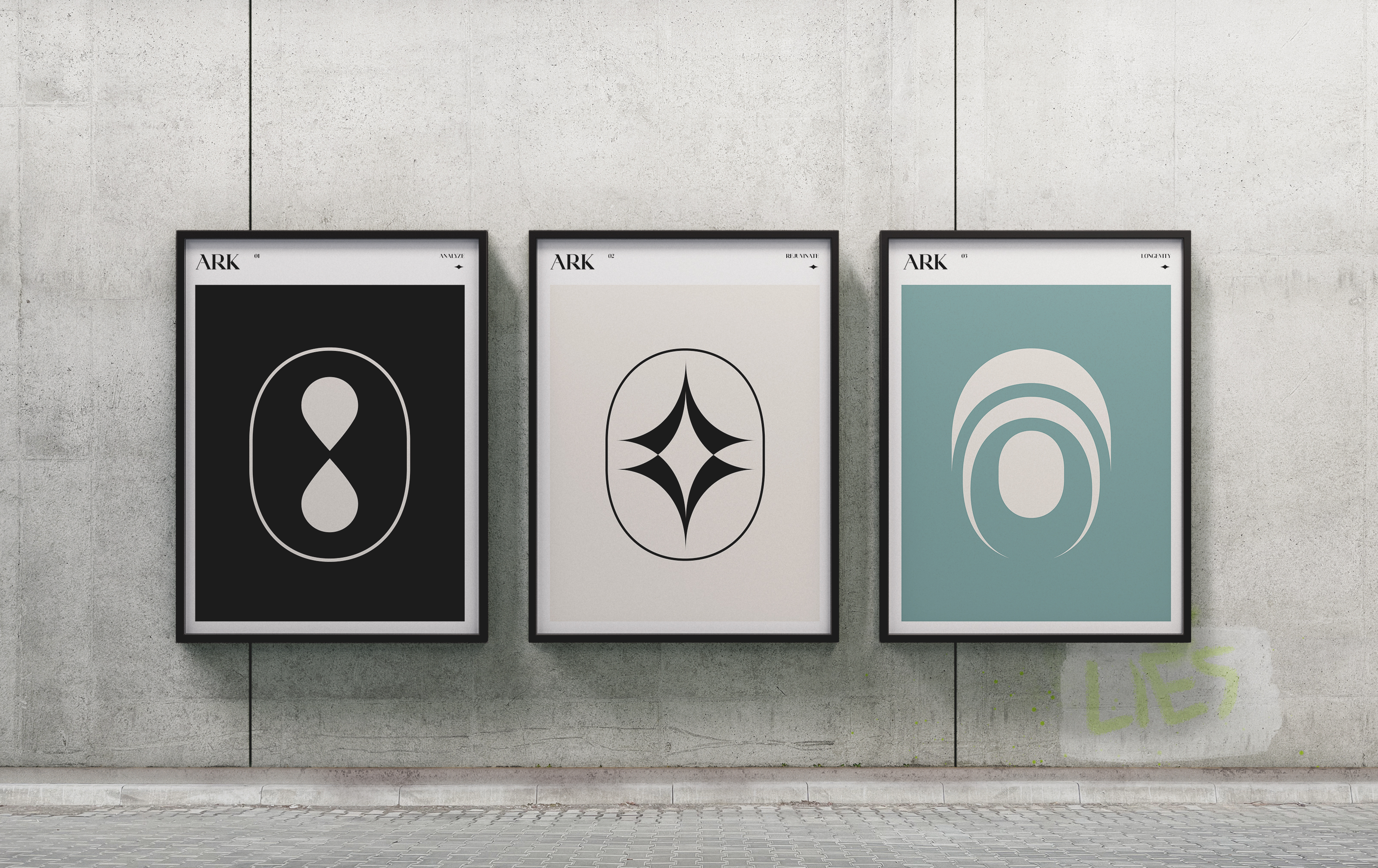
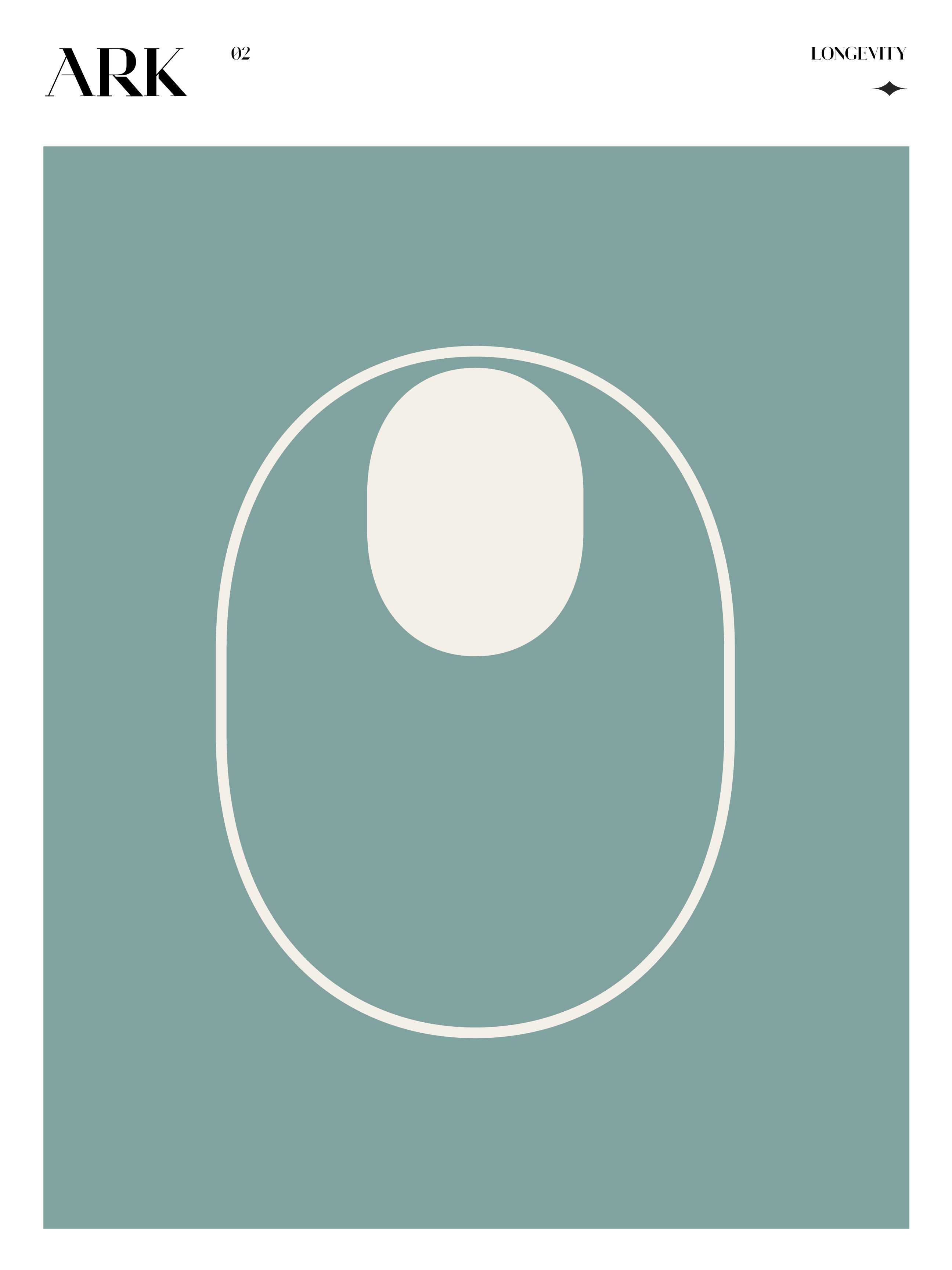
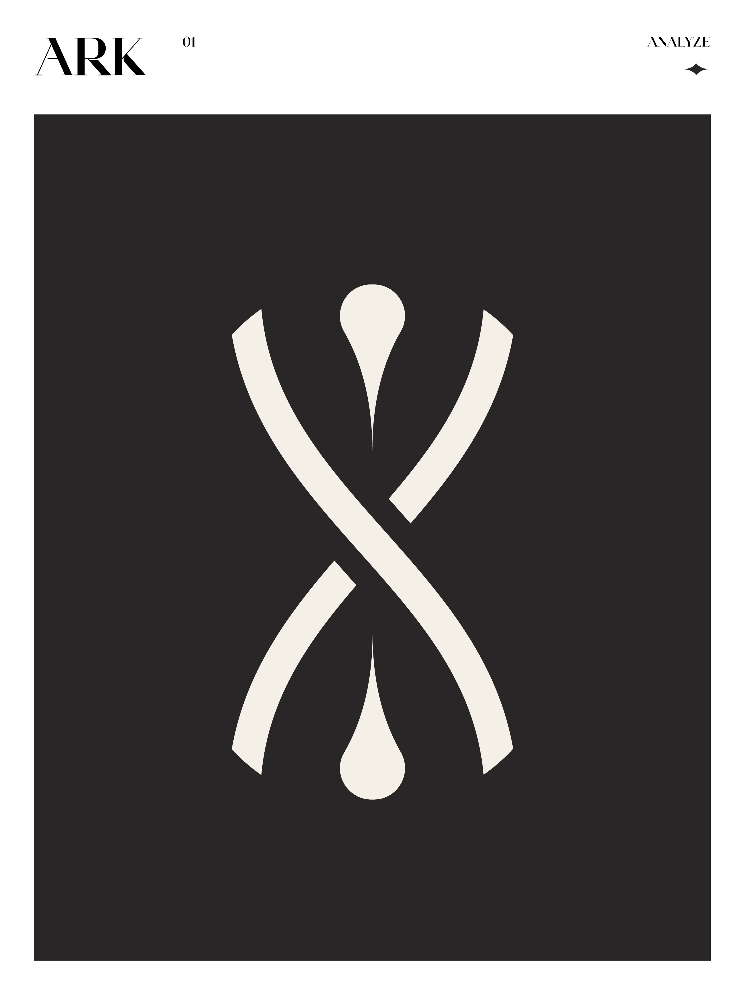
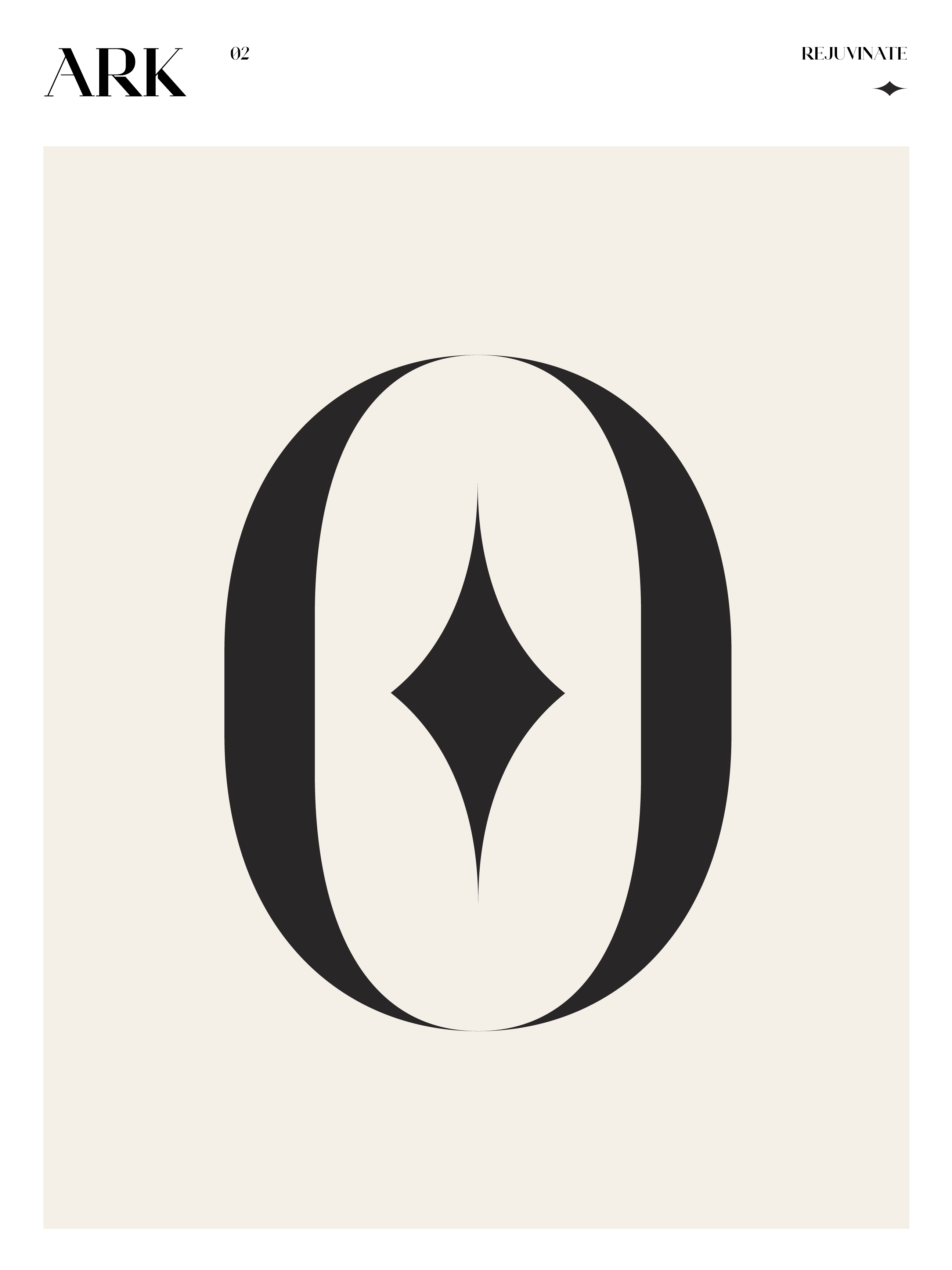
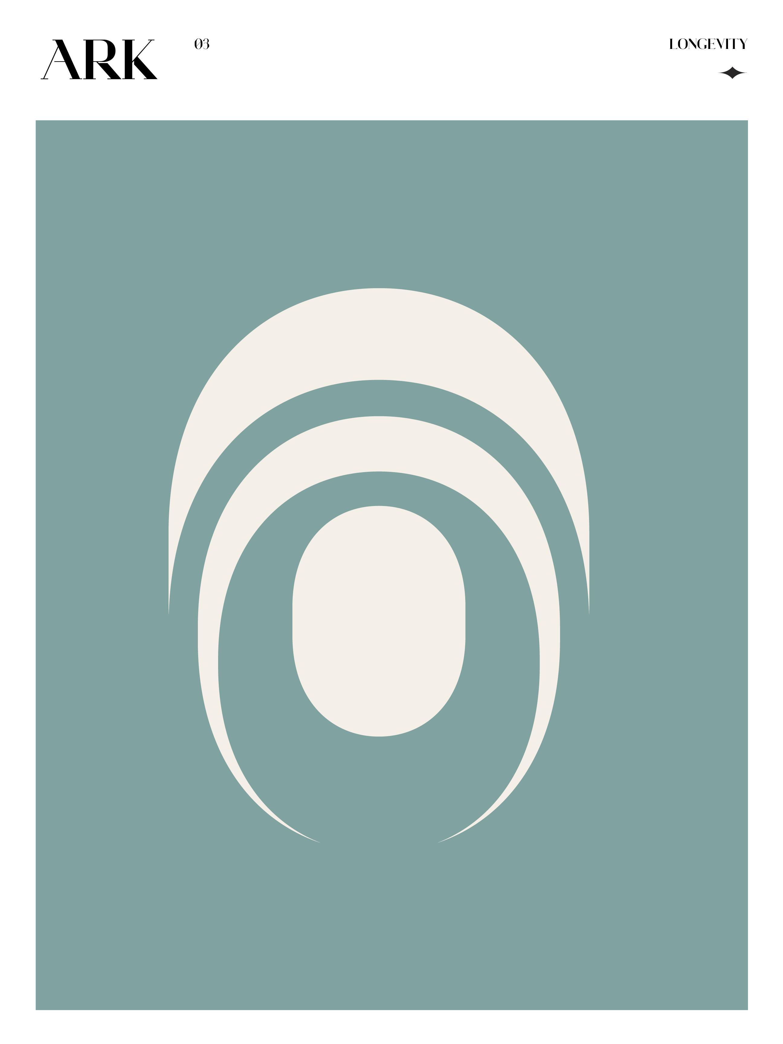
An icon language was also established to help visualize the key product categories in the ARK family. With a wide variety of products, ARK needed a way to quickly articulate what each product would do with simple icon semiotics. The icon system enables the brand to express their key product areas while remaining open for product line growth.
The brand seeks to convey confidence and empowerment with a calm visual vernacular paired with a brand voice that communicates an empathetic and inclusive tone. The icon system channels this approach while building brand recognition beyond the primary wordmark.



Product & Marketing
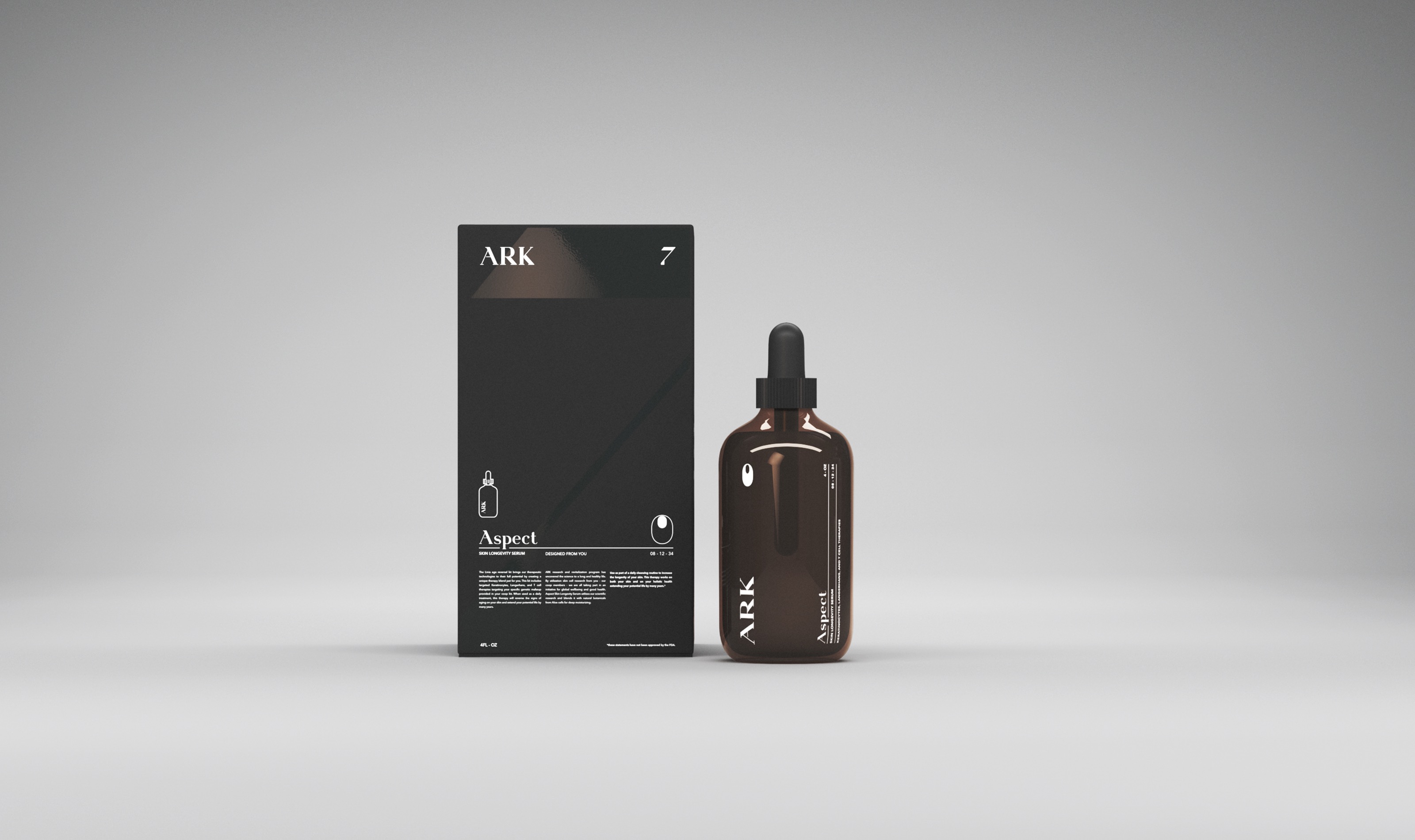
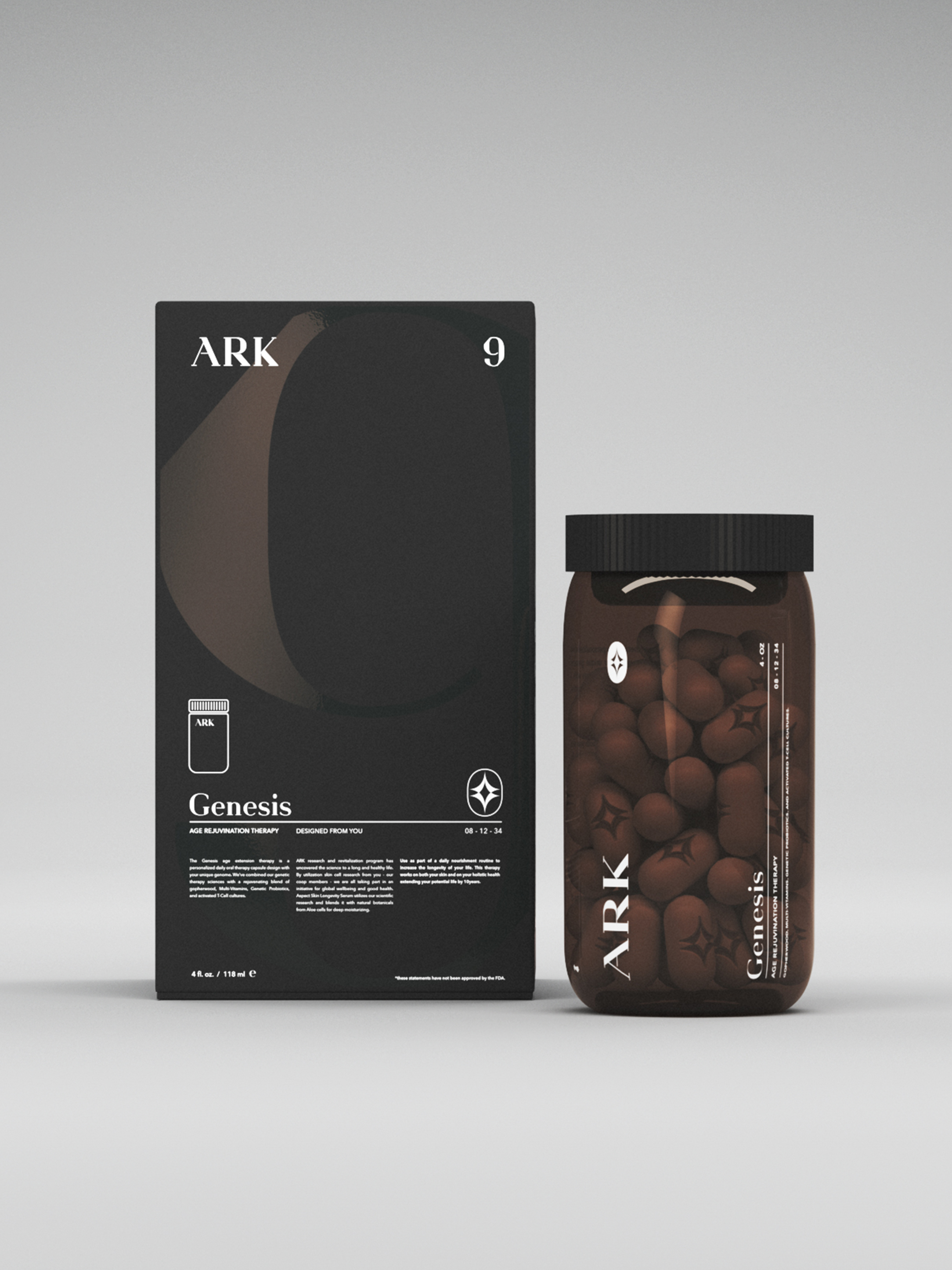
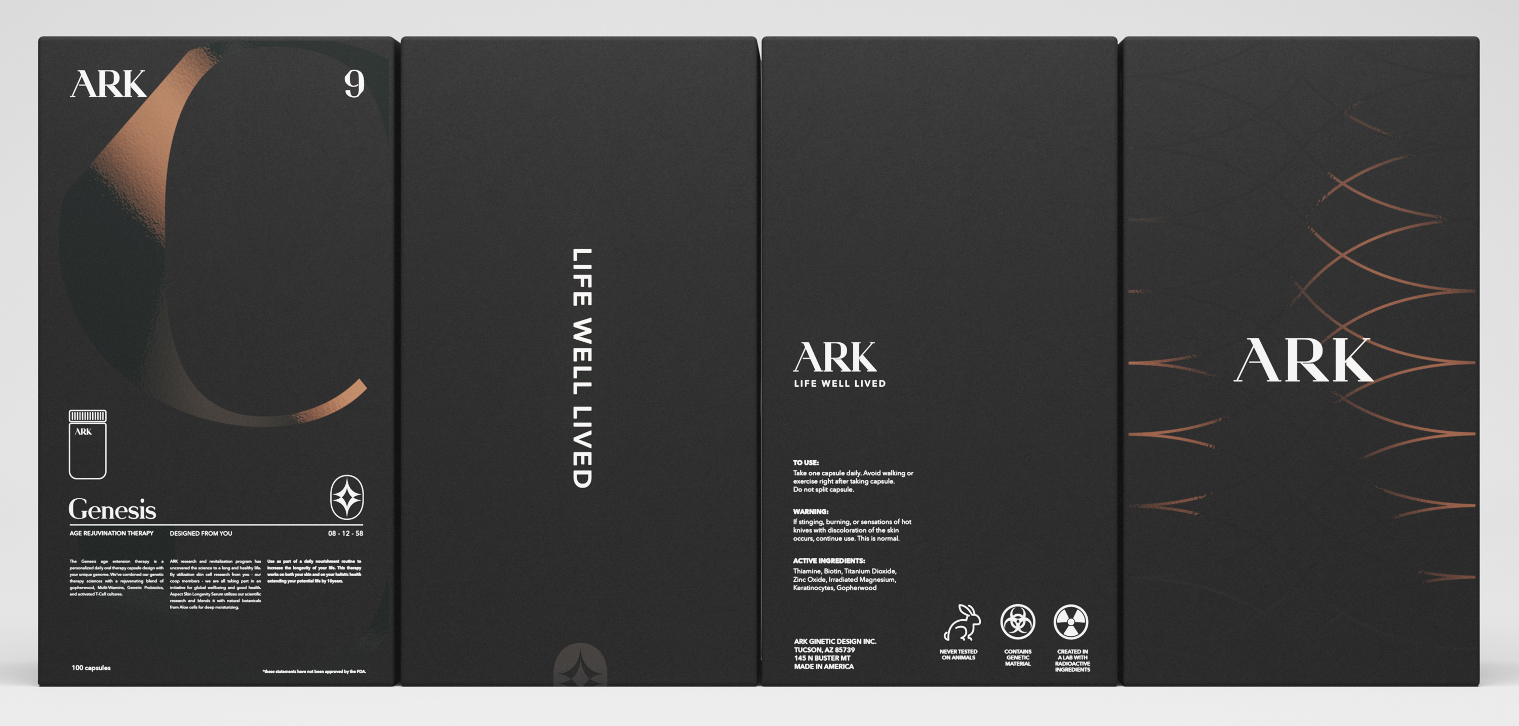
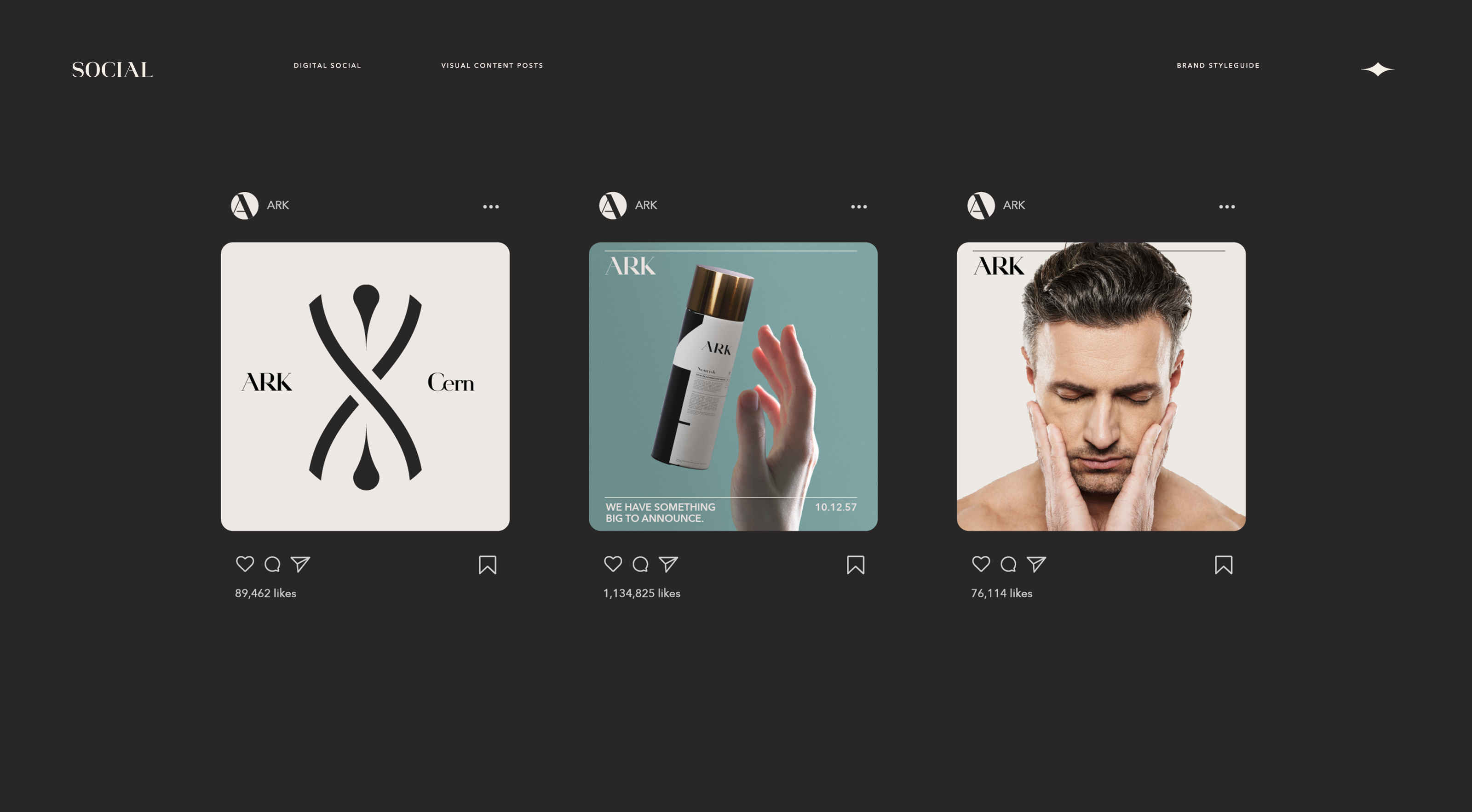
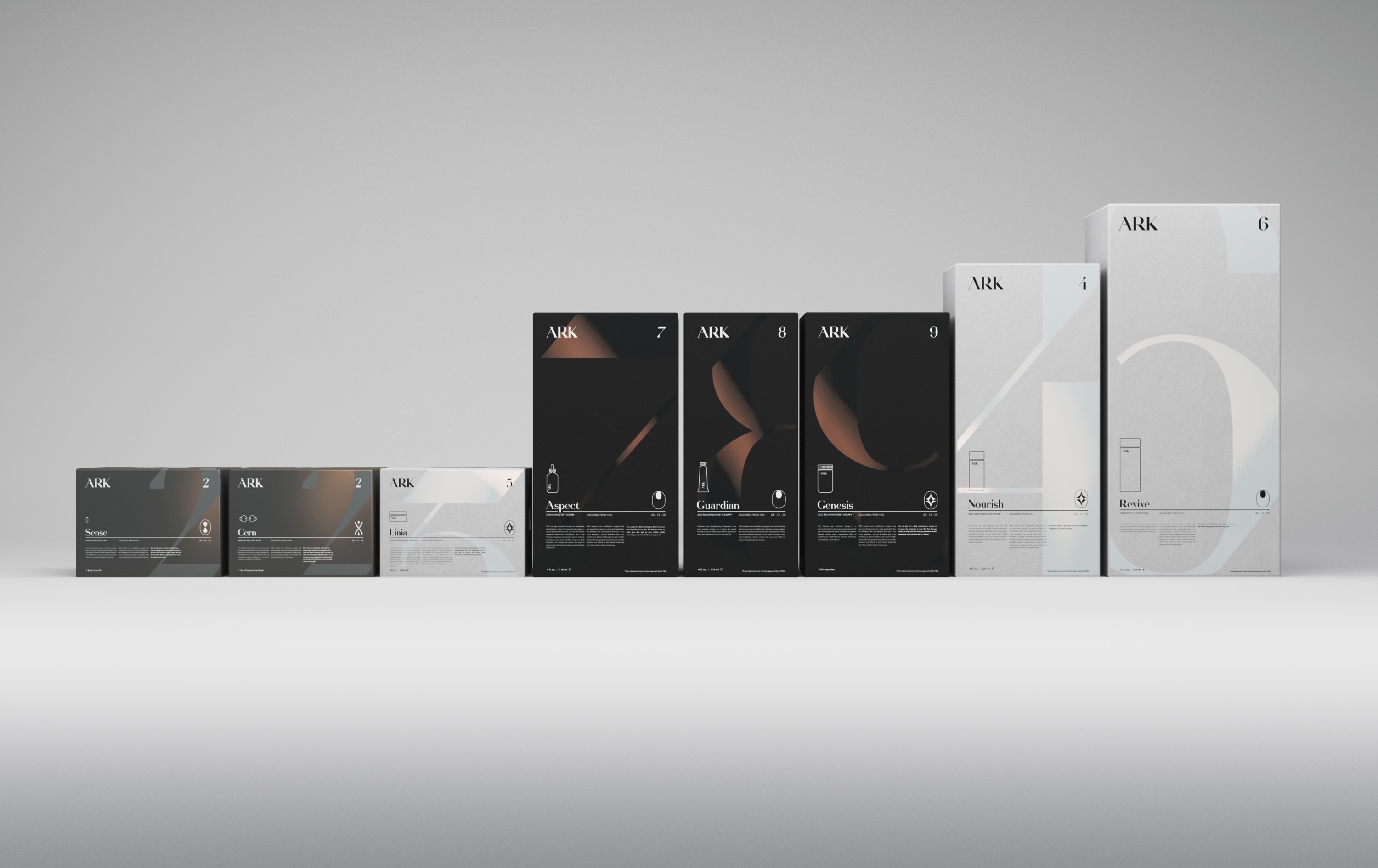
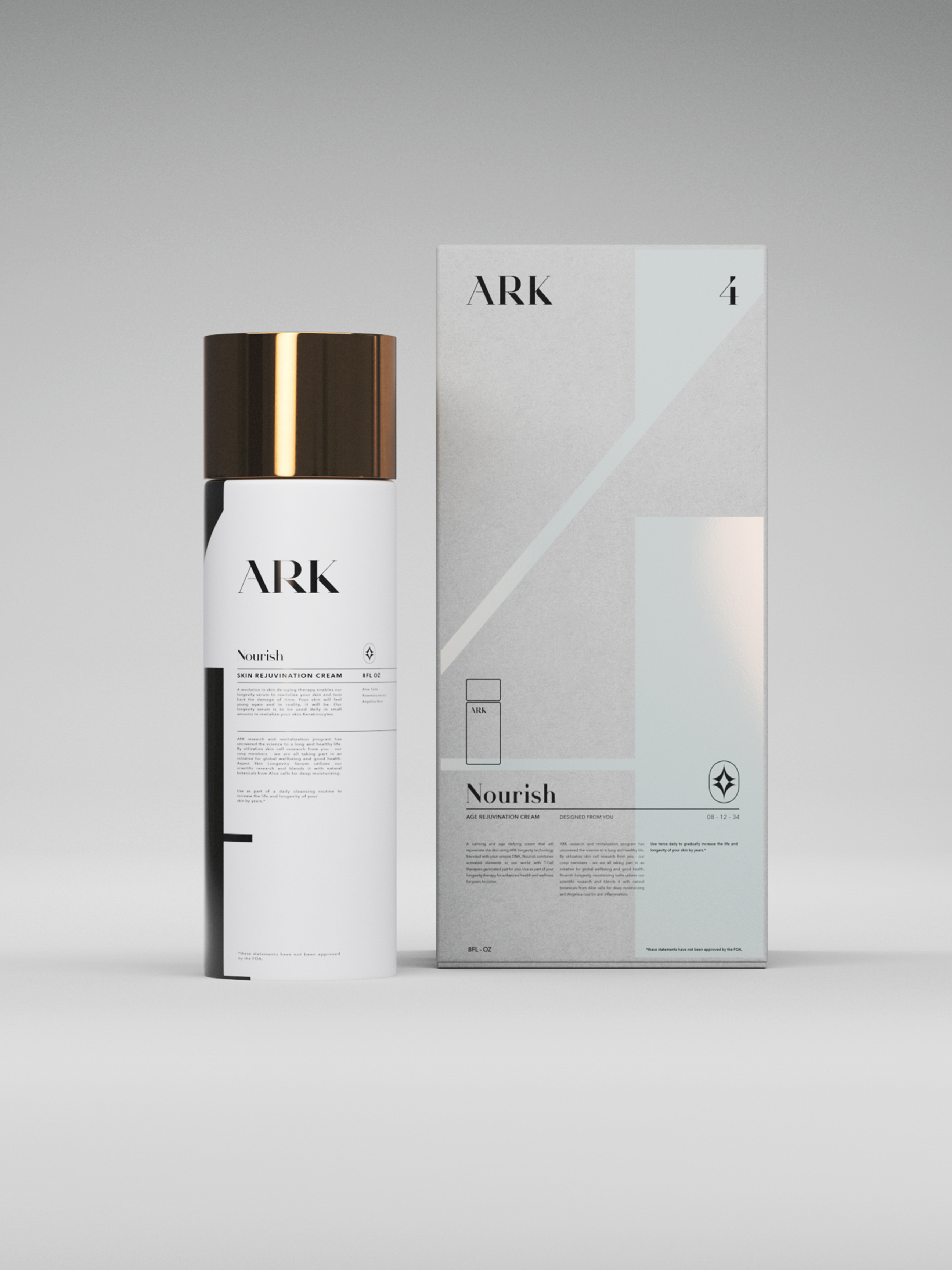
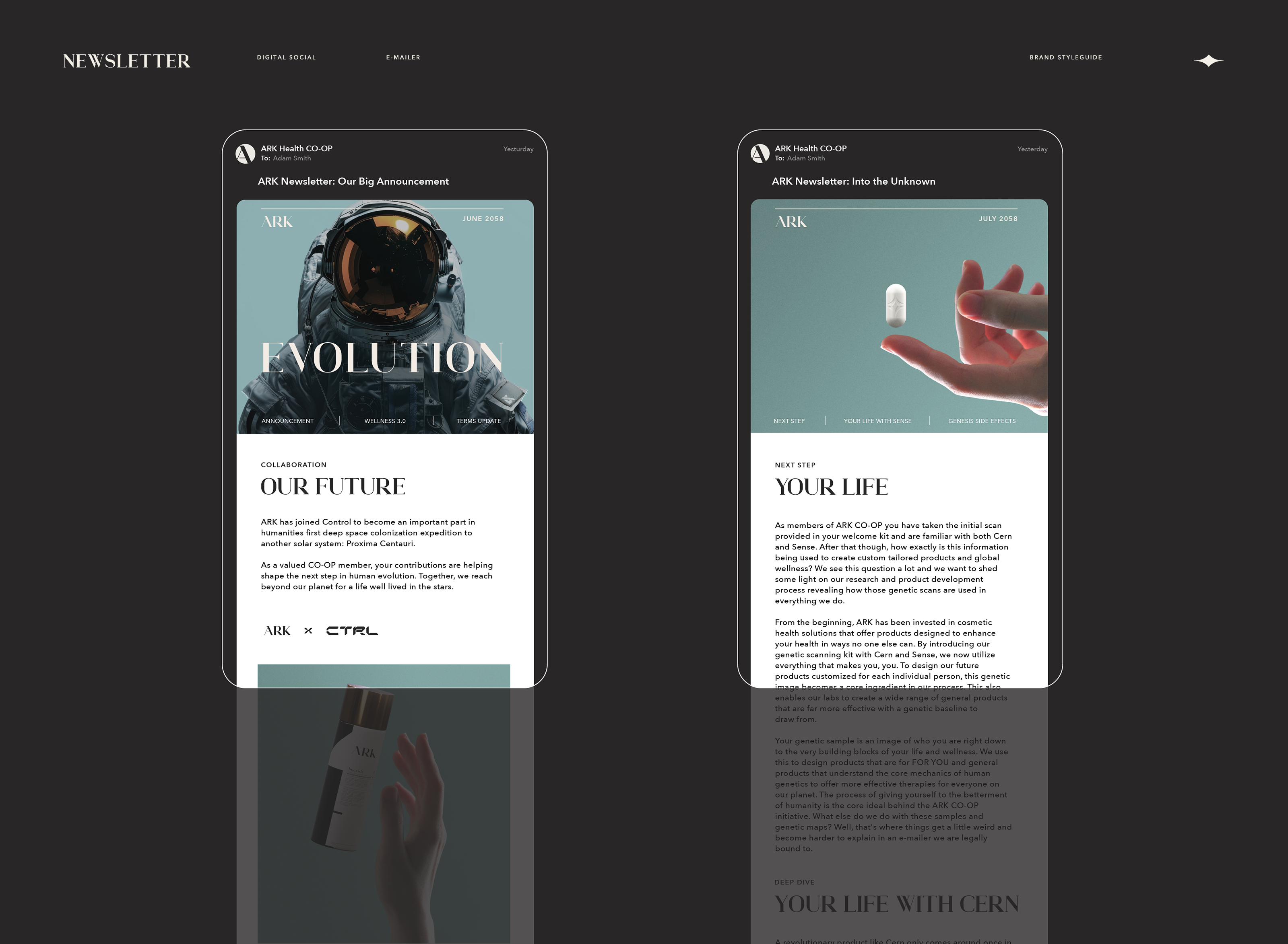
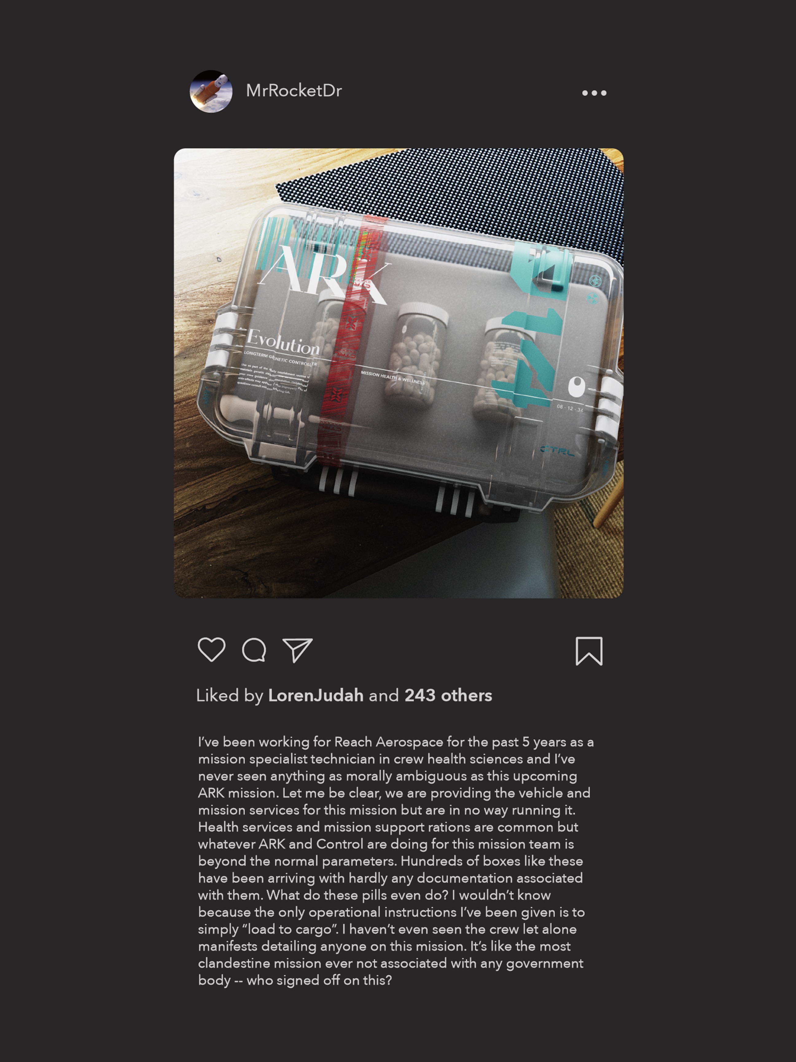
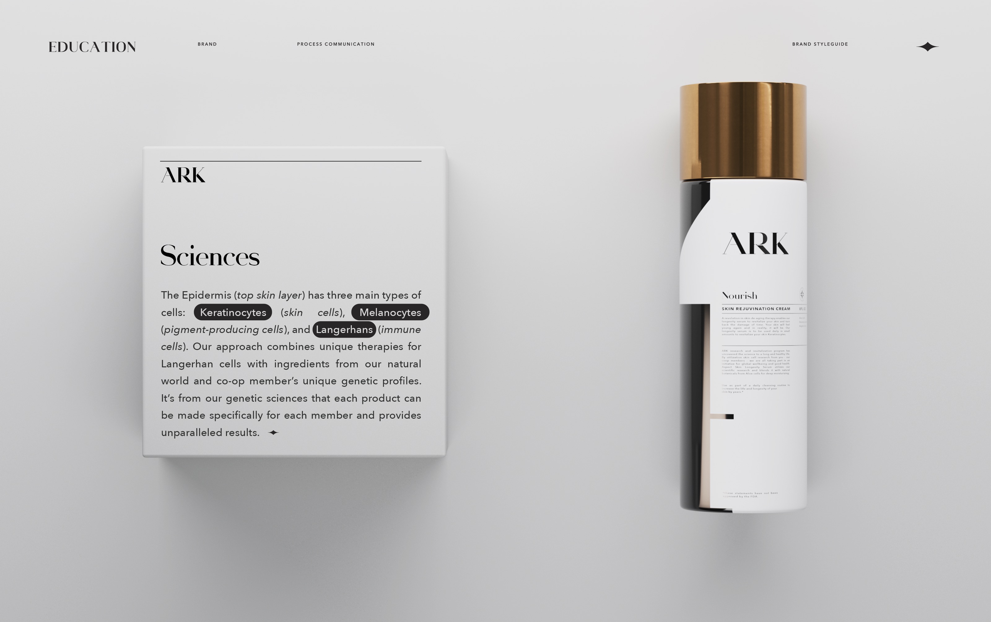
As the brand expands into product design and marketing, the core visual style remains intact with a simple layout system that is used across all product packaging. Key to the visual system is the brand's growth plans across all product categories. It was important to develop a system that would enable this growth without needing to re-think or recompose the key visual styles.
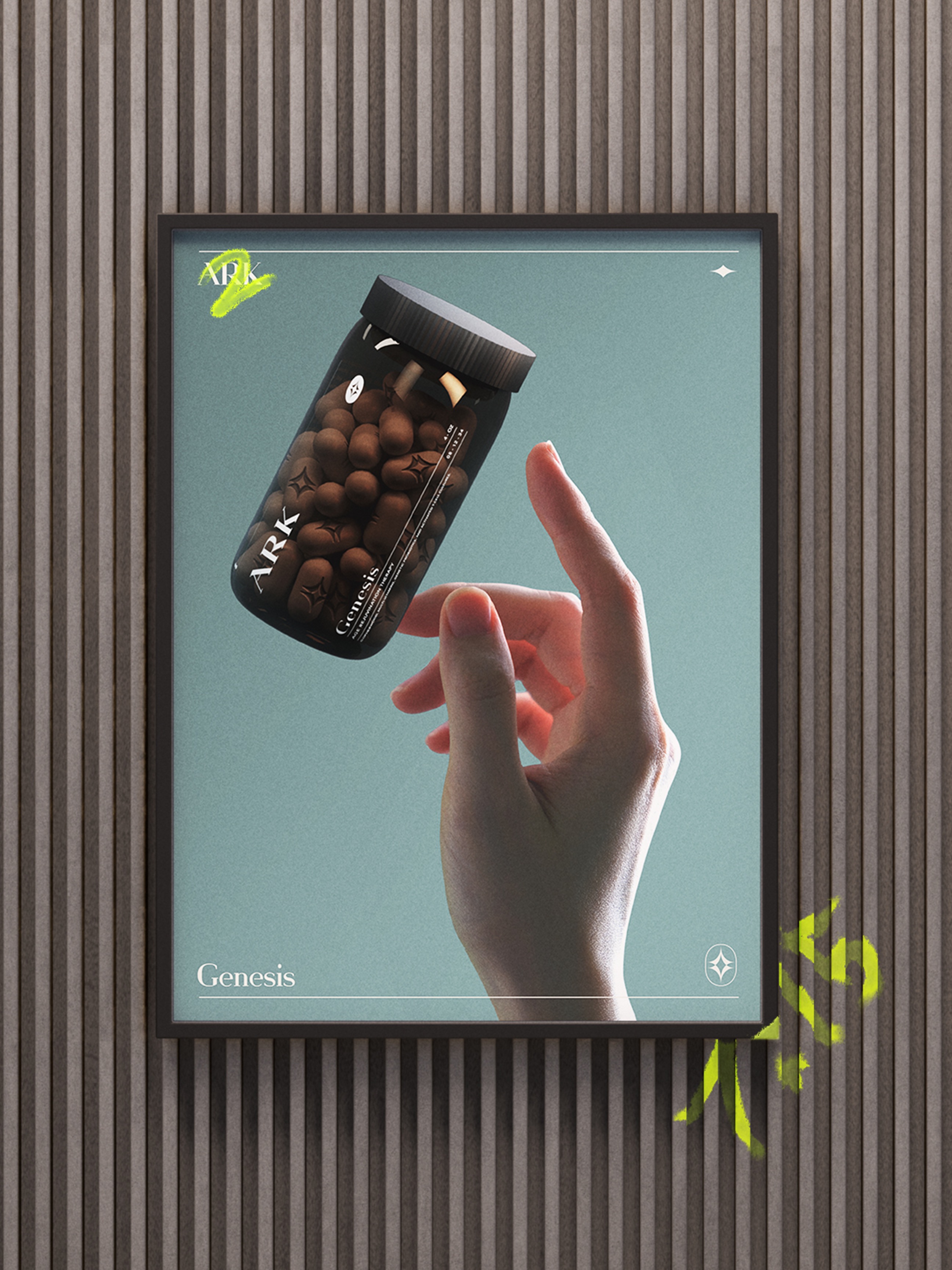
A two-toned approach was taken to explore visual variety and provide another indicator of product type. White package is used for daily cleansing routine while black is used for genetically designed products. Foil packaging is reserved for body scan and initiation products.

